Introduction
Rust Radix is a Rust port of Radix.
Radix is a library of components, icons, colors, and templates for building high-quality, accessible UI.
Parts
Rust Radix consists of the following parts:
Frameworks
Rust Radix is available for the following frameworks:
The tables below show the support for the various frameworks.
- ✅ = Supported
- 🟦 = Early Support
- 🚧 = Work In Progress
- ❌ = Unsupported
Colors Support
| Name | Framework Independent |
|---|---|
| Colors | ✅ |
Icons Support
| Name | Dioxus | Leptos | Yew |
|---|---|---|---|
| Icons | ✅ | ✅ | ✅ |
Primitives Support
| Name | Dioxus | Leptos | Yew |
|---|---|---|---|
| Accessible Icon | ❌ #120 | 🚧 #17 | ❌ #69 |
| Accordion | ❌ #121 | ❌ #18 | ❌ #70 |
| Alert Dialog | ❌ #122 | ❌ #19 | ❌ #71 |
| Arrow | ❌ #123 | 🚧 #20 | 🚧 #72 |
| Aspect Ratio | ❌ #124 | 🟦 #21 | ❌ #73 |
| Avatar | ❌ #125 | 🚧 #22 | 🚧 #74 |
| Checkbox | ❌ #126 | 🚧 #23 | 🟦 #75 |
| Collapsible | ❌ #127 | ❌ #24 | ❌ #76 |
| Collection | ❌ #128 | 🟦 #25 | 🟦 #77 |
| Compose Refs | ❌ #129 | 🟦 #26 | 🟦 #78 |
| Context Menu | ❌ #130 | ❌ #27 | ❌ #79 |
| Context | ❌ #131 | ❌ #28 | ❌ #80 |
| Dialog | ❌ #132 | ❌ #29 | 🚧 #81 |
| Direction | ❌ #133 | 🟦 #30 | 🟦 #82 |
| Dismissable Layer | ❌ #134 | 🚧 #31 | 🚧 #83 |
| Dropdown Menu | ❌ #135 | ❌ #32 | ❌ #84 |
| Focus Guards | ❌ #136 | 🟦 #33 | 🟦 #85 |
| Focus Scope | ❌ #137 | 🚧 #34 | 🚧 #86 |
| Form | ❌ #138 | ❌ #35 | ❌ #87 |
| Hover Card | ❌ #139 | ❌ #36 | ❌ #88 |
| ID | ❌ | 🟦 | 🟦 |
| Label | ❌ #140 | 🟦 #37 | 🟦 #89 |
| Menu | ❌ #141 | 🚧 #38 | ❌ #90 |
| Menubar | ❌ #142 | ❌ #39 | ❌ #91 |
| Navigation Menu | ❌ #143 | ❌ #40 | ❌ #92 |
| Popover | ❌ #144 | ❌ #41 | ❌ #93 |
| Popper | ❌ #145 | 🟦 #42 | 🚧 #94 |
| Portal | ❌ #146 | 🟦 #43 | 🟦 #95 |
| Presence | ❌ #147 | 🟦 #44 | 🟦 #96 |
| Primitive | ❌ #148 | 🟦 #45 | 🟦 #97 |
| Progress | ❌ #149 | 🟦 #46 | ❌ #98 |
| Radio Group | ❌ #150 | ❌ #47 | ❌ #99 |
| Roving Focus | ❌ #151 | 🚧 #48 | ❌ #100 |
| Scroll Area | ❌ #152 | ❌ #49 | ❌ #101 |
| Select | ❌ #153 | ❌ #50 | 🚧 #102 |
| Separator | ❌ #154 | 🟦 #51 | 🟦 #103 |
| Slider | ❌ #155 | ❌ #52 | ❌ #104 |
| Slot | ❌ #156 | 🚧 #53 | ❌ #105 |
| Switch | ❌ #157 | 🟦 #54 | 🟦 #106 |
| Tabs | ❌ #158 | ❌ #55 | ❌ #107 |
| Toast | ❌ #159 | ❌ #56 | ❌ #108 |
| Toggle Group | ❌ #160 | ❌ #57 | ❌ #109 |
| Toggle | ❌ #161 | 🚧 #58 | ❌ #110 |
| Toolbar | ❌ #162 | ❌ #59 | ❌ #111 |
| Tooltip | ❌ #163 | ❌ #60 | 🚧 #112 |
| Use Callback Ref | ❌ | ❌ | ❌ |
| Use Controllable State | ❌ #164 | 🟦 #61 | 🟦 #113 |
| Use Escape Keydown | ❌ #165 | 🟦 #62 | ❌ #114 |
| Use Layout Effect | ❌ | ❌ | ❌ |
| Use Previous | ❌ #166 | 🟦 #63 | 🟦 #115 |
| Use Rect | ❌ #167 | ❌ #64 | ❌ #116 |
| Use Size | ❌ #168 | 🟦 #65 | 🟦 #117 |
| Visually Hidden | ❌ #169 | 🟦 #66 | 🟦 #118 |
| Total | 0 / 52 | 29 / 52 | 24 / 52 |
Themes Support
| Name | Dioxus | Leptos | Yew |
|---|---|---|---|
| Accessible Icon | ❌ #172 | ❌ #231 | ❌ #290 |
| Alert Dialog | ❌ #173 | ❌ #232 | ❌ #291 |
| Aspect Ratio | ❌ #174 | ❌ #233 | 🟦 #292 |
| Avatar | ❌ #175 | ❌ #234 | 🟦 #293 |
| Badge | ❌ #176 | ❌ #235 | 🟦 #294 |
| Base Button | ❌ #177 | ❌ #236 | 🟦 #295 |
| Blockquote | ❌ #178 | ❌ #237 | 🟦 #296 |
| Box | ❌ #179 | ❌ #238 | 🟦 #297 |
| Button | ❌ #180 | ❌ #239 | 🟦 #298 |
| Callout | ❌ #181 | ❌ #240 | 🟦 #299 |
| Card | ❌ #182 | ❌ #241 | 🟦 #300 |
| Checkbox Cards | ❌ #183 | ❌ #242 | ❌ #301 |
| Checkbox Group | ❌ #184 | ❌ #243 | ❌ #302 |
| Checkbox | ❌ #185 | ❌ #244 | 🟦 #303 |
| Code | ❌ #186 | ❌ #245 | 🟦 #304 |
| Container | ❌ #187 | ❌ #246 | 🟦 #305 |
| Context Menu | ❌ #188 | ❌ #247 | ❌ #306 |
| Data List | ❌ #189 | ❌ #248 | 🟦 #307 |
| Dialog | ❌ #190 | ❌ #249 | ❌ #308 |
| Dropdown Menu | ❌ #191 | ❌ #250 | ❌ #309 |
| Em | ❌ #192 | ❌ #251 | 🟦 #310 |
| Flex | ❌ #193 | ❌ #252 | 🟦 #311 |
| Grid | ❌ #194 | ❌ #253 | 🟦 #312 |
| Heading | ❌ #195 | ❌ #254 | 🟦 #313 |
| Hover Card | ❌ #196 | ❌ #255 | ❌ #314 |
| Icon Button | ❌ #197 | ❌ #256 | 🟦 #315 |
| Icons | ❌ #198 | ❌ #257 | 🟦 #316 |
| Inset | ❌ #199 | ❌ #258 | 🟦 #317 |
| Kbd | ❌ #200 | ❌ #259 | 🟦 #318 |
| Link | ❌ #201 | ❌ #260 | 🟦 #319 |
| Popover | ❌ #202 | ❌ #261 | ❌ #320 |
| Portal | ❌ #203 | ❌ #262 | 🟦 #321 |
| Progress | ❌ #204 | ❌ #263 | ❌ #322 |
| Quote | ❌ #205 | ❌ #264 | 🟦 #323 |
| Radio Cards | ❌ #206 | ❌ #265 | ❌ #324 |
| Radio Group | ❌ #207 | ❌ #266 | ❌ #325 |
| Radio | ❌ #208 | ❌ #267 | 🟦 #326 |
| Reset | ❌ #209 | ❌ #268 | ❌ #327 |
| Scroll Area | ❌ #210 | ❌ #269 | ❌ #328 |
| Section | ❌ #211 | ❌ #270 | 🟦 #329 |
| Segmented Control | ❌ #212 | ❌ #271 | ❌ #330 |
| Select | ❌ #213 | ❌ #272 | 🚧 #331 |
| Separator | ❌ #214 | ❌ #273 | 🟦 #332 |
| Skeleton | ❌ #215 | ❌ #274 | 🟦 #333 |
| Slider | ❌ #216 | ❌ #275 | ❌ #334 |
| Slot | ❌ #217 | ❌ #276 | ❌ #335 |
| Spinner | ❌ #218 | ❌ #277 | 🟦 #336 |
| Strong | ❌ #219 | ❌ #278 | 🟦 #337 |
| Switch | ❌ #220 | ❌ #279 | 🟦 #338 |
| Table | ❌ #221 | ❌ #280 | 🟦 #339 |
| Tab Nav | ❌ #222 | ❌ #281 | ❌ #340 |
| Tabs | ❌ #223 | ❌ #282 | ❌ #341 |
| Text Area | ❌ #224 | ❌ #283 | 🟦 #342 |
| Text Field | ❌ #225 | ❌ #284 | 🟦 #343 |
| Text | ❌ #226 | ❌ #285 | 🟦 #344 |
| Theme Panel | ❌ #227 | ❌ #286 | ❌ #345 |
| Theme | ❌ #228 | ❌ #287 | 🟦 #346 |
| Tooltip | ❌ #229 | ❌ #288 | 🚧 #347 |
| Visually Hidden | ❌ #230 | ❌ #289 | 🟦 #348 |
| Total | 0 / 59 | 0 / 59 | 39 / 59 |
License
This project is available under the MIT license.
Rust for Web
The Rust Radix project is part of Rust for Web.
Rust for Web creates and ports web libraries for Rust. All projects are free and open source.
Colors
Installation
Install the colors from your command line.
cargo add radix-colors
TODO
Icons
A crisp set of 15×15 icons. All icons are available as individual components.
Installation
Install the icons from your command line.
cargo add radix-dioxus-icons
Anatomy
Import the icons.
use dioxus::prelude::*;
use radix_dioxus_icons::{FaceIcon, ImageIcon, SunIcon};

#[component]
fn App() -> Element {
    rsx! {
        FaceIcon {}
        ImageIcon {}
        SunIcon {}
    }
}API Reference
| Prop | Type | Default |
|---|---|---|
width | usize | 15 |
height | usize | 15 |
color | String | "currentColor" |
See Also
Primitives
Overview
Introduction
An open-source UI component library for building high-quality, accessible design systems and web apps.
Radix Primitives is a low-level UI component library with a focus on accessibility, customization and developer experience. You can use these components either as the base layer of your design system, or adopt them incrementally.
Vision
Most of us share similar definitions for common UI patterns like accordion, checkbox, combobox, dialog, dropdown, select, slider, and tooltip. These UI patterns are documented by WAI-ARIA. and generally understood by the community.
However, the implementations provided to us by the web platform are inadequate. They’re either non-existent, lacking in functionality, or cannot be customized sufficiently.
So, developers are forced to build custom components; an incredibly difficult task. As a result, most components on the web are inaccessible, non-performant, and lacking important features.
The goal of Radix Primitives is to create an open-source component library that the community can use to build accessible design systems.
Key Features
Accessible
Components adhere to the WAI-ARIA design patterns where possible. It handles many of the difficult implementation details related to accessibility, including aria and role attributes, focus management, and keyboard navigation. Learn more in the accessibility overview.
Unstyled
Components ship with zero styles, giving you complete control over styling. Components can be styled with any styling solution (vanilla CSS, CSS preprocessors, CSS-in-Rust libraries). Learn more in the styling guide.
Opened
Radix Primitives are designed to be customized to suit your needs. The open component architecture provides you granular access to each component part, so you can wrap them and add your own event listeners, props, or refs.
Uncontrolled
Where applicable, components are uncontrolled by default but can also be controlled, alternatively. All of the behavior wiring is handled internally, so you can get up and running as smoothly as possible, without needing to create any local states.
Developer Experience
One of the main goals is to provide the best possible developer experience. Radix Primitives provides a fully-typed API. All components share a similar API, creating a consistent and predictable experience. They also implement an as_child prop, giving users full control over the rendered element.
Incremental Adoption
Each primitive can be installed individually so you can adopt them incrementally.
See Also
Getting Started
A quick tutorial to get you up and running with Rust Radix Primitives.
Implementing a Popover
In this quick tutorial, we will install and style the Popover component.
1. Install the primtive
Install the component from your command line.
cargo add radix-leptos-popover
2. Import the parts
Import and structure the parts.
use leptos::*;
use radix_leptos_popover::*;

#[component]
fn PopoverDemo() -> impl IntoView {
    view! {
        <Popover>
            <PopoverTrigger>More info</PopoverTrigger>
            <PopoverPortal>
                <PopoverContent>
                    Some more info...
                    <PopoverArrow />
                </PopoverContent>
            </PopoverPortal>
        </Popover>
    }
}3. Add your styles
Add styles where desired.
// TODO.PopoverTrigger {
background-color: white;
border-radius: 4px;
}
.PopoverContent {
border-radius: 4px;
padding: 20px;
width: 260px;
background-color: white;
}
.PopoverArrow {
fill: white;
}
Demo
Here’s a complete demo.
TODO
Summary
The steps above outline briefly what’s involved in using a Rust Radix Primitive in your application.
These components are low-level enough to give you control over how you want to wrap them. You’re free to introduce your own high-level API to better suit the needs of your team and product.
In a few simple steps, we’ve implemented a fully accessible Popover component, without having to worry about many of its complexities.
- Adheres to WAI-ARIA design pattern.
- Can be controlled or uncontrolled.
- Customize side, alignment, offsets, collision handling.
- Optionally render a pointing arrow.
- Focus is fully managed and customizable.
- Dismissing and layering behavior is highly customizable.
See Also
Accessibility
Radix Primitives follow the WAI-ARIA authoring practices guidelines and are tested in a wide selection of modern browsers and commonly used assistive technologies.
It takes care of many of the difficult implementation details related to accessibility, including aria and role attributes, focus management, and keyboard navigation. That means that users should be able to use the components as-is in most contexts and rely on functionality to follow the expected accessibility design patterns.
WAI-ARIA
WAI-ARIA, published and maintained by the W3C, specifies the semantics for many common UI patterns that show up in Radix Primitives. This is designed to provide meaning for controls that aren’t built using elements provided by the browser. For example, if you use a div instead of a button element to create a button, there are attributes you need to add to the div in order to convey that it’s a button for screen readers or voice recognition tools.
In addition to semantics, there are behaviors that are expected from different types of components. A button element is going to respond to certain interactions in ways that a div will not, so it’s up to the developer to reimplement those interactions. The WAI-ARIA authoring practices provide additional guidance for implementing behaviors for various controls that come with Radix Primitives.
Accessible Labels
With many built-in form controls, the native HTML label element is designed to provide semantic meaning and context for corresponding input elements. For non-form control elements, or for custom controls like those provided by Radix Primitives, WAI-ARIA provides a specification for how to provide accessible names and descriptions to those controls.
Where possible, Radix Primitives include abstractions to make labelling the controls simple. The Label primitive is designed to work with many of the controls. Ultimately it’s up to you to provide those labels so that users have the proper context when navigating your application.
Keyboard Navigation
Many complex components, like Tabs and Dialog, come with expectations from users on how to interact with their content using a keyboard or other non-mouse input modalities. Radix Primitives provide basic keyboard support in accordance with the WAI-ARIA authoring practices.
Focus Mangement
Proper keyboard navigation and good labelling often go hand-in-hand with managing focus. When a user interacts with an element and something changes as a result, it’s often helpful to move focus with the interaction so that the next tab stop is logical depending on the new context of the app. And for screen reader users, moving focus often results in an announcement to convey this new context, which relies on proper labelling.
In many Radix Primitives, the focus moves based on the interactions a user normally takes in a given component. For example, in AlertDialog, when the modal is opened, focus is programatically moved to a Cancel button element to anticipate a response to the prompt.
Guides
Styling
Radix Primitives are unstyled - and compatible with any styling solution - giving you complete control over styling.
Styling Overview
Functional Styles
You are in control of all aspects of styling, including functional styles. For example - by default - a Dialog Overlay won’t cover the entire viewport. You’re responsible for adding those styles, plus any presentation styles.
Classes
All components and their parts accept a class prop. This class will be passed through to the DOM element. You can use it in CSS as expected.
Data Attributes
When components are stateful, their state will be exposed in a data-state attribute. For example, when an Accordion Item is opened, it includes a data-state="open" attribute.
Styling with CSS
Styling a Part
You can style a component part by targeting the class that you provide.
use leptos::*;
use radix_leptos_accordion::*;

#[component]
fn AccordionDemo() -> impl IntoView {
    view! {
        <Accordion>
            <AccordionItem class="AccordionItem" value="item-1" />
            /* ... */
        </Accordion>
    }
}Styling a State
You can style a component state by targeting its data-state attribute.
.AccordionItem {
    border-bottom: 1px solid gainsboro;
}

.AccordionItem[data-state='open'] {
    border-bottom-width: 2px;
}
Styling with CSS-in-Rust
TODO
Extending a Primitive
Extending a primitive is done the same way you extend any component.
// TODOSummary
Radix Primitives were designed to encapsulate accessibility concerns and other complex functionalities, while ensuring you retain complete control over styling.
For convenience, stateful components include a data-state attribute.
See Also
Animation
Animate Radix Primitives with CSS keyframes or the Rust animation library of your choice.
Adding animation to Radix Primitives should feel similar to any other component, but there are some caveats noted here in regards to exiting animations with Rust animation libraries.
Animating with CSS Animation
The simplest way to animate Primitives is with CSS.
You can use CSS animation to animate both mount and unmount phases. The latter is possible because the Radix Primitives will suspend unmount while your animation plays out.
@keyframes fadeIn {
    from {
        opacity: 0;
    }
    to {
        opacity: 1;
    }
}

@keyframes fadeOut {
    from {
        opacity: 1;
    }
    to {
        opacity: 0;
    }
}

.DialogOverlay[data-state='open'],
.DialogContent[data-state='open'] {
    animation: fadeIn 300ms ease-out;
}

.DialogOverlay[data-state='closed'],
.DialogContent[data-state='closed'] {
    animation: fadeOut 300ms ease-in;
}
Delegating Unmounting for Rust Animation
TODO
See Also
Composition
Use the as_child prop to compose Radix’s functionality onto alternative element types or your own components.
TODO
See Also
Components
Aspect Ratio
Displays content within a desired ratio.
Features
- Accepts any custom ratio.
Installation
Install the component from your command line.
cargo add radix-leptos-aspect-ratio
Anatomy
Import the component.
use leptos::*;
use radix_leptos_aspect_ratio::*;

#[component]
fn Anatomy() -> impl IntoView {
    view! {
        <AspectRatio />
    }
}API Reference
Root
Contains the content you want to constrain to a given ratio.
| Prop | Type | Default |
|---|---|---|
as_child | MaybeProp<bool> | false |
ratio | Signal<f64> | 1.0 |
See Also
Avatar
An image element with a fallback for representing the user.
This component is not yet updated to Leptos 0.7+.
Features
- Automatic and manual control over when the image renders.
- Fallback part accepts any children.
- Optionally delay fallback rendering to avoid content flashing.
Installation
Install the component from your command line.
cargo add radix-leptos-avatar
Anatomy
Import all parts and piece them together.
use leptos::*;
use radix_leptos_avatar::*;

#[component]
fn Anatomy() -> impl IntoView {
    view! {
        <Avatar>
            <AvatarImage />
            <AvatarFallback />
        </Avatar>
    }
}API Reference
Root
Contains all the parts of an avatar.
| Prop | Type | Default |
|---|---|---|
as_child | MaybeProp<bool> | false |
Image
The image to render. By default it will only render when it has loaded. You can use the on_loading_status_change handler if you need more control.
| Prop | Type | Default |
|---|---|---|
as_child | MaybeProp<bool> | false |
on_loading_status_change | Option<Callback<ImageLoadingStatus>> | - |
Fallback
An element that renders when the image hasn’t loaded. This means whilst it’s loading, or if there was an error. If you notice a flash during loading, you can provide a delay_ms prop to delay its rendering so it only renders for those with slower connections. For more control, use the on_loading_status_change handler on AvatarImage.
| Prop | Type | Default |
|---|---|---|
as_child | MaybeProp<bool> | false |
delay_ms | MaybeProp<i32> | - |
Examples
TODO
See Also
Checkbox
A control that allows the user to toggle between checked and not checked.
This component is not yet updated to Leptos 0.7+.
Features
- Supports indeterminate state.
- Full keyboard navigation.
- Can be controlled or uncontrolled.
Installation
Install the component from your command line.
cargo add radix-leptos-checkbox
Anatomy
Import all parts and piece them together.
use leptos::*;
use radix_leptos_checkbox::*;

#[component]
fn Anatomy() -> impl IntoView {
    view! {
        <Checkbox>
            <CheckboxIndicator />
        </Checkbox>
    }
}API Reference
Root
Contains all the parts of a checkbox. An input will also render when used within a form to ensure events propagate correctly.
| Prop | Type | Default |
|---|---|---|
as_child | MaybeProp<bool> | false |
default_checked | MaybeProp<CheckedState> | - |
checked | MaybeProp<CheckedState> | - |
on_checked_change | Option<Callback<bool>> | - |
disabled | MaybeProp<bool> | - |
required | MaybeProp<bool> | - |
name | MaybeProp<String> | - |
value | MaybeProp<String> | "on" |
| Data attribute | Values |
|---|---|
[data-state] | "checked" | "unchecked" | "indeterminate" |
[data-disabled] | Present when disabled |
Indicator
Renders when the checkbox is in a checked or indeterminate state. You can style this element directly, or you can use it as a wrapper to put an icon into, or both.
| Prop | Type | Default |
|---|---|---|
as_child | MaybeProp<bool> | false |
force_mount | MaybeProp<bool> | - |
| Data attribute | Values |
|---|---|
[data-state] | "checked" | "unchecked" | "indeterminate" |
[data-disabled] | Present when disabled |
Examples
Indeterminate
You can set the checkbox to CheckedState::Indeterminate by taking control of its state.
TODO
Accessibility
Adheres to the tri-state Checkbox WAI-ARIA design pattern.
Keyboard Interactions
| Key | Description |
|---|---|
Space | Checks/unchecks the checkbox. |
See Also
Label
Renders an accessible label associated with controls.
Features
- Text selection is prevented when double clicking label.
- Supports nested controls.
Installation
Install the component from your command line.
cargo add radix-leptos-label
Anatomy
Import the component.
use leptos::*;
use radix_leptos_label::*;

#[component]
fn Anatomy() -> impl IntoView {
    view! {
        <Label />
    }
}API Reference
Root
Contains the content for the label.
| Prop | Type | Default |
|---|---|---|
as_child | MaybeProp<bool> | false |
on_mouse_down | MaybeCallback<MouseEvent> | - |
Accessibility
This component is based on the native label element, it will automatically apply the correct labelling when wrapping controls or using the for attribute. For your own custom controls to work correctly, ensure they use native elements such as button or input as a base.
See Also
Progress
Displays an indicator showing the completion progress of a task, typically displayed as a progress bar.
This component is not yet updated to Leptos 0.7+.
Features
- Provides context for assistive technology to read the progress of a task.
Installation
Install the component from your command line.
cargo add radix-leptos-progress
Anatomy
Import all parts and piece them together.
use leptos::*;
use radix_leptos_progress::*;

#[component]
fn Anatomy() -> impl IntoView {
    view! {
        <Progress>
            <ProgressIndicator />
        </Progress>
    }
}
API Reference
Root
Contains all of the progress parts.
| Prop | Type | Default |
|---|---|---|
as_child | MaybeProp<bool> | false |
value | MaybeProp<f64> | - |
max | MaybeProp<f64> | 100.0 |
get_value_label | Option<Callback<(f64, f64), String>> | - |
| Data attribute | Values |
|---|---|
[data-state] | "complete" | "indeterminate" | "loading" |
[data-value] | The current value |
[data-max] | The max value |
Indicator
Used to show the progress visually. It also makes progress accessible to assistive technologies.
| Prop | Type | Default |
|---|---|---|
as_child | MaybeProp<bool> | false |
| Data attribute | Values |
|---|---|
[data-state] | "complete" | "indeterminate" | "loading" |
[data-value] | The current value |
[data-max] | The max value |
Accessibility
Adheres to the progressbar role requirements.
See Also
Select
This component is work in progress and not yet available for use.
Displays a list of options for the user to pick from - triggered by a button.
Features
- Can be controlled or uncontrolled.
- Offers 2 positioning modes.
- Supports items, labels, groups of items.
- Focus is fully managed.
- Full keyboard navigation.
- Supports custom placeholder.
- Typeahead support.
- Supports Right to Left direction.
Installation
Install the component from your command line.
cargo add radix-yew-select
Anatomy
Import all parts and piece them together.
use radix_yew_switch::*;
use yew::prelude::*;

#[function_component]
fn Anatomy() -> Html {
    html! {
        <Select>
            <SelectTrigger>
                <SelectValue />
                <SelectIcon />
            </SelectTrigger>

            <SelectPortal>
                <SelectContent>
                    <SelectScrollUpButton />
                    <SelectViewport>
                        <SelectItem>
                            <SelectItemText />
                            <SelectItemIndicator />
                        </SelectItem>

                        <SelectGroup>
                            <SelectLabel />
                            <SelectItem>
                                <SelectItemText />
                                <SelectItemIndicator />
                            </SelectItem>
                        </SelectGroup>

                        <SelectSeparator />
                    </SelectViewport>
                    <SelectScrollDownButton />
                    <SelectArrow />
                </SelectContent>
            </SelectPortal>
        </Select>
    }
}
API Reference
TODO
Examples
TODO
Accessibility
Adheres to the ListBox WAI-ARIA design pattern.
See the W3C Select-Only Combobox example for more information.
Keyboard Interactions
| Key | Description |
|---|---|
Space | When focus is on SelectTrigger, opens the select and focuses the selected item.When focus is on an item, selects the focused item. |
Enter | When focus is on SelectTrigger, opens the select and focuses the first item.When focus is on an item, selects the focused item. |
ArrowDown | When focus is on SelectTrigger, opens the select.When focus is on an item, moves focus to the next item. |
ArrowUp | When focus is on SelectTrigger, opens the select.When focus is on an item, moves focus to the previous item. |
Esc | Closes the select and moves focus to Select.Trigger. |
Labelling
Use the Label component in order to offer a visual and accessible label for the select.
use radix_yew_label::*;
use radix_yew_switch::*;
use yew::prelude::*;

#[function_component]
fn Labelling() -> Html {
    html! {
        <>
            <Label>
                {"Country"}
                <Select>...</Select>
            </Label>

            // or

            <Label r#for="country">Country</Label>
            <Select>
                <SelectTrigger id="country">...</SelectTrigger>

                <SelectPortal>
                    <SelectContent>...</SelectContent>
                </SelectPortal>
            </Select>
        </>
    }
}
Custom APIs
TODO
See Also
Separator
Visually or semantically separates content.
Features
- Supports horizontal and vertical orientations.
Installation
Install the component from your command line.
cargo add radix-leptos-separator
Anatomy
Import the component.
use leptos::*;
use radix_leptos_separator::*;

#[component]
fn Anatomy() -> impl IntoView {
    view! {
        <Separator />
    }
}API Reference
Root
The separator.
| Prop | Type | Default |
|---|---|---|
as_child | MaybeProp<bool> | false |
orientation | MaybeProp<Orientation> | Orientation::Horizontal |
decorative | MaybeProp<bool> | false |
| Data attribute | Values |
|---|---|
[data-orientation] | "horizontal" | "vertical" |
Accessibility
Adheres to the separator role requirements.
See Also
Switch
A control that allows the user to toggle between checked and not checked.
This component is not yet updated to Leptos 0.7+.
Features
- Full keyboard navigation.
- Can be controlled or uncontrolled.
Installation
Install the component from your command line.
cargo add radix-leptos-switch
Anatomy
Import all parts and piece them together.
use leptos::*;
use radix_leptos_switch::*;

#[component]
fn Anatomy() -> impl IntoView {
    view! {
        <Switch>
            <SwitchThumb />
        </Switch>
    }
}API Reference
Root
Contains all the parts of a switch. An input will also render when used within a form to ensure events propagate correctly.
| Prop | Type | Default |
|---|---|---|
as_child | MaybeProp<bool> | false |
default_checked | MaybeProp<bool> | - |
checked | MaybeProp<bool> | - |
on_checked_change | Option<Callback<bool>> | - |
disabled | MaybeProp<bool> | - |
required | MaybeProp<bool> | - |
name | MaybeProp<String> | - |
value | MaybeProp<String> | "on" |
| Data attribute | Values |
|---|---|
[data-state] | "checked" | "unchecked" |
[data-disabled] | Present when disabled |
Thumb
The thumb that is used to visually indicate whether the switch is on or off.
| Prop | Type | Default |
|---|---|---|
as_child | MaybeProp<bool> | false |
| Data attribute | Values |
|---|---|
[data-state] | "checked" | "unchecked" |
[data-disabled] | Present when disabled |
Accessibility
Adheres to the switch role requirements.
Keyboard Interactions
| Key | Description |
|---|---|
Space | Toggles the component’s state. |
Enter | Toggles the component’s state. |
See Also
Toggle
A two-state button that can be either on or off.
This component is not yet updated to Leptos 0.7+.
Features
- Full keyboard navigation.
- Can be controlled or uncontrolled.
Installation
Install the component from your command line.
cargo add radix-leptos-toggle
Anatomy
Import the component.
use leptos::*;
use radix_leptos_toggle::*;

#[component]
fn Anatomy() -> impl IntoView {
    view! {
        <Toggle />
    }
}
API Reference
Root
The toggle.
| Prop | Type | Default |
|---|---|---|
as_child | MaybeProp<bool> | false |
default_pressed | MaybeProp<bool> | - |
pressed | MaybeProp<bool> | - |
on_pressed_change | Option<Callback<bool>> | - |
disabled | MaybeProp<bool> | - |
| Data attribute | Values |
|---|---|
[data-state] | "on" | "off" |
[data-disabled] | Present when disabled |
Accessibility
Keyboard Interactions
| Key | Description |
|---|---|
Space | Activates/deactivates the toggle. |
Enter | Activates/deactivates the toggle. |
See Also
Tooltip
A popup that displays information related to an element when the element receives keyboard focus or the mouse hovers over it.
Features
- Provider to control display delay globally.
- Opens when the trigger is focused or hovered.
- Closes when the trigger is activated or when pressing escape.
- Supports custom timings.
Installation
Install the component from your command line.
cargo add radix-yew-tooltip
Anatomy
Import all parts and piece them together.
use radix_yew_tooltip::*;
use yew::prelude::*;

#[component]
fn Anatomy() -> Html {
    html! {
        <TooltipProvider>
            <Tooltip>
                <TooltipTrigger />
                <TooltipPortal>
                    <TooltipContent>
                        <TooltipArrow />
                    </TooltipContent>
                </TooltipPortal>
            </Tooltip>
        </TooltipProvider>
    }
}
API Reference
Provider
Wraps your app to provide global functionality to your tooltips.
| Prop | Type | Default |
|---|---|---|
delay_duration | i32 | 700 |
skip_delay_duration | i32 | 300 |
disable_hoverable_content | Option<bool> | - |
Root
Contains all the parts of a tooltip.
| Prop | Type | Default |
|---|---|---|
default_open | Option<bool> | - |
open | Option<bool> | - |
on_open_change | Callback<bool> | - |
delay_duration | Option<i32> | - |
disable_hoverable_content | Option<bool> | - |
Trigger
The button that toggles the tooltip. By default, the TooltipContent will position itself against the trigger.
| Prop | Type | Default |
|---|---|---|
as_child | Callback<TooltipTriggerChildProps, Html> | - |
| Data attribute | Values |
|---|---|
[data-state] | "closed" | "delayed-open" | "instant-open" |
Portal
When used, portals the content part into the body.
| Prop | Type | Default |
|---|---|---|
force_mount | Option<bool> | - |
container | Option<web_sys::Element> | - |
container_ref | Option<NodeRef> | - |
Content
The component that pops out when the tooltip is open.
| Prop | Type | Default |
|---|---|---|
as_child | Option<Callback<TooltipContentChildProps, Html>> | - |
on_escape_key_down | Callback<KeyboardEvent> | - |
on_pointer_down_outside | Callback<PointerDownOutsideEvent> | - |
force_mount | Option<bool> | - |
side | Side | Side::Top |
side_offset | f64 | 0.0 |
align | Align | Align::Center |
align_offset | f64 | 0.0 |
avoid_collisions | bool | true |
collision_boundary | Vec<web_sys::Element> | vec![] |
collision_padding | Padding | Padding::All(0.0) |
sticky | Sticky | Sticky::Partial |
hide_when_detatched | bool | false |
| Data attribute | Values |
|---|---|
[data-state] | "closed" | "delayed-open" | "instant-open" |
[data-side] | "left" | "right" | "bottom" | "top" |
[data-align] | "start" | "end" | "center" |
| CSS Variable | Description |
|---|---|
--radix-tooltip-content-transform-origin | The transform-origin computed from the content and arrow positions/offsets. |
--radix-tooltip-content-available-width | The remaining width between the trigger and the boundary edge. |
--radix-tooltip-content-available-height | The remaining height between the trigger and the boundary edge. |
--radix-tooltip-trigger-width | The width of the trigger. |
--radix-tooltip-trigger-height | The height of the trigger. |
Arrow
An optional arrow element to render alongside the tooltip. This can be used to help visually link the trigger with the TooltipContent. Must be rendered inside TooltipContent.
| Prop | Type | Default |
|---|---|---|
as_child | Option<Callback<TooltipArrowChildProps, Html>> | - |
width | f64 | 10.0 |
height | f64 | 5.0 |
Examples
TODO
Accessibility
Keyboard Interactions
| Key | Description |
|---|---|
Tab | Opens/closes the tooltip without delay. |
Space | If open, closes the tooltip without delay. |
Enter | If open, closes the tooltip without delay. |
Escape | If open, closes the tooltip without delay. |
Custom APIs
TODO
See Also
Utilities
Accessible Icon
Makes icons accessible by adding a label.
Features
- Quickly make any icon accessible by wrapping it and providing a meaningful label.
- No visual difference, but announced correctly by screen readers.
Installation
Install the component from your command line.
cargo add radix-leptos-accessible-icon
Anatomy
Import the component.
use leptos::*;
use radix_leptos_accessible_icon::*;

#[component]
fn Anatomy() -> impl IntoView {
    view! {
        <AccessibleIcon />
    }
}
API Reference
Root
Contains the icon to make accessible.
| Prop | Type | Default |
|---|---|---|
label | Signal<String> | - |
Accessibility
Most icons or icon systems come with no accessibility built-in. For example, the same visual cross icon may in fact mean “close” or “delete”. This component lets you give meaning to icons used throughout your app.
This is built with Visually Hidden.
See Also
Direction Provider
Wraps your app to provide global reading direction.
Features
- Enables all primitives to inherit global reading direction.
Installation
Install the component from your command line.
cargo add radix-leptos-direction
Anatomy
Import the component.
use leptos::*;
use radix_leptos_direction::*;

#[component]
fn Anatomy() -> impl IntoView {
    view! {
        <DirectionProvider />
    }
}API Reference
Root
When creating localized apps that require right-to-left (RTL) reading direction, you need to wrap your application with the DirectionProvider component to ensure all of the primitives adjust their behavior based on the dir prop.
| Prop | Type | Default |
|---|---|---|
dir | Signal<Direction> | - |
Example
Use the direction provider.
use leptos::*;
use radix_leptos_direction::*;

#[component]
fn Example() -> impl IntoView {
    view! {
        <DirectionProvider dir=Direction::Rtl>
            /* your app */
        </DirectionProvider>
    }
}See Also
Portal
Renders a subtree in a different part of the DOM.
Features
- Render any subtree outside of your App.
- Appends to
document.bodyby default but can be customized to use a different container.
Installation
Install the component from your command line.
cargo add radix-leptos-portal
Anatomy
Import the component.
use leptos::*;
use radix_leptos_portal::Portal;

#[component]
fn Anatomy() -> impl IntoView {
    view! {
        <Portal />
    }
}API Reference
Root
Anything you put inside this component will be rendered in a separate <div> element. By default, this element will be appended to document.body but you can choose a different container by using the container or container_ref prop.
| Prop | Type | Default |
|---|---|---|
as_child | MaybeProp<bool> | false |
container | MaybeProp<SendWrapper<web_sys::Element>> | - |
container_ref | NodeRef<AnyElement> | - |
Example
Use the portal primitive.
use leptos::*;
use radix_leptos_portal::Portal;

#[component]
fn Example() -> impl IntoView {
    view! {
        <Portal>Content</Portal>
    }
}See Also
Visually Hidden
Hides content from the screen in an accessible way.
Features
- Visually hides content while preserving it for assistive technology.
Installation
Install the component from your command line.
cargo add radix-leptos-visually-hidden
Anatomy
Import the component.
use leptos::*;
use radix_leptos_visually_hidden::*;

#[component]
fn Anatomy() -> impl IntoView {
    view! {
        <VisuallyHidden />
    }
}API Reference
Root
Anything you put inside this component will be hidden from the screen but will be announced by screen readers.
| Prop | Type | Default |
|---|---|---|
as_child | MaybeProp<bool> | false |
Example
Use the visually hidden primitive.
use leptos::*;
use radix_leptos_icons::GearIcon;
use radix_leptos_visually_hidden::*;

#[component]
fn Example() -> impl IntoView {
    view! {
        <button>
            <GearIcon />
            <VisuallyHidden>"Settings"</VisuallyHidden>
        </button>
    }
}Accessibility
This is useful in certain scenarios as an alternative to traditional labelling with aria-label or aria-labelledby.
See Also
Themes
Overview
Getting Started
Install Rust Radix Themes and start building in minutes.
Rust Radix Themes is a pre-styled component library that is designed to work out of the box with minimal configuration. If you are looking for the unstyled components, go to Rust Radix Primitives.
Installation
Getting up and running is quick and easy.
1. Install Rust Radix Themes
Install the package from your command line.
cargo add radix-yew-themes
2. Import the CSS file
Import the global CSS file at the root of your application.
TODO
3. Add the Theme component
Add Theme to your application, wrapping the root component inside of body.
use radix_yew_themes::Theme;
use yew::prelude::*;

#[function_component]
pub fn Root() -> Html {
    html! {
        <Theme>
            <MyApp />
        </Theme>
    }
}
4. Start building
You are now ready to use Rust Radix Themes components.
use radix_yew_themes::{Button, Flex, FlexDirection, Text};
use yew::prelude::*;

#[function_component]
pub fn MyApp() -> Html {
    html! {
        <Flex direction={FlexDirection::Column} gap=2>
            <Text>{"Hello from Rust Radix Themes :)"}</Text>
            <Button>{"Let's go"}</Button>
        </Flex>
    }
}
Customizing your theme
Configuration is managed and applied via the Theme component.
Basic configuration
Pass configuration to the Theme to customize appearance.
use radix_yew_themes::{AccentColor, GrayColor, Large, Radius, Scaling, Theme};
use yew::prelude::*;

#[function_component]
pub fn Root() -> Html {
    html! {
        <Theme accent_color={AccentColor::Crimson} gray_color={GrayColor::Sand} radius={Radius::Large} scaling={Scaling::S95}>
            <MyApp />
        </Theme>
    }
}
Using the theme panel
TODO
Take it further
Get the most out of Radix Themes by exploring more concepts and features.
TODO: links
- Styling
- Layout
- Theme Overview
- Color
- Dark Mode
- Typography
See Also
Styling
How to approach styling with Radix Themes.
Introduction
Radix Themes does not come with a built-in styling system. There’s no css or sx prop, and it does not use any styling libraries internally. Under the hood, it’s built with vanilla CSS.
There’s no overhead when it comes to picking a styling technology for your app.
What You Get
The components in Radix Themes are relatively closed - they come with a set of styles that aren’t always easily overridden. They are customizable within what’s allowed by their props and the theme configuration.
However, you also get access to the same CSS variables that power the Radix Themes components. You can use these tokens to create custom components that naturally feel at home in the original theme. Changes to the token system are treated as breaking.
For more information on specific tokens, refer to the corresponding guides in the Theme section.
Overriding Styles
Beyond simple style overrides, we recommend using the components as-is, or create your own versions using the same building blocks.
Most components do have class and style props, but if you find yourself needing to override a lot of styles, it’s a good sign that you should either:
- Try to achieve what you need with the existing props and theme configuration.
- See whether you can achieve your design by tweaking the underlying token system.
- Create your own component using lower-level building blocks, such as Primitives and Colors.
- Reconsider whether Radix Themes is the right fit for your project.
Tailwind
Tailwind is great. Yet, if you plan to use Radix Themes with Tailwind, keep in mind how its ergonomics may encourage you to create complex styles on the fly, sometimes reaching into the component internals without friction.
Tailwind is a different styling paradigm, which may not mix well with the idea of a closed component system where customization is achieved through props, tokens, and creating new components on top of a shared set of building blocks.
Custom Components
If you need to create a custom component, use the same building blocks that Radix Themes uses:
- Theme tokens that power the components
- Radix Primitives, a library of accessible, unstyled components
- Radix Colors, a color system for building beautiful websites and apps
Feel free to explore the source code of Radix Themes to see how it is built.
Common Issues
Z-Index Conflicts
Out of the box, portalled Radix Themes components can be nested and stacked in any order without conflicts. For example, you can open a popover that opens a dialog, which in turn opens another popover. They all stack on top of each other in the order they were opened:
TODO: demo
When building your own components, use the following rules to avoid z-index conflicts:
- Don’t use
z-indexvalues other thanauto,0, or-1in rare cases. - Render the elements that should stack on top of each other in portals.
Your main content and portalled content are separated by the stacking context that the styles of the root Theme component create. This allows you to stack portalled content on top of the main content without worrying about z-indices.
Tailwind Base Styles
As of Tailwind v3, styles produced by the @tailwind directive are usually appended after any imported CSS, no matter the original import order. In particular, Tailwind’s button reset style may interfere with Radix Themes buttons, rendering certain buttons without a background color.
Workarounds:
- Don’t use
@tailwind base. - Set up separate CSS layers for Tailwind and Radix Themes.
- Set up
postcss-importand manually import Tailwind base styles via@import tailwindcss/basebefore Radix Themes styles. Example setup.
Missing Styles in Portals
When you render a custom portal in a Radix Themes project, it will naturally appear outside of the root Theme component, which means it won’t have access to most of the theme tokens and styles. To fix that, wrap the portal content with another Theme.
Components like Dialog and Popover in Radix Themes already handle this for you, so this is only necessary when creating your own portalled components.
// Implementation example of a custom dialog using the low-level Dialog primitive
// Refer to https://radix.rustforweb.org/primitives/components/dialog.html
use leptos::*;
use radix_leptos_dialog::*;
use radix_leptos_themes::Theme;

#[component]
fn MyCustomDialog() -> impl IntoView {
    view! {
        <Dialog>
            <DialogTrigger>Open</DialogTrigger>
            <DialogPortal>
                <Theme>
                    <DialogOverlay />
                    <DialogContent>
                        <DialogTitle />
                        <DialogDescription />
                        <DialogClose />
                    </DialogContent>
                </Theme>
            </DialogPortal>
        </Dialog>
    }
}Complex CSS Precedence
Usually, you’d want your custom CSS to override Radix Themes styles. However, there are cases when it is natural to expect the opposite.
Consider a simple paragraph style that just resets the browser’s default margin:
.my-paragraph {
    margin: 0;
}
And the styles are imported as follows:
@import '@radix-ui/themes/styles.css';
@import './my-styles.css';
You might apply the margin prop from a Box onto your custom paragraph via as_child:
use leptos::*;
use radix_leptos_dialog::*;

#[component]
fn MyApp() -> impl IntoView {
    view! {
        // TODO
    }
}Yet, this won’t work intuitively. The custom styles are imported after Radix Themes styles, so they will override the margin prop. As a workaround, Radix Themes provides separate tokens.css, components.css, and utilities.css files that the original styles.css is built upon:
@import '@radix-ui/themes/tokens.css';
@import '@radix-ui/themes/components.css';
@import '@radix-ui/themes/utilities.css';
You can import utilities.css after your custom styles to ensure that the layout props work as expected with your custom styles.
If you use standalone layout components, split CSS files are also available for them:
@import '@radix-ui/themes/layout/tokens.css';
@import '@radix-ui/themes/layout/components.css';
@import '@radix-ui/themes/layout/utilities.css';
See Also
Layout
Get the layout concerns right.
Layout Components
Layout components are used to separate layout responsibilities from content and interactivity. This is the separation of concerns that makes your app maintainable and easy to reason about, and understanding these principles is key to building your interfaces effectively.
Box
Box is the most fundamental layout component. Box is used to:
- Provide spacing to child elements.
- Impose sizing constraints on content.
- Control layout behaviour within flex and grid containers.
- Hide content based on screen size using its responsive
displayprop.
Flex
Flex component does everything that Box can do, but comes with an additional set of props to organize items along an axis. It provides convenient access to the CSS flexbox properties.
Grid
Grid is used to organize the content in columns and rows. Like Box and Flex, it’s made to provide convenient access to the underlying CSS grid properties without any magic of its own.
Section
Section provides a consistent vertical spacing between the larger parts of your page content, creating a sense of hierarchy and separation. There’s just a few pre-defined sizes for different spacing levels to keep things simple and consistent.
Container
Container’s sole responsibility is to provide a consistent max-width to the content it wraps. Like Section, it comes just with a couple of pre-defined sizes that work well with common breakpoints and typical content widths for comfortable reading.
Common Layout Props
Each layout component has a set of it’s own specialized props and also a shared set of common layout props. All layout props support responsive values.
Padding
TODO
Width
TODO
Height
TODO
Positioning
TODO
Flex Children
TODO
Grid Children
TODO
Margin Props
TODO
See Also
Theme
Theme Overview
Use the Theme component to change the look and feel of your UI.
Anatomy
The Theme component defines the overall visual look of your application. It can be customized by passing a minimal set of configuration options.
TODO: example
A well tuned set of defaults is provided to get you started, but don’t be afraid to play with all of the available options to find the right visual style for your application. Check out the Playground to see what effect each option has.
Variants
Variants are visual variations of a component which are used to create visual hierarchies and communicate relative importance.
Each component offers a different set of variants, though all are designed to be consistent and complimentary with each other.
TODO: example
Examples
Using a combination of component variants alongside customized theme settings allows you to create a multitude of unique-looking interfaces.
For example you could create:
These examples are from the original Radix Themes written in TypeScript.
Or any number of differing treatments and styles.
TODO: examples
Tokens
Tokens provide direct access to theme values and give you flexibility to build and customize your own themed components.
For all available theme tokens see the source code, or read more about each type of token in the relevant theme pages.
See Also
Color
Understanding the color system and its application in your theme.
Radix Themes comes with a number of color scales, each with their own light, dark and alpha variants. Under the hood, the color system is powered by Radix Colors.
Accents
Accent color is the most dominant color in your theme. It is used for primary buttons, links and other interactive elements. accent_color is specified directly on the Theme component:
use radix_yew_themes::{AccentColor, Theme};
use yew::prelude::*;

#[function_component]
pub fn AccentColorExample() -> Html {
    html! {
        <Theme accent_color={AccentColor::Indigo}>
            <MyApp />
        </Theme>
    }
}
Available Accent Colors
There is a range of accent colors to choose from:
TODO: visual
Accent Scale Anatomy
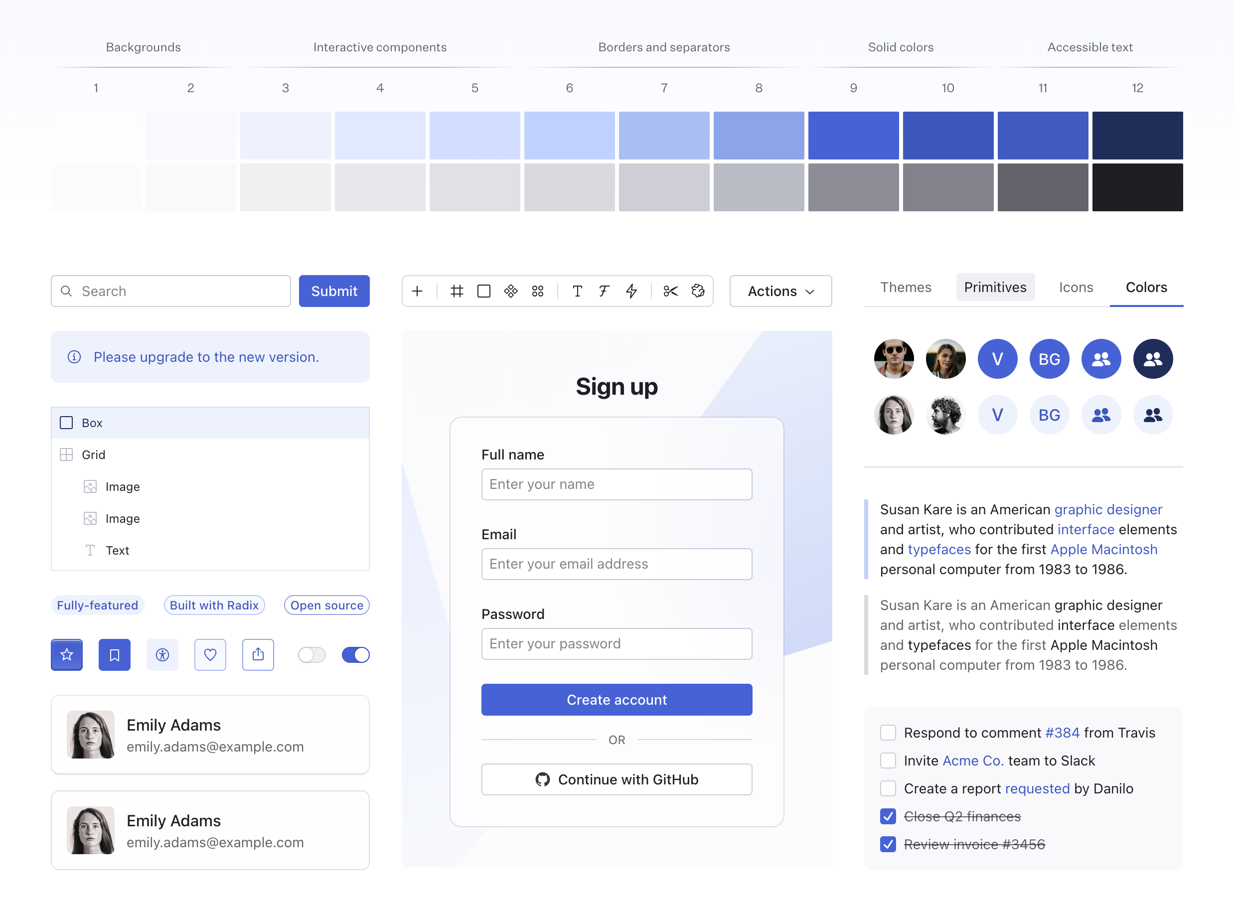
Each accent is a 12-step scale that includes a solid and a transparent variant of each color. For example, here’s the AccentColor::Indigo color scale:
TODO: visual
Accent Scale Tokens
Accent color tokens can be accessed using CSS variables. You can use these tokens to style your custom components, ensuring they are accessible and consistent with the rest of your theme.
/* Backgrounds */
var(--accent-1);
var(--accent-2);

/* Interactive components */
var(--accent-3);
var(--accent-4);
var(--accent-5);

/* Borders and separators */
var(--accent-6);
var(--accent-7);
var(--accent-8);

/* Solid colors */
var(--accent-9);
var(--accent-10);

/* Accessible text */
var(--accent-11);
var(--accent-12);

/* Functional colors */
var(--accent-surface);
var(--accent-indicator);
var(--accent-track);
var(--accent-contrast);
Grays
You can also choose between a pure gray or a number of tinted grays. Your accent color will be automatically paired with a gray shade that compliments it. However, you can also specify a custom gray_color directly on the Theme component:
use radix_yew_themes::{GrayColor, Theme};
use yew::prelude::*;

#[function_component]
pub fn GrayColorExample() -> Html {
    html! {
        <Theme gray_color={GrayColor::Mauve}>
            <MyApp />
        </Theme>
    }
}
Available Gray Colors
There is 6 grays to choose from. The difference may seem subtle, but it is impactful especially on pages with a lot of text or in dense UIs.
TODO: visual
Gray Scale Anatomy
Grays are based on the same 12-step color scale that includes a solid and a transparent variant of each color. For example, here’s the Gray::Slate color scale:
TODO: visual
Gray Scale Tokens
Gray color tokens can be accessed using CSS variables. You can use these tokens to style your custom components, ensuring they are accessible and consistent with the rest of your theme.
/* Backgrounds */
var(--gray-1);
var(--gray-2);

/* Interactive components */
var(--gray-3);
var(--gray-4);
var(--gray-5);

/* Borders and separators */
var(--gray-6);
var(--gray-7);
var(--gray-8);

/* Solid colors */
var(--gray-9);
var(--gray-10);

/* Accessible text */
var(--gray-11);
var(--gray-12);

/* Functional colors */
var(--gray-surface);
var(--gray-indicator);
var(--gray-track);
var(--gray-contrast);
Color Overrides
When available, the color prop on the components can be used to override the theme accent. Nested components will automatically inherit the new accent color.
TODO: example
Individual Color Tokens
Individual colors can be accessed directly using similar CSS variables by their corresponding names. For example, the reds are accessed via --red-1, --red-2, and so on up to --red-12.
High Contrast
Most of the time, components with a color prop also provide a high_contrast option that achieves appearance that stands out against the page background:
TODO: example
Focus and Selection
Radix Themes automatically adjusts the focus and selection colors depending on the accent color of the current component. Most of the time, setting the color prop will intelligently change the focus and selection colors to avoid a mismatch of conflicting hues:
TODO: example
Focus Scale Tokens
Focus color tokens can be accessed using CSS variables that follow a similar naming structure like the other scales, e.g. --focus-1, --focus-2, and so on up to --focus-12.
Most of the components use --focus-8 for the focus outline color.
Alpha Colors
Every color has an alpha variant which is designed to appear visually the same when placed over the page background. This is a powerful tool that allows colors to look naturally when overlayed over another background. All numerical color steps have a corresponding alpha variant.
/* Solid colors */
var(--red-1);
var(--red-2);
...
var(--red-12);

/* Alpha colors */
var(--red-a1);
var(--red-a2);
...
var(--red-a12);
Alpha colors are used automatically within Radix Themes components - no additional configuration is required.
Backgrounds
A number of background colors are used to create a sense of visual hierarchy in Radix Themes UIs. These colors are used for backgrounds, cards, and other surfaces.
/* Page background */
var(--color-background);

/* Panel backgrounds, such as cards, tables, popovers, dropdown menus, etc. */
var(--color-panel-solid);
var(--color-panel-translucent);

/* Form component backgrounds, such as text fields, checkboxes, select, etc. */
var(--color-surface);

/* Dialog overlays */
var(--color-overlay);
Panel Background
The panel_background prop controls whether panelled elements use a solid or a translucent background color. The default PanelBackground::Translucent value creates a subtle overlay effect:
use radix_yew_themes::{PanelBackground, Theme};
use yew::prelude::*;

#[function_component]
pub fn PanelBackgroundExample() -> Html {
    html! {
        <Theme panel_background={PanelBackground::Translucent}>
            <MyApp />
        </Theme>
    }
}
TODO: example
While PanelBackground::Solid is useful when you’d prefer to present information unobstructed.
use radix_yew_themes::{PanelBackground, Theme};
use yew::prelude::*;

#[function_component]
pub fn PanelBackgroundExample() -> Html {
    html! {
        <Theme panel_background={PanelBackground::Solid}>
            <MyApp />
        </Theme>
    }
}
TODO: example
Customization
Radix Themes colors can be customized by overriding the corresponding CSS variables of the token system. Refer to the source code for the full list of the color tokens.
Make sure that your CSS is applied after the Radix Themes styles so that it takes precedence.
Brand Color
You can replace a specific color with your brand color by remapping the corresponding token. Usually, you’d override step 9 of the scale that you are using as your theme accent.
.radix-themes {
    --my-brand-color: #3052f6;
    --indigo-9: var(--my-brand-color);
    --indigo-a9: var(--my-brand-color);
}
In this example, using solid-colored AccentColor::Indigo components will now reference your custom color.
Custom Palette
You can use the custom color palette tool to generate a custom palette based just on a couple reference colors. Once you are happy with the result, paste the generated CSS into your project. You can rename the generated colors to match the accent that you want to use in your theme.
To generate dark theme colors, toggle the appearance to use the dark theme. Make sure to paste the generated CSS after your light theme color overrides.
Color Aliasing
You may prefer to use generic color names to refer to the color shades that you want to use. For example, it is common to refer to AccentColor::Crimson, AccentColor::Jade, and AccentColor::Indigo as AccentColor::Red, AccentColor::Green, and AccentColor::Blue respectively.
In this case, you can remap Radix Themes tokens in place of one another and reclaim the color names you want to use:
.radix-themes {
    --red-1: var(--ruby-1);
    --red-2: var(--ruby-2);
    --red-3: var(--ruby-3);
    --red-4: var(--ruby-4);
    --red-5: var(--ruby-5);
    --red-6: var(--ruby-6);
    --red-7: var(--ruby-7);
    --red-8: var(--ruby-8);
    --red-9: var(--ruby-9);
    --red-10: var(--ruby-10);
    --red-11: var(--ruby-11);
    --red-12: var(--ruby-12);

    --red-a1: var(--ruby-a1);
    --red-a2: var(--ruby-a2);
    --red-a3: var(--ruby-a3);
    --red-a4: var(--ruby-a4);
    --red-a5: var(--ruby-a5);
    --red-a6: var(--ruby-a6);
    --red-a7: var(--ruby-a7);
    --red-a8: var(--ruby-a8);
    --red-a9: var(--ruby-a9);
    --red-a10: var(--ruby-a10);
    --red-a11: var(--ruby-a11);
    --red-a12: var(--ruby-a12);

    --red-surface: var(--ruby-surface);
    --red-indicator: var(--ruby-indicator);
    --red-track: var(--ruby-track);
    --red-contrast: var(--ruby-contrast);
}
In this example, using the AccentColor::Red color in Radix Themes components and tokens would now reference the original AccentColor::Ruby scale.
Individual CSS Files
Color definitions comprise around 20% of the total CSS size that Radix Themes ships with.
If you’d prefer to reduce your CSS bundle size and have access just to the colors you use, you can import the individual CSS files for each color module. Here’s a sample setup:
// Base theme tokens
@import "@radix-ui/themes/tokens/base.css";

// Include just the colors you use, for example `ruby`, `teal`, and `slate`.
// Remember to import the gray tint that matches your theme setting.
@import "@radix-ui/themes/tokens/colors/ruby.css";
@import "@radix-ui/themes/tokens/colors/teal.css";
@import "@radix-ui/themes/tokens/colors/slate.css";

// Rest of the CSS
@import "@radix-ui/themes/components.css";
@import "@radix-ui/themes/utilities.css";
Please note that the colors you didn’t import will still be accepted by the color prop in Rust. Also, make sure that your developer tooling preserves the order of the imported CSS files.
See Also
Dark Mode
Using appearance to manage and integrate dark mode.
Overview
Light and dark modes are supported out of the box, allowing you to easily switch appearance without additional design or styling.
TODO: example
Basic Usage
By default, the root Theme appearance is Appearance::Light. To set a different appearance pass it via the appearance prop. This will force the theme to use the specified setting.
use radix_yew_themes::{Appearance, Theme};
use yew::prelude::*;

#[function_component]
pub fn AppearanceExample() -> Html {
    html! {
        <Theme appearance={Appearance::Dark}>
            <MyApp />
        </Theme>
    }
}
Inheriting System Appearance
A common requirement is to inherit the appearance setting from a user’s system preferences.
This is a deceptively complex problem to solve given SSR, SSG and client side hydration considerations. To make implementation easier, we recommend integrating with a theme switching library.
With ?
TODO: recommend a library
With Other Libraries
Any library that supports class switching is compatible. You’ll just need to ensure that the appended class names match those supported by Radix Themes:
class="light"class="light-theme"class="dark"class="dark-theme"
See Also
Typography
Guidance for using and tuning typography.
Base Components
Use Text and Heading components to render titles and body copy. These components share size and weight props and map to the underlying type system to ensure consistent typography throughout your app.
TODO: example
Formatting Components
Compose formatting components to add emphasis, signal importance, present code and more.
TODO: example
Type Scale
The typographic system is based on a 9-step size scale. Every step has a corresponding font size, line height and letter spacing value which are all designed to be used in combination.
TODO: visual TODO: example
| Step | Size | Letter Spacing | Line Height |
|---|---|---|---|
1 | 12px | 0.0025em | 16px |
2 | 14px | 0em | 20px |
3 | 16px | 0em | 24px |
4 | 18px | -0.0025em | 26px |
5 | 20px | -0.005em | 28px |
6 | 24px | -0.00625em | 30px |
7 | 28px | -0.0075em | 36px |
8 | 35px | -0.01em | 40px |
9 | 60px | -0.025em | 60px |
Font Weight
The following weights are supported. Weights can be customized to map to your own typeface.
TODO: example
| Weight | Description | Default Value |
|---|---|---|
Weight::Light | Light | 300 |
Weight::Regular | Regular | 400 |
Weight::Medium | Medium | 500 |
Weight::Bold | Bold | 700 |
Font Family
By default, Radix Themes uses a system font stack for portability and legibility. Continue to the next section to learn about customizing your theme with a custom font.
| Type | Default value |
|---|---|
| Text | -apple-system, BlinkMacSystemFont, 'Segoe UI (Custom)', Roboto, 'Helvetica Neue', 'Open Sans (Custom)', system-ui, sans-serif, 'Apple Color Emoji', 'Segoe UI Emoji' |
| Code | 'Menlo', 'Consolas (Custom)', 'Bitstream Vera Sans Mono', monospace, 'Apple Color Emoji', 'Segoe UI Emoji' |
| Emphasis | 'Times New Roman', 'Times', serif |
| Quote | 'Times New Roman', 'Times', serif |
Customization
Radix Themes typography can be customized by overriding the corresponding CSS variables of the token system. Refer to the source code for the full list of the typographic tokens.
Make sure that your CSS is applied after the Radix Themes styles so that it takes precedence.
Custom Fonts
You can provide your own fonts, however, how you choose to import and serve them is up to you. It is only required that you specify your named fonts using the correct syntax.
To customize the font family used in your theme, remap the corresponding font-family tokens:
.radix-themes {
    --default-font-family: /* Your custom default font */ '';
    --heading-font-family: /* Your custom font for <Heading> components */ '';
    --code-font-family:  /* Your custom font for <Code> components */ '';
    --strong-font-family:  /* Your custom font for <Strong> components */ '';
    --em-font-family:  /* Your custom font for <Em> components */ '';
    --quote-font-family:  /* Your custom font for <Quote> components */ '';
}
Custom Font Weights
To customize the exact font weights used in your theme, remap the corresponding font-weight tokens to your own values:
.radix-themes {
    --font-weight-light: 200;
    --font-weight-regular: 300;
    --font-weight-medium: 600;
    --font-weight-bold: 800;
}
Advanced Settings
There’s a number of advanced typographic features that can be customized. These include a font size multiplier for certain components, font style, letter spacing, and leading trim. For example, you can customize the headings to render with a relatively larger font size than your default font, different leading trim values, and tighter letter spacing:
.radix-themes {
    --heading-font-family: 'Untitled Sans', sans-serif;
    --heading-font-size-adjust: 1.05;
    --heading-font-style: normal;
    --heading-leading-trim-start: 0.42em;
    --heading-leading-trim-end: 0.38em;
    --heading-letter-spacing: -0.01em;
}
See Also
Spacing
Overview of the space scale and scaling options.
Space scale
Spacing values are derived from a 9-step scale, which is used for props such as margin and padding. These props accept numeric values from 1 to 9, which correspond to the steps in the scale below.
TODO: visual
| Step | Base value |
|---|---|
1 | 4px |
2 | 8px |
3 | 12px |
4 | 16px |
5 | 24px |
6 | 32px |
7 | 40px |
8 | 48px |
9 | 64px |
Space Scale Tokens
Space scale tokens can be also accessed using CSS variables. You can use these tokens to style your custom components, ensuring they are consistent with the rest of your theme.
/* Space scale */
var(--space-1);
var(--space-2);
var(--space-3);
var(--space-4);
var(--space-5);
var(--space-6);
var(--space-7);
var(--space-8);
var(--space-9);
Scaling
Values which affect layout (spacing, font size, line height) scale relatively to each other based on the scaling value defined in your Theme. This setting allows you to scale the UI density uniformly across your entire application.
TODO: example
Scaling Factor
The scaling factor token can be accessed using the --scaling CSS variable. If you need to use different scaling factors in your app, you can use this token in your custom styles, ensuring they are consistent with the rest of your theme.
.MyCustomComponent {
    width: calc(200px * var(--scaling));
}
See Also
Breakpoints
Built-in breakpoints allow you to easily build adaptive layouts.
Available Sizes
Each breakpoint matches a fixed screen width. Values are min-width based and apply when the screen width is equal or greater.
| Size | Description | Width |
|---|---|---|
Breakpoint::Initial | Phones (portait) | 0px |
Breakpoint::Xs | Phones (landscape) | 520px |
Breakpoint::Sm | Tablets(portait) | 768px |
Breakpoint::Md | Tablets (landscape) | 1024px |
Breakpoint::Lg | Laptops | 1280px |
Breakpoint::Xl | Desktops | 1640px |
Usage
Most component size and layout props will accept an additional ResponsiveValues struct instance for modifying the given prop across breakpoints.
Each size maps to a corresponding key, the value of each will be applied when the screen size is greater than or equal to the named breakpoint.
use radix_yew_themes::{Breakpoint, Heading};
use yew::prelude::*;

#[function_component]
pub fn BreakpointsExample() -> Html {
    html! {
        <Heading
            size={ResponsiveValues::from([
                (Breakpoint::Initial, 3)
                (Breakpoint::Md, 5)
                (Breakpoint::Xl, 7)
            ])}
        />
    }
}
See Also
Radius
Choosing the right radius setting in your theme.
Theme Setting
Theme radius setting manages the radius factor applied to the components:
use radix_yew_themes::{Radius, Theme};
use yew::prelude::*;

#[function_component]
pub fn RadiusExample() -> Html {
    html! {
        <Theme radius={Radius::Dark}>
            <MyApp />
        </Theme>
    }
}| Radius | Description | Example |
|---|---|---|
Radius::None | None | TODO |
Radius::Small | Small | TODO |
Radius::Medium | Medium | TODO |
Radius::Large | Large | TODO |
Radius::Full | Full | TODO |
The resulting border-radius is contextual and differs depending on the component. For example, when set to Radius::Full, a Button becomes pill-shaped, while a Checkbox will never become fully rounded to prevent any confusion between it and a Radio.
TODO: example
Radius Overrides
Certain components allow you to override the radius factor using their own radius prop.
TODO: example
Components that render panels, like Card, Dialog, and Popover, among others, won’t have the radius prop, but will inherit the radius setting from the theme. The radius prop is also unavailable on most text-based components.
Radius Scale
Radius values used in the components are derived from a 6-step scale.
TODO: visual
While you can’t use a specific step on a particular component directly - the radius prop is used to set just the radius factor - you can use the radius scale to style your own components.
Radius tokens are accessed using CSS variables. You can use these tokens to style your custom components, ensuring they are consistent with the rest of your theme.
/* Radius values that automatically respond to the radius factor */
var(--radius-1);
var(--radius-2);
var(--radius-3);
var(--radius-4);
var(--radius-5);
var(--radius-6);

/* A multiplier that controls the theme radius */
var(--radius-factor);

/*
 * A variable used to calculate a fully rounded radius.
 * Usually used within a CSS `max()` function.
 */
var(--radius-full);

/*
 * A variable used to calculate radius of a thumb element.
 * Usually used within a CSS `max()` function.
 */
var(--radius-thumb);
See Also
Shadows
Understanding the shadow styles used in your theme.
Shadows used in the components are derived from a 6-step scale. Refer to the source code for the actual values used to achieve these shadows.
TODO: visual
Shadow Tokens
Shadow tokens can be accessed using CSS variables. You can use these tokens to style your custom components, ensuring they are consistent with the rest of your theme.
/* Inset shadow */
var(--shadow-1);

/* Shadows for variant="classic" panels, like Card */
var(--shadow-2);
var(--shadow-3);

/* Shadows for smaller overlay panels, like Hover Card and Popover */
var(--shadow-4);
var(--shadow-5);

/* Shadows for larger overlay panels, like Dialog */
var(--shadow-6);
See Also
Cursors
Customizing cursors used for interactive elements.
Default Cursors
By default, interactive elements that don\t link to another page use the regular arrow cursor. This also matches the browser defaults. However, disabled elements use an explicit disabled cursor.
TODO: example
Cursor Tokens
Cursor settings can be accessed using CSS variables. You can use these tokens to style your custom components, ensuring they are accessible and consistent with the rest of your theme.
/* Available cursor tokens */
var(--cursor-button);
var(--cursor-checkbox);
var(--cursor-disabled);
var(--cursor-link);
var(--cursor-menu-item);
var(--cursor-radio);
var(--cursor-slider-thumb);
var(--cursor-slider-thumb-active);
var(--cursor-switch);
Customization
It’s common to use a pointer cursor for interactive elements. Radix Themes cursors can be customized by overriding the corresponding CSS variables of the token system.
Here’s an example of how you can customize the cursor tokens to set cursor: pointer for most interactive elements in the theme:
.radix-themes {
    --cursor-button: pointer;
    --cursor-checkbox: pointer;
    --cursor-disabled: default;
    --cursor-link: pointer;
    --cursor-menu-item: pointer;
    --cursor-radio: pointer;
    --cursor-slider-thumb: grab;
    --cursor-slider-thumb-active: grabbing;
    --cursor-switch: pointer;
}
Make sure that your CSS is applied after the Radix Themes styles so that it takes precedence.
See Also
Layout
Box
Fundamental layout building block.
use radix_yew_themes::Box;
use yew::prelude::*;

use crate::decorative_box::DecorativeBox;

#[function_component]
pub fn BoxExample() -> Html {
    html! {
        <Box width="64px" height="64px">
            <DecorativeBox />
        </Box>
    }
}
API Reference
TODO
See Also
Flex
Component for creating flex layouts.
use radix_yew_themes::{Box, Flex};
use yew::prelude::*;

use crate::decorative_box::DecorativeBox;

#[function_component]
pub fn FlexExample() -> Html {
    html! {
        <Flex gap=3>
            <Box width="64px" height="64px">
                <DecorativeBox />
            </Box>
            <Box width="64px" height="64px">
                <DecorativeBox />
            </Box>
            <Box width="64px" height="64px">
                <DecorativeBox />
            </Box>
            <Box width="64px" height="64px">
                <DecorativeBox />
            </Box>
            <Box width="64px" height="64px">
                <DecorativeBox />
            </Box>
        </Flex>
    }
}
API Reference
TODO
See Also
Grid
Component for creating grid layouts.
use radix_yew_themes::Grid;
use yew::prelude::*;

use crate::decorative_box::DecorativeBox;

#[function_component]
pub fn GridExample() -> Html {
    html! {
        <Grid columns=3 gap=3 rows="repeat(2, 64px)" width="auto">
            <DecorativeBox />
            <DecorativeBox />
            <DecorativeBox />
            <DecorativeBox />
            <DecorativeBox />
            <DecorativeBox />
        </Grid>
    }
}
API Reference
TODO
Examples
Responsive
All props marked Responsive, such as columns and rows accept a breakpoint values. For example, the following grid starts with 1 column, and uses 2 columns from the medium breakpoint.
use radix_yew_themes::{Box, Breakpoint, Grid, ResponsiveValues};
use yew::prelude::*;

use crate::decorative_box::DecorativeBox;

#[function_component]
pub fn GridResponsiveExample() -> Html {
    html! {
        <Grid columns={ResponsiveValues::from([(Breakpoint::Initial, 1), (Breakpoint::Md, 2)])} gap=3 width="auto">
            <Box height="64px">
                <DecorativeBox />
            </Box>
            <Box height="64px">
                <DecorativeBox />
            </Box>
        </Grid>
    }
}
See Also
Container
Constrains the maximum width of page content.
use radix_yew_themes::{Box, Container};
use yew::prelude::*;

use crate::decorative_box::DecorativeBox;

#[function_component]
pub fn ContainerExample() -> Html {
    html! {
        <Box style={[("background", "var(--gray-a2)"), ("border-radius", "var(--radius-3)")]}>
            <Container size=1>
                <DecorativeBox>
                    <Box py=9 />
                </DecorativeBox>
            </Container>
        </Box>
    }
}
API Reference
TODO
See Also
Section
Denotes a section of page content.
use radix_yew_themes::{Box, Section};
use yew::prelude::*;

use crate::decorative_box::{DecorativeBox, DecorativeBoxChildProps};

#[function_component]
pub fn SectionExample() -> Html {
    html! {
        <Box py=8 style={[("background", "var(--gray-a2)"), ("border-radius", "var(--radius-3)")]}>
            <DecorativeBox
                as_child={Callback::from(|DecorativeBoxChildProps {height, style}| html! {
                    <Section size=2 height={height} style={style} />
                })}
            />
        </Box>
    }
}
API Reference
TODO
See Also
Typography
Text
Foundational text primitive.
use radix_yew_themes::Text;
use yew::prelude::*;

#[function_component]
pub fn TextExample() -> Html {
    html! {
        <Text>{"The quick brown fox jumps over the lazy dog."}</Text>
    }
}
API Reference
This component is based on the span element and supports common margin props.
| Prop | Type | Default |
|---|---|---|
as | TextAs | TextAs::Span |
as_child | Option<Callback<TextChildProps>> | - |
size | Option<Responsive<1..9>> | - |
weight | Option<Responsive<Weight>> | - |
align | Option<Responsive<TextAlign>> | - |
trim | Option<Responsive<LeadingTrim>> | - |
truncate | Option<bool> | - |
wrap | Option<Responsive<TextWrap>> | - |
color | Option<AccentColor> | - |
high_contrast | Option<bool> | - |
Examples
As Another Element
Use the as prop to render text as a p, label, div or span. This prop is purely semantic and does not alter visual appearance.
use radix_yew_themes::{Strong, Text, TextAs};
use yew::prelude::*;

#[function_component]
pub fn TextAsExample() -> Html {
    html! {
        <>
            <Text r#as={TextAs::P}>{"This is a "}<Strong>{"paragraph"}</Strong>{" element."}</Text>
            <Text r#as={TextAs::Label}>{"This is a "}<Strong>{"label"}</Strong>{" element."}</Text>
            <Text r#as={TextAs::Div}>{"This is a "}<Strong>{"div"}</Strong>{" element."}</Text>
            <Text r#as={TextAs::Span}>{"This is a "}<Strong>{"span"}</Strong>{" element."}</Text>
        </>
    }
}
Size
Use the size prop to control text size. This prop also provides correct line height and corrective letter spacing - as text size increases, the relative line height and letter spacing decrease.
use radix_yew_themes::{Flex, FlexDirection, Text};
use yew::prelude::*;

#[function_component]
pub fn TextSizeExample() -> Html {
    html! {
        <Flex direction={FlexDirection::Column} gap=3>
            <Text size=1>{"The quick brown fox jumps over the lazy dog."}</Text>
            <Text size=2>{"The quick brown fox jumps over the lazy dog."}</Text>
            <Text size=3>{"The quick brown fox jumps over the lazy dog."}</Text>
            <Text size=4>{"The quick brown fox jumps over the lazy dog."}</Text>
            <Text size=5>{"The quick brown fox jumps over the lazy dog."}</Text>
            <Text size=6>{"The quick brown fox jumps over the lazy dog."}</Text>
            <Text size=7>{"The quick brown fox jumps over the lazy dog."}</Text>
            <Text size=8>{"The quick brown fox jumps over the lazy dog."}</Text>
            <Text size=9>{"The quick brown fox jumps over the lazy dog."}</Text>
        </Flex>
    }
}
Sizes 2-4 are designed to work well for long-form content.
use radix_yew_themes::{AccentColor, Text, TextAs};
use yew::prelude::*;

#[function_component]
pub fn TextSizeContentExample() -> Html {
    html! {
        <>
            <Text r#as={TextAs::P} mb=5 size=4>
                {"The goal of typography is to relate font size, line height, and line width in a proportional way that maximizes beauty and makes reading easier and more pleasant. The question is: What proportion(s) will give us the best results? The golden ratio is often observed in nature where beauty and utility intersect; perhaps we can use this “divine” proportion to enhance these attributes in our typography."}
            </Text>

            <Text r#as={TextAs::P} mb=5 size=3>
                {"The goal of typography is to relate font size, line height, and line width in a proportional way that maximizes beauty and makes reading easier and more pleasant. The question is: What proportion(s) will give us the best results? The golden ratio is often observed in nature where beauty and utility intersect; perhaps we can use this “divine” proportion to enhance these attributes in our typography."}
            </Text>

            <Text r#as={TextAs::P} size=2 color={AccentColor::Gray}>
                {"The goal of typography is to relate font size, line height, and line width in a proportional way that maximizes beauty and makes reading easier and more pleasant. The question is: What proportion(s) will give us the best results? The golden ratio is often observed in nature where beauty and utility intersect; perhaps we can use this “divine” proportion to enhance these attributes in our typography."}
            </Text>
        </>
    }
}
Sizes 1-3 are designed to work well for UI labels.
use radix_yew_themes::{AccentColor, Flex, FlexDirection, Grid, GridAlign, Text, Weight};
use yew::prelude::*;

#[function_component]
pub fn TextSizeLabelsExample() -> Html {
    html! {
        <Grid align={GridAlign::Center} columns=2 gap=5 p=3>
            <Flex direction={FlexDirection::Column}>
                <Text size=3 weight={Weight::Bold}>
                    {"Get started"}
                </Text>
                <Text color={AccentColor::Gray} size=2>
                    {"Start your next project in minutes"}
                </Text>
            </Flex>

            <Flex direction={FlexDirection::Column}>
                <Text size=2 weight={Weight::Bold}>
                    {"Get started"}
                </Text>
                <Text color={AccentColor::Gray} size=1>
                    {"Start your next project in minutes"}
                </Text>
            </Flex>

            <Flex direction={FlexDirection::Column}>
                <Text size=1 weight={Weight::Bold}>
                    {"Get started"}
                </Text>
                <Text color={AccentColor::Gray} size=1>
                    {"Start your next project in minutes"}
                </Text>
            </Flex>
        </Grid>
    }
}
Weight
Use the weight prop to set the text weight.
use radix_yew_themes::{Text, TextAs, Weight};
use yew::prelude::*;

#[function_component]
pub fn TextWeightExample() -> Html {
    html! {
        <>
            <Text weight={Weight::Light} r#as={TextAs::Div} >
                {"The quick brown fox jumps over the lazy dog."}
            </Text>

            <Text weight={Weight::Regular} r#as={TextAs::Div} >
                {"The quick brown fox jumps over the lazy dog."}
            </Text>

            <Text weight={Weight::Medium} r#as={TextAs::Div} >
                {"The quick brown fox jumps over the lazy dog."}
            </Text>

            <Text weight={Weight::Bold} r#as={TextAs::Div} >
                {"The quick brown fox jumps over the lazy dog."}
            </Text>
        </>
    }
}
Align
Use the align prop to set text alignment.
use radix_yew_themes::{Text, TextAlign, TextAs};
use yew::prelude::*;

#[function_component]
pub fn TextAlignExample() -> Html {
    html! {
        <>
            <Text align={TextAlign::Left} r#as={TextAs::Div}>{"Left-aligned"}</Text>
            <Text align={TextAlign::Center} r#as={TextAs::Div}>{"Center-aligned"}</Text>
            <Text align={TextAlign::Right} r#as={TextAs::Div}>{"Right-aligned"}</Text>
        </>
    }
}
Trim
Use the trim prop to trim the leading space at the start, end, or both sides of the text box.
The prop works similarly to the upcoming half-leading control spec, but uses a common negative margin workaround under the hood for cross-browser support.
use radix_yew_themes::{Flex, FlexDirection, LeadingTrim, Text};
use yew::prelude::*;

#[function_component]
pub fn TextTrimExample() -> Html {
    html! {
        <Flex direction={FlexDirection::Column} gap=3>
            <Text
                trim={LeadingTrim::Normal}
                style={[
                    ("background", "var(--gray-a2)"),
                    ("border-top", "1px dashed var(--gray-a7)"),
                    ("border-bottom", "1px dashed var(--gray-a7)"),
                ]}
            >
                {"Without trim"}
            </Text>
            <Text
                trim={LeadingTrim::Both}
                style={[
                    ("background", "var(--gray-a2)"),
                    ("border-top", "1px dashed var(--gray-a7)"),
                    ("border-bottom", "1px dashed var(--gray-a7)"),
                ]}
            >
                {"With trim"}
            </Text>
        </Flex>
    }
}
Trimming the leading is useful when dialing in vertical spacing in cards or other “boxy” components. Otherwise, padding looks larger on top and bottom than on the sides.
use radix_yew_themes::{Box, Flex, FlexDirection, Heading, LeadingTrim, Text};
use yew::prelude::*;

#[function_component]
pub fn TextTrimBoxExample() -> Html {
    html! {
        <Flex direction={FlexDirection::Column} gap=3>
            <Box
                p=4
                style={[
                    ("background", "var(--gray-a2)"),
                    ("border", "1px dashed var(--gray-a7)"),
                ]}
            >
                <Heading mb=1 size=3>
                    {"Without trim"}
                </Heading>
                <Text>
                    {"The goal of typography is to relate font size, line height, and line width
                    in a proportional way that maximizes beauty and makes reading easier and
                    more pleasant."}
                </Text>
            </Box>

            <Box
                p=4
                style={[
                    ("background", "var(--gray-a2)"),
                    ("border", "1px dashed var(--gray-a7)"),
                ]}
            >
                <Heading mb=1 size=3 trim={LeadingTrim::Start}>
                    {"With trim"}
                </Heading>
                <Text trim={LeadingTrim::End}>
                    {"The goal of typography is to relate font size, line height, and line width
                    in a proportional way that maximizes beauty and makes reading easier and
                    more pleasant."}
                </Text>
            </Box>
        </Flex>
    }
}
The default trim values are configured for the system font stack that’s used by Radix Themes. If you are using custom fonts, you can adjust the trim values using the corresponding CSS variables.
.radix-themes {
    --default-leading-trim-start: 0.42em;
    --default-leading-trim-end: 0.36em;
    --heading-leading-trim-start: 0.42em;
    --heading-leading-trim-end: 0.36em;
}
Truncate
Use the truncate prop to truncate text with an ellipsis when it overflows its container.
use radix_yew_themes::{Flex, Text};
use yew::prelude::*;

#[function_component]
pub fn TextTruncateExample() -> Html {
    html! {
        <Flex max_width="300px">
            <Text truncate=true>
                {"The goal of typography is to relate font size, line height, and line width
                in a proportional way that maximizes beauty and makes reading easier and
                more pleasant."}
            </Text>
        </Flex>
    }
}
Wrap
Use the wrap prop to control text wrapping.
use radix_yew_themes::{Flex, FlexDirection, Text, TextWrap};
use yew::prelude::*;

#[function_component]
pub fn TextWrapExample() -> Html {
    html! {
        <Flex direction={FlexDirection::Column} gap=3>
            <Flex max_width="270px">
                <Text wrap={TextWrap::Nowrap}>
                    {"The goal of typography is to relate font size, line height, and line width
                    in a proportional way that maximizes beauty and makes reading easier and
                    more pleasant."}
                </Text>
            </Flex>

            <Flex max_width="270px">
                <Text wrap={TextWrap::Balance}>
                    {"The goal of typography is to relate font size, line height, and line width
                    in a proportional way that maximizes beauty and makes reading easier and
                    more pleasant."}
                </Text>
            </Flex>

            <Flex max_width="270px">
                <Text wrap={TextWrap::Pretty}>
                    {"The goal of typography is to relate font size, line height, and line width
                    in a proportional way that maximizes beauty and makes reading easier and
                    more pleasant."}
                </Text>
            </Flex>
        </Flex>
    }
}
text-wrap: pretty is an experimental value that is not yet supported in all browsers. However, it can be treated as a progressive enhancement for browsers that do support it.
Color
Use the color prop to assign a specific color. The text colors are designed to achieve at least Lc 60 APCA contrast over common background colors.
use radix_yew_themes::{AccentColor, Flex, FlexDirection, Text};
use yew::prelude::*;

#[function_component]
pub fn TextColorExample() -> Html {
    html! {
        <Flex direction={FlexDirection::Column}>
            <Text color={AccentColor::Indigo}>{"The quick brown fox jumps over the lazy dog."}</Text>
            <Text color={AccentColor::Cyan}>{"The quick brown fox jumps over the lazy dog."}</Text>
            <Text color={AccentColor::Orange}>{"The quick brown fox jumps over the lazy dog."}</Text>
            <Text color={AccentColor::Crimson}>{"The quick brown fox jumps over the lazy dog."}</Text>
        </Flex>
    }
}
High-Contrast
Use the high_contrast prop to increase color contrast with the background.
use radix_yew_themes::{AccentColor, Flex, FlexDirection, Text};
use yew::prelude::*;

#[function_component]
pub fn TextHighContrastExample() -> Html {
    html! {
        <Flex direction={FlexDirection::Column}>
            <Text color={AccentColor::Gray}>{"The quick brown fox jumps over the lazy dog."}</Text>
            <Text color={AccentColor::Gray} high_contrast=true>
                {"The quick brown fox jumps over the lazy dog."}
            </Text>
        </Flex>
    }
}
With Formatting
use radix_yew_themes::{Em, Kbd, Text, TextAs};
use yew::prelude::*;

// TODO

#[function_component]
pub fn TextFormattingExample() -> Html {
    html! {
        <Text r#as={TextAs::P}>
            {"Look, such a helpful "}/*<Link href="#">{"link"}</Link>*/{", an "}<Em>{"italic emphasis"}</Em>{",
            a piece of computer "}/*<Code>{"code"}</Code>*/{", and even a hotkey combination "}
            <Kbd>{"⇧⌘A"}</Kbd>{" within the text."}
        </Text>
    }
}
With Form Controls
Compose Text with formatting components to add emphasis and structure to content.
Composing Text with a form control like Checkbox, RadioGroup, or Switch automatically centers the control with the first line of text, even when the text is multi-line.
use radix_yew_themes::{Box, Flex, Text, TextAs};
use yew::prelude::*;

// TODO

#[function_component]
pub fn TextFormControlsExample() -> Html {
    html! {
        <>
            <Box max_width="300px">
                <Text r#as={TextAs::Label} size=3>
                    <Flex gap=2>
                        /*<Checkbox default_checked=true />*/{" I understand that these documents are
                        confidential and cannot be shared with a third party."}
                    </Flex>
                </Text>
            </Box>
        </>
    }
}
See Also
Heading
Semantic heading element.
use radix_yew_themes::Heading;
use yew::prelude::*;

#[function_component]
pub fn HeadingExample() -> Html {
    html! {
        <Heading>{"The quick brown fox jumps over the lazy dog"}</Heading>
    }
}
API Reference
This component is based on the h1 element and supports common margin props.
| Prop | Type | Default |
|---|---|---|
as | HeadingAs | HeadingAs::H1 |
as_child | Option<Callback<HeadingChildProps>> | - |
size | Responsive<1..9> | 6 |
weight | Option<Responsive<Weight>> | - |
align | Option<Responsive<TextAlign>> | - |
trim | Option<Responsive<LeadingTrim>> | - |
truncate | Option<bool> | - |
wrap | Option<Responsive<TextWrap>> | - |
color | Option<AccentColor> | - |
high_contrast | Option<bool> | - |
Examples
As Another Element
Use the as prop to change the heading level. This prop is purely semantic and does not change the visual appearance.
use radix_yew_themes::{Heading, HeadingAs};
use yew::prelude::*;

#[function_component]
pub fn HeadingAsExample() -> Html {
    html! {
        <>
            <Heading r#as={HeadingAs::H1}>{"Level 1"}</Heading>
            <Heading r#as={HeadingAs::H2}>{"Level 2"}</Heading>
            <Heading r#as={HeadingAs::H3}>{"Level 3"}</Heading>
        </>
    }
}
Size
Use the size prop to control the size of the heading. The prop also provides correct line height and corrective letter spacing - as text size increases, the relative line height and letter spacing decrease.
Heading sizes match Text sizes. However, the line heights are set a bit tighter as headings tend to be shorter than running text.
use radix_yew_themes::{Flex, FlexDirection, Heading};
use yew::prelude::*;

#[function_component]
pub fn HeadingSizeExample() -> Html {
    html! {
        <Flex direction={FlexDirection::Column} gap=3>
            <Heading size=1>{"The quick brown fox jumps over the lazy dog"}</Heading>
            <Heading size=2>{"The quick brown fox jumps over the lazy dog"}</Heading>
            <Heading size=3>{"The quick brown fox jumps over the lazy dog"}</Heading>
            <Heading size=4>{"The quick brown fox jumps over the lazy dog"}</Heading>
            <Heading size=5>{"The quick brown fox jumps over the lazy dog"}</Heading>
            <Heading size=6>{"The quick brown fox jumps over the lazy dog"}</Heading>
            <Heading size=7>{"The quick brown fox jumps over the lazy dog"}</Heading>
            <Heading size=8>{"The quick brown fox jumps over the lazy dog"}</Heading>
            <Heading size=9>{"The quick brown fox jumps over the lazy dog"}</Heading>
        </Flex>
    }
}
Weight
Use the weight prop to set the text weight.
use radix_yew_themes::{Heading, Weight};
use yew::prelude::*;

#[function_component]
pub fn HeadingWeightExample() -> Html {
    html! {
        <>
            <Heading weight={Weight::Light}>
                {"The quick brown fox jumps over the lazy dog."}
            </Heading>

            <Heading weight={Weight::Regular}>
                {"The quick brown fox jumps over the lazy dog."}
            </Heading>

            <Heading weight={Weight::Medium}>
                {"The quick brown fox jumps over the lazy dog."}
            </Heading>

            <Heading weight={Weight::Bold}>
                {"The quick brown fox jumps over the lazy dog."}
            </Heading>
        </>
    }
}
Align
Use the align prop to set text alignment.
use radix_yew_themes::{Heading, TextAlign};
use yew::prelude::*;

#[function_component]
pub fn HeadingAlignExample() -> Html {
    html! {
        <>
            <Heading align={TextAlign::Left}>{"Left-aligned"}</Heading>
            <Heading align={TextAlign::Center}>{"Center-aligned"}</Heading>
            <Heading align={TextAlign::Right}>{"Right-aligned"}</Heading>
        </>
    }
}
Trim
Use the trim prop to trim the leading space at the start, end, or both sides of the text box.
The prop works similarly to the upcoming half-leading control spec, but uses a common negative margin workaround under the hood for cross-browser support.
use radix_yew_themes::{Flex, FlexDirection, Heading, LeadingTrim};
use yew::prelude::*;

#[function_component]
pub fn HeadingTrimExample() -> Html {
    html! {
        <Flex direction={FlexDirection::Column} gap=3>
            <Heading
                trim={LeadingTrim::Normal}
                style={[
                    ("background", "var(--gray-a2)"),
                    ("border-top", "1px dashed var(--gray-a7)"),
                    ("border-bottom", "1px dashed var(--gray-a7)"),
                ]}
            >
                {"Without trim"}
            </Heading>
            <Heading
                trim={LeadingTrim::Both}
                style={[
                    ("background", "var(--gray-a2)"),
                    ("border-top", "1px dashed var(--gray-a7)"),
                    ("border-bottom", "1px dashed var(--gray-a7)"),
                ]}
            >
                {"With trim"}
            </Heading>
        </Flex>
    }
}
Trimming the leading is useful when dialing in vertical spacing in cards or other “boxy” components. Otherwise, padding looks larger on top and bottom than on the sides.
use radix_yew_themes::{Box, Flex, FlexDirection, Heading, LeadingTrim, Text};
use yew::prelude::*;

#[function_component]
pub fn HeadingTrimBoxExample() -> Html {
    html! {
        <Flex direction={FlexDirection::Column} gap=3>
            <Box
                p=4
                style={[
                    ("background", "var(--gray-a2)"),
                    ("border", "1px dashed var(--gray-a7)"),
                ]}
            >
                <Heading mb=1 size=3>
                    {"Without trim"}
                </Heading>
                <Text>
                    {"The goal of typography is to relate font size, line height, and line width
                    in a proportional way that maximizes beauty and makes reading easier and
                    more pleasant."}
                </Text>
            </Box>

            <Box
                p=4
                style={[
                    ("background", "var(--gray-a2)"),
                    ("border", "1px dashed var(--gray-a7)"),
                ]}
            >
                <Heading mb=1 size=3 trim={LeadingTrim::Start}>
                    {"With trim"}
                </Heading>
                <Text trim={LeadingTrim::End}>
                    {"The goal of typography is to relate font size, line height, and line width
                    in a proportional way that maximizes beauty and makes reading easier and
                    more pleasant."}
                </Text>
            </Box>
        </Flex>
    }
}
The default trim values are configured for the system font stack that’s used by Radix Themes. If you are using custom fonts, you can adjust the trim values using the corresponding CSS variables.
.radix-themes {
    --default-leading-trim-start: 0.42em;
    --default-leading-trim-end: 0.36em;
    --heading-leading-trim-start: 0.42em;
    --heading-leading-trim-end: 0.36em;
}
Truncate
Use the truncate prop to truncate text with an ellipsis when it overflows its container.
use radix_yew_themes::{Flex, Heading};
use yew::prelude::*;

#[function_component]
pub fn HeadingTruncateExample() -> Html {
    html! {
        <Flex max_width="300px">
            <Heading truncate=true>{"The quick brown fox jumps over the lazy dog"}</Heading>
        </Flex>
    }
}
Wrap
Use the wrap prop to control text wrapping.
use radix_yew_themes::{Flex, FlexDirection, Heading, TextWrap};
use yew::prelude::*;

#[function_component]
pub fn HeadingWrapExample() -> Html {
    html! {
        <Flex direction={FlexDirection::Column} gap=3>
            <Flex max_width="300px">
                <Heading wrap={TextWrap::Nowrap}>{"The quick brown fox jumps over the lazy dog"}</Heading>
            </Flex>

            <Flex max_width="300px">
                <Heading wrap={TextWrap::Balance}>{"The quick brown fox jumps over the lazy dog"}</Heading>
            </Flex>

            <Flex max_width="300px">
                <Heading wrap={TextWrap::Pretty}>{"The quick brown fox jumps over the lazy dog"}</Heading>
            </Flex>
        </Flex>
    }
}
text-wrap: pretty is an experimental value that is not yet supported in all browsers. However, it can be treated as a progressive enhancement for browsers that do support it.
Color
Use the color prop to assign a specific color. The text colors are designed to achieve at least Lc 60 APCA contrast over common background colors.
use radix_yew_themes::{AccentColor, Flex, FlexDirection, Heading};
use yew::prelude::*;

#[function_component]
pub fn HeadingColorExample() -> Html {
    html! {
        <Flex direction={FlexDirection::Column}>
            <Heading color={AccentColor::Indigo}>{"The quick brown fox jumps over the lazy dog"}</Heading>
            <Heading color={AccentColor::Cyan}>{"The quick brown fox jumps over the lazy dog"}</Heading>
            <Heading color={AccentColor::Orange}>{"The quick brown fox jumps over the lazy dog"}</Heading>
            <Heading color={AccentColor::Crimson}>{"The quick brown fox jumps over the lazy dog"}</Heading>
        </Flex>
    }
}
High-Contrast
Use the high_contrast prop to increase color contrast with the background.
use radix_yew_themes::{AccentColor, Flex, FlexDirection, Heading};
use yew::prelude::*;

#[function_component]
pub fn HeadingHighContrastExample() -> Html {
    html! {
        <Flex direction={FlexDirection::Column}>
            <Heading color={AccentColor::Gray}>{"The quick brown fox jumps over the lazy dog."}</Heading>
            <Heading color={AccentColor::Gray} high_contrast=true>
                {"The quick brown fox jumps over the lazy dog."}
            </Heading>
        </Flex>
    }
}
See Also
Blockquote
Block-level quotation from another source.
use radix_yew_themes::Blockquote;
use yew::prelude::*;

#[function_component]
pub fn BlockquoteExample() -> Html {
    html! {
        <Blockquote>
            {"Perfect typography is certainly the most elusive of all arts. Sculpture in
            stone alone comes near it in obstinacy."}
        </Blockquote>
    }
}
API Reference
This component is based on the blockquote element and supports common margin props.
| Prop | Type | Default |
|---|---|---|
as_child | Option<Callback<BlockquoteChildProps>> | - |
size | Option<Responsive<1..9>> | - |
weight | Option<Responsive<Weight>> | - |
color | Option<AccentColor> | - |
high_contrast | Option<bool> | - |
truncate | Option<bool> | - |
wrap | Option<Responsive<TextWrap>> | - |
Examples
Size
Use the size prop to control the size.
use radix_yew_themes::{Blockquote, Box, Flex, FlexDirection};
use yew::prelude::*;

#[function_component]
pub fn BlockquoteSizeExample() -> Html {
    html! {
        <Flex direction={FlexDirection::Column} gap=5>
            <Box max_width="300px">
                <Blockquote size=1>
                    {"Perfect typography is certainly the most elusive of all arts. Sculpture in
                    stone alone comes near it in obstinacy."}
                </Blockquote>
            </Box>
            <Box max_width="350px">
                <Blockquote size=2>
                    {"Perfect typography is certainly the most elusive of all arts. Sculpture in
                    stone alone comes near it in obstinacy."}
                </Blockquote>
            </Box>
            <Box max_width="400px">
                <Blockquote size=3>
                    {"Perfect typography is certainly the most elusive of all arts. Sculpture in
                    stone alone comes near it in obstinacy."}
                </Blockquote>
            </Box>
            <Box max_width="450px">
                <Blockquote size=4>
                    {"Perfect typography is certainly the most elusive of all arts. Sculpture in
                    stone alone comes near it in obstinacy."}
                </Blockquote>
            </Box>
            <Box max_width="500px">
                <Blockquote size=5>
                    {"Perfect typography is certainly the most elusive of all arts. Sculpture in
                    stone alone comes near it in obstinacy."}
                </Blockquote>
            </Box>
            <Box max_width="550px">
                <Blockquote size=6>
                    {"Perfect typography is certainly the most elusive of all arts. Sculpture in
                    stone alone comes near it in obstinacy."}
                </Blockquote>
            </Box>
            <Box max_width="600px">
                <Blockquote size=7>
                    {"Perfect typography is certainly the most elusive of all arts. Sculpture in
                    stone alone comes near it in obstinacy."}
                </Blockquote>
            </Box>
            <Box max_width="650px">
                <Blockquote size=8>
                    {"Perfect typography is certainly the most elusive of all arts. Sculpture in
                    stone alone comes near it in obstinacy."}
                </Blockquote>
            </Box>
            <Box max_width="1000px">
                <Blockquote size=9>
                    {"Perfect typography is certainly the most elusive of all arts. Sculpture in
                    stone alone comes near it in obstinacy."}
                </Blockquote>
            </Box>
        </Flex>
    }
}
Weight
Use the weight prop to set the text weight.
use radix_yew_themes::{Blockquote, Flex, FlexDirection, Weight};
use yew::prelude::*;

#[function_component]
pub fn BlockquoteWeightExample() -> Html {
    html! {
        <Flex direction={FlexDirection::Column} gap=3 max_width="500px">
            <Blockquote weight={Weight::Light}>
                {"Perfect typography is certainly the most elusive of all arts. Sculpture in
                stone alone comes near it in obstinacy."}
            </Blockquote>

            <Blockquote weight={Weight::Regular}>
                {"Perfect typography is certainly the most elusive of all arts. Sculpture in
                stone alone comes near it in obstinacy."}
            </Blockquote>

            <Blockquote weight={Weight::Medium}>
                {"Perfect typography is certainly the most elusive of all arts. Sculpture in
                stone alone comes near it in obstinacy."}
            </Blockquote>

            <Blockquote weight={Weight::Bold}>
                {"Perfect typography is certainly the most elusive of all arts. Sculpture in
                stone alone comes near it in obstinacy."}
            </Blockquote>
        </Flex>
    }
}
Color
Use the color prop to assign a specific color.
use radix_yew_themes::{AccentColor, Blockquote, Flex, FlexDirection};
use yew::prelude::*;

#[function_component]
pub fn BlockquoteColorExample() -> Html {
    html! {
        <Flex direction={FlexDirection::Column} gap=3 max_width="500px">
            <Blockquote color={AccentColor::Indigo}>
                {"Perfect typography is certainly the most elusive of all arts. Sculpture in
                stone alone comes near it in obstinacy."}
            </Blockquote>

            <Blockquote color={AccentColor::Cyan}>
                {"Perfect typography is certainly the most elusive of all arts. Sculpture in
                stone alone comes near it in obstinacy."}
            </Blockquote>

            <Blockquote color={AccentColor::Orange}>
                {"Perfect typography is certainly the most elusive of all arts. Sculpture in
                stone alone comes near it in obstinacy."}
            </Blockquote>

            <Blockquote color={AccentColor::Crimson}>
                {"Perfect typography is certainly the most elusive of all arts. Sculpture in
                stone alone comes near it in obstinacy."}
            </Blockquote>
        </Flex>
    }
}
High-Contrast
Use the high_contrast prop to increase color contrast with the background.
use radix_yew_themes::{AccentColor, Blockquote, Flex, FlexDirection};
use yew::prelude::*;

#[function_component]
pub fn BlockquoteHighContrastExample() -> Html {
    html! {
        <Flex direction={FlexDirection::Column} gap=3 max_width="500px">
            <Blockquote color={AccentColor::Gray}>
                {"Perfect typography is certainly the most elusive of all arts. Sculpture in
                stone alone comes near it in obstinacy."}
            </Blockquote>
            <Blockquote color={AccentColor::Gray} high_contrast=true>
                {"Perfect typography is certainly the most elusive of all arts. Sculpture in
                stone alone comes near it in obstinacy."}
            </Blockquote>
        </Flex>
    }
}
Truncate
Use the truncate prop to truncate text with an ellipsis when it overflows its container.
use radix_yew_themes::{Blockquote, Flex};
use yew::prelude::*;

#[function_component]
pub fn BlockquoteTruncateExample() -> Html {
    html! {
        <Flex max_width="500px">
            <Blockquote truncate=true>
                {"Perfect typography is certainly the most elusive of all arts. Sculpture in
                stone alone comes near it in obstinacy."}
            </Blockquote>
        </Flex>
    }
}
See Also
Code
Marks text to signify a short fragment of computer code.
use radix_yew_themes::Code;
use yew::prelude::*;

#[function_component]
pub fn CodeExample() -> Html {
    html! {
        <Code>{"console.log()"}</Code>
    }
}
API Reference
This component is based on the code element and supports common margin props.
| Prop | Type | Default |
|---|---|---|
as_child | Option<Callback<CodeChildProps>> | - |
size | Option<Responsive<1..9>> | - |
variant | CodeVariant | CodeVariant::Soft |
weight | Option<Responsive<Weight>> | - |
color | Option<AccentColor> | - |
high_contrast | Option<bool> | - |
truncate | Option<bool> | - |
wrap | Option<Responsive<TextWrap>> | - |
Examples
Size
Use the size prop to control text size. This prop also provides correct line height and corrective letter spacing - as text size increases, the relative line height and letter spacing decrease.
use radix_yew_themes::{Code, Flex, FlexAlign, FlexDirection};
use yew::prelude::*;

#[function_component]
pub fn CodeSizeExample() -> Html {
    html! {
        <Flex direction={FlexDirection::Column} gap=3 align={FlexAlign::Start}>
            <Code size=1>{"console.log()"}</Code>
            <Code size=2>{"console.log()"}</Code>
            <Code size=3>{"console.log()"}</Code>
            <Code size=4>{"console.log()"}</Code>
            <Code size=5>{"console.log()"}</Code>
            <Code size=6>{"console.log()"}</Code>
            <Code size=7>{"console.log()"}</Code>
            <Code size=8>{"console.log()"}</Code>
            <Code size=9>{"console.log()"}</Code>
        </Flex>
    }
}
Variant
Use the variant prop to control the visual style.
use radix_yew_themes::{Code, CodeVariant, Flex, FlexAlign, FlexDirection};
use yew::prelude::*;

#[function_component]
pub fn CodeVariantExample() -> Html {
    html! {
        <Flex direction={FlexDirection::Column} align={FlexAlign::Start} gap=2>
            <Code variant={CodeVariant::Solid}>{"console.log()"}</Code>
            <Code variant={CodeVariant::Soft}>{"console.log()"}</Code>
            <Code variant={CodeVariant::Outline}>{"console.log()"}</Code>
            <Code variant={CodeVariant::Ghost}>{"console.log()"}</Code>
        </Flex>
    }
}
Color
Use the color prop to assign a specific color.
use radix_yew_themes::{AccentColor, Code, Flex, FlexAlign, FlexDirection};
use yew::prelude::*;

#[function_component]
pub fn CodeColorExample() -> Html {
    html! {
        <Flex direction={FlexDirection::Column} align={FlexAlign::Start} gap=2>
            <Code color={AccentColor::Indigo}>{"console.log()"}</Code>
            <Code color={AccentColor::Crimson}>{"console.log()"}</Code>
            <Code color={AccentColor::Cyan}>{"console.log()"}</Code>
            <Code color={AccentColor::Orange}>{"console.log()"}</Code>
        </Flex>
    }
}
High-Contrast
Use the high_contrast prop to increase color contrast with the background.
use radix_yew_themes::{AccentColor, Code, CodeVariant, Flex, FlexAlign, FlexDirection};
use yew::prelude::*;

#[function_component]
pub fn CodeHighContrastExample() -> Html {
    html! {
        <Flex gap=3>
            <Flex direction={FlexDirection::Column} align={FlexAlign::Start} gap=2>
                <Code color={AccentColor::Gray} variant={CodeVariant::Solid}>
                    {"console.log()"}
                </Code>
                <Code color={AccentColor::Gray} variant={CodeVariant::Soft}>
                    {"console.log()"}
                </Code>
                <Code color={AccentColor::Gray} variant={CodeVariant::Outline}>
                    {"console.log()"}
                </Code>
                <Code color={AccentColor::Gray} variant={CodeVariant::Ghost}>
                    {"console.log()"}
                </Code>
            </Flex>

            <Flex direction={FlexDirection::Column} align={FlexAlign::Start} gap=2>
                <Code color={AccentColor::Gray} variant={CodeVariant::Solid} high_contrast=true>
                    {"console.log()"}
                </Code>
                <Code color={AccentColor::Gray} variant={CodeVariant::Soft} high_contrast=true>
                    {"console.log()"}
                </Code>
                <Code color={AccentColor::Gray} variant={CodeVariant::Outline} high_contrast=true>
                    {"console.log()"}
                </Code>
                <Code color={AccentColor::Gray} variant={CodeVariant::Ghost} high_contrast=true>
                    {"console.log()"}
                </Code>
            </Flex>
        </Flex>
    }
}
Weight
Use the weight prop to set the text weight.
use radix_yew_themes::{Code, Flex, FlexAlign, FlexDirection, Weight};
use yew::prelude::*;

#[function_component]
pub fn CodeWeightExample() -> Html {
    html! {
        <Flex direction={FlexDirection::Column} gap=2 align={FlexAlign::Start}>
            <Code weight={Weight::Light}>{"console.log()"}</Code>
            <Code weight={Weight::Regular}>{"console.log()"}</Code>
            <Code weight={Weight::Medium}>{"console.log()"}</Code>
            <Code weight={Weight::Bold}>{"console.log()"}</Code>
        </Flex>
    }
}
Truncate
Use the truncate prop to truncate text with an ellipsis when it overflows its container.
use radix_yew_themes::{Code, Flex};
use yew::prelude::*;

#[function_component]
pub fn CodeTruncateExample() -> Html {
    html! {
        <Flex max_width="200px">
            <Code truncate=true>{"linear-gradient(red, orange, yellow, green, blue);"}</Code>
        </Flex>
    }
}
See Also
Em
Marks text to stress emphasis.
use radix_yew_themes::{Em, Text};
use yew::prelude::*;

#[function_component]
pub fn EmExample() -> Html {
    html! {
        <Text>
            {"We "}<Em>{"had"}</Em>{" to do something about it."}
        </Text>
    }
}
API Reference
This component is based on the em element and supports common margin props.
| Prop | Type | Default |
|---|---|---|
as_child | Option<Callback<EmChildProps>> | - |
truncate | Option<bool> | - |
wrap | Option<Responsive<TextWrap>> | - |
Examples
Truncate
Use the truncate prop to truncate text with an ellipsis when it overflows its container.
use radix_yew_themes::{Em, Flex};
use yew::prelude::*;

#[function_component]
pub fn EmTruncateExample() -> Html {
    html! {
        <Flex max_width="300px">
            <Em truncate=true>
                {"The goal of typography is to relate font size, line height, and line width
                in a proportional way that maximizes beauty and makes reading easier and
                more pleasant."}
            </Em>
        </Flex>
    }
}
See Also
Kbd
Represents keyboard input or a hotkey.
use radix_yew_themes::Kbd;
use yew::prelude::*;

#[function_component]
pub fn KbdExample() -> Html {
    html! {
        <Kbd>{"Shift + Tab"}</Kbd>
    }
}
API Reference
This component is based on the kbd element and supports common margin props.
| Prop | Type | Default |
|---|---|---|
as_child | Option<Callback<KbdChildProps>> | - |
size | Option<Responsive<1..9>> | - |
Examples
Size
Use the size prop to control text size.
use radix_yew_themes::{Flex, FlexAlign, FlexDirection, Kbd};
use yew::prelude::*;

#[function_component]
pub fn KbdSizeExample() -> Html {
    html! {
        <Flex direction={FlexDirection::Column} align={FlexAlign::Start} gap=3>
            <Kbd size=1>{"Shift + Tab"}</Kbd>
            <Kbd size=2>{"Shift + Tab"}</Kbd>
            <Kbd size=3>{"Shift + Tab"}</Kbd>
            <Kbd size=4>{"Shift + Tab"}</Kbd>
            <Kbd size=5>{"Shift + Tab"}</Kbd>
            <Kbd size=6>{"Shift + Tab"}</Kbd>
            <Kbd size=7>{"Shift + Tab"}</Kbd>
            <Kbd size=8>{"Shift + Tab"}</Kbd>
            <Kbd size=9>{"Shift + Tab"}</Kbd>
        </Flex>
    }
}
See Also
Link
Semantic element for navigation between pages.
use radix_yew_themes::Link;
use yew::prelude::*;

#[function_component]
pub fn LinkExample() -> Html {
    html! {
        <Link href="#">{"Sign up"}</Link>
    }
}
API Reference
This component is based on the a element and supports common margin props.
| Prop | Type | Default |
|---|---|---|
as_child | Option<Callback<LinkChildProps>> | - |
size | Option<Responsive<1..9>> | - |
weight | Option<Responsive<Weight>> | - |
trim | Option<Responsive<LeadingTrim>> | - |
truncate | Option<bool> | - |
wrap | Option<Responsive<TextWrap>> | - |
underline | LinkUnderline | LinkUnderline::Auto |
color | Option<AccentColor> | - |
high_contrast | Option<bool> | - |
Examples
Size
Use the size prop to control the size of the link. The prop also provides correct line height and corrective letter spacing - as text size increases, the relative line height and letter spacing decrease.
use radix_yew_themes::{Flex, FlexDirection, Link};
use yew::prelude::*;

#[function_component]
pub fn LinkSizeExample() -> Html {
    html! {
        <Flex direction={FlexDirection::Column} gap=3>
            <Link href="#" size=1>
                {"Sign up"}
            </Link>
            <Link href="#" size=2>
                {"Sign up"}
            </Link>
            <Link href="#" size=3>
                {"Sign up"}
            </Link>
            <Link href="#" size=4>
                {"Sign up"}
            </Link>
            <Link href="#" size=5>
                {"Sign up"}
            </Link>
            <Link href="#" size=6>
                {"Sign up"}
            </Link>
            <Link href="#" size=7>
                {"Sign up"}
            </Link>
            <Link href="#" size=8>
                {"Sign up"}
            </Link>
            <Link href="#" size=9>
                {"Sign up"}
            </Link>
        </Flex>
    }
}
Weight
Use the weight prop to set the text weight.
use radix_yew_themes::{Flex, FlexDirection, Link, Weight};
use yew::prelude::*;

#[function_component]
pub fn LinkWeightExample() -> Html {
    html! {
        <Flex direction={FlexDirection::Column}>
            <Link href="#" weight={Weight::Light}>
                {"Sign up"}
            </Link>
            <Link href="#" weight={Weight::Regular}>
                {"Sign up"}
            </Link>
            <Link href="#" weight={Weight::Medium}>
                {"Sign up"}
            </Link>
            <Link href="#" weight={Weight::Bold}>
                {"Sign up"}
            </Link>
        </Flex>
    }
}
Truncate
Use the truncate prop to truncate text with an ellipsis when it overflows its container.
use radix_yew_themes::{Flex, Link};
use yew::prelude::*;

#[function_component]
pub fn LinkTruncateExample() -> Html {
    html! {
        <Flex max_width="150px">
            <Link href="#" truncate=true>
                {"Sign up to the newsletter"}
            </Link>
        </Flex>
    }
}
Color
Use the color prop to assign a specific color.
use radix_yew_themes::{AccentColor, Flex, FlexDirection, Link};
use yew::prelude::*;

#[function_component]
pub fn LinkColorExample() -> Html {
    html! {
        <Flex direction={FlexDirection::Column}>
            <Link href="#" color={AccentColor::Indigo}>
                {"Sign up"}
            </Link>
            <Link href="#" color={AccentColor::Cyan}>
                {"Sign up"}
            </Link>
            <Link href="#" color={AccentColor::Orange}>
                {"Sign up"}
            </Link>
            <Link href="#" color={AccentColor::Crimson}>
                {"Sign up"}
            </Link>
        </Flex>
    }
}
High-Contrast
Use the high_contrast prop to increase color contrast with the background.
use radix_yew_themes::{AccentColor, Flex, FlexDirection, Link};
use yew::prelude::*;

#[function_component]
pub fn LinkHighContrastExample() -> Html {
    html! {
        <Flex direction={FlexDirection::Column}>
            <Link color={AccentColor::Gray}>
                {"Sign up."}
            </Link>
            <Link href="#" color={AccentColor::Gray} high_contrast=true>
                {"Sign up"}
            </Link>
        </Flex>
    }
}
Underline
Use the underline prop to manage the visibility of the underline affordance.
use radix_yew_themes::{Flex, FlexDirection, Link, LinkUnderline};
use yew::prelude::*;

#[function_component]
pub fn LinkUnderlineExample() -> Html {
    html! {
        <Flex direction={FlexDirection::Column}>
            <Link href="#" underline={LinkUnderline::Hover}>
                {"Sign up"}
            </Link>
            <Link href="#" underline={LinkUnderline::Always}>
                {"Sign up"}
            </Link>
        </Flex>
    }
}
See Also
Quote
Short inline quotation.
use radix_yew_themes::{Quote, Text};
use yew::prelude::*;

#[function_component]
pub fn QuoteExample() -> Html {
    html! {
        <Text>
            {"His famous quote, "}
            <Quote>{"Styles come and go. Good design is a language, not a style"}</Quote>{",
            elegantly summs up Massimo's philosophy of design."}
        </Text>
    }
}
API Reference
This component is based on the q element and supports common margin props.
| Prop | Type | Default |
|---|---|---|
as_child | Option<Callback<QuoteChildProps>> | - |
truncate | Option<bool> | - |
wrap | Option<Responsive<TextWrap>> | - |
Examples
Truncate
Use the truncate prop to truncate text with an ellipsis when it overflows its container.
use radix_yew_themes::{Flex, Quote};
use yew::prelude::*;

#[function_component]
pub fn QuoteTruncateExample() -> Html {
    html! {
        <Flex max_width="300px">
            <Quote truncate=true>
                {"The goal of typography is to relate font size, line height, and line width
                in a proportional way that maximizes beauty and makes reading easier and
                more pleasant."}
            </Quote>
        </Flex>
    }
}
See Also
Strong
Marks text to signify strong importance.
use radix_yew_themes::{Strong, Text};
use yew::prelude::*;

#[function_component]
pub fn StrongExample() -> Html {
    html! {
        <Text>
            {"The most important thing to remember is, "}<Strong>{"stay positive"}</Strong>{"."}
        </Text>
    }
}
API Reference
This component is based on the strong element and supports common margin props.
| Prop | Type | Default |
|---|---|---|
as_child | Option<Callback<StrongChildProps>> | - |
truncate | Option<bool> | - |
wrap | Option<Responsive<TextWrap>> | - |
Examples
Truncate
Use the truncate prop to truncate text with an ellipsis when it overflows its container.
use radix_yew_themes::{Flex, Strong};
use yew::prelude::*;

#[function_component]
pub fn StrongTruncateExample() -> Html {
    html! {
        <Flex max_width="300px">
            <Strong truncate=true>
                {"The goal of typography is to relate font size, line height, and line width
                in a proportional way that maximizes beauty and makes reading easier and
                more pleasant."}
            </Strong>
        </Flex>
    }
}
See Also
Components
- Aspect Ratio
- Avatar
- Badge
- Button
- Callout
- Card
- Checkbox
- Data List
- Icon Button
- Inset
- Radio
- Select
- Separator
- Skeleton
- Spinner
- Switch
- Table
- Text Area
- Text Field
- Tooltip
Aspect Ratio
Displays content within a desired ratio.
use radix_yew_themes::AspectRatio;
use yew::prelude::*;
use yew_style::Style;

#[function_component]
pub fn AspectRatioExample() -> Html {
    html! {
        <AspectRatio ratio={16.0 / 8.0}>
            <img
                src="https://images.unsplash.com/photo-1479030160180-b1860951d696?&auto=format&fit=crop&w=1200&q=80"
                alt="A house in a forest"
                style={Style::from([
                    ("object-fit", "cover",),
                    ("width", "100%"),
                    ("height", "100%"),
                    ("border-radius", "var(--radius-2)"),
                ])}
            />
        </AspectRatio>
    }
}
API Reference
This component inherits props from the Aspect Ratio primitive.
Avatar
Profile picture, user initials or fallback icon.
use radix_yew_themes::{Avatar, Flex};
use yew::prelude::*;

#[function_component]
pub fn AvatarExample() -> Html {
    html! {
        <Flex gap=2>
            <Avatar
                src="https://images.unsplash.com/photo-1502823403499-6ccfcf4fb453?&w=256&h=256&q=70&crop=focalpoint&fp-x=0.5&fp-y=0.3&fp-z=1&fit=crop"
                fallback="A"
            />
            <Avatar fallback="A" />
        </Flex>
    }
}
API Reference
This component inherits props from the Avatar primitive.
| Prop | Type | Default |
|---|---|---|
as_child | Option<Callback<AvatarChildProps>> | - |
size | Responsive<1..9> | 3 |
variant | AvatarVariant | AvatarVariant::Soft |
color | Option<AccentColor> | - |
high_contrast | Option<bool> | - |
radius | Option<Radius> | - |
fallback | Html | - |
Examples
Size
Use the size prop to control the size of the avatar.
use radix_yew_themes::{Avatar, Flex, FlexAlign};
use yew::prelude::*;

#[function_component]
pub fn AvatarSizeExample() -> Html {
    html! {
        <Flex align={FlexAlign::Center} gap=4>
            <Avatar
                size=1
                src="https://images.unsplash.com/photo-1502823403499-6ccfcf4fb453?&w=256&h=256&q=70&crop=focalpoint&fp-x=0.5&fp-y=0.3&fp-z=1&fit=crop"
                fallback="A"
            />
            <Avatar
                size=2
                src="https://images.unsplash.com/photo-1502823403499-6ccfcf4fb453?&w=256&h=256&q=70&crop=focalpoint&fp-x=0.5&fp-y=0.3&fp-z=1&fit=crop"
                fallback="A"
            />
            <Avatar
                size=3
                src="https://images.unsplash.com/photo-1502823403499-6ccfcf4fb453?&w=256&h=256&q=70&crop=focalpoint&fp-x=0.5&fp-y=0.3&fp-z=1&fit=crop"
                fallback="A"
            />
            <Avatar
                size=4
                src="https://images.unsplash.com/photo-1502823403499-6ccfcf4fb453?&w=256&h=256&q=70&crop=focalpoint&fp-x=0.5&fp-y=0.3&fp-z=1&fit=crop"
                fallback="A"
            />
            <Avatar
                size=5
                src="https://images.unsplash.com/photo-1502823403499-6ccfcf4fb453?&w=256&h=256&q=70&crop=focalpoint&fp-x=0.5&fp-y=0.3&fp-z=1&fit=crop"
                fallback="A"
            />
            <Avatar
                size=6
                src="https://images.unsplash.com/photo-1502823403499-6ccfcf4fb453?&w=256&h=256&q=70&crop=focalpoint&fp-x=0.5&fp-y=0.3&fp-z=1&fit=crop"
                fallback="A"
            />
            <Avatar
                size=7
                src="https://images.unsplash.com/photo-1502823403499-6ccfcf4fb453?&w=256&h=256&q=70&crop=focalpoint&fp-x=0.5&fp-y=0.3&fp-z=1&fit=crop"
                fallback="A"
            />
            <Avatar
                size=8
                src="https://images.unsplash.com/photo-1502823403499-6ccfcf4fb453?&w=256&h=256&q=70&crop=focalpoint&fp-x=0.5&fp-y=0.3&fp-z=1&fit=crop"
                fallback="A"
            />
            <Avatar
                size=9
                src="https://images.unsplash.com/photo-1502823403499-6ccfcf4fb453?&w=256&h=256&q=70&crop=focalpoint&fp-x=0.5&fp-y=0.3&fp-z=1&fit=crop"
                fallback="A"
            />
        </Flex>
    }
}
Variant
Use the variant prop to control the visual style of the avatar.
use radix_yew_themes::{Avatar, AvatarVariant, Flex};
use yew::prelude::*;

#[function_component]
pub fn AvatarVariantExample() -> Html {
    html! {
        <Flex gap=2>
            <Avatar variant={AvatarVariant::Solid} fallback="A" />
            <Avatar variant={AvatarVariant::Soft} fallback="A" />
        </Flex>
    }
}
Color
Use the color prop to assign a specific color.
use radix_yew_themes::{AccentColor, Avatar, AvatarVariant, Flex};
use yew::prelude::*;

#[function_component]
pub fn AvatarColorExample() -> Html {
    html! {
        <Flex gap=2>
            <Avatar variant={AvatarVariant::Solid} color={AccentColor::Indigo} fallback="A" />
            <Avatar variant={AvatarVariant::Solid} color={AccentColor::Cyan} fallback="A" />
            <Avatar variant={AvatarVariant::Solid} color={AccentColor::Orange} fallback="A" />
            <Avatar variant={AvatarVariant::Solid} color={AccentColor::Crimson} fallback="A" />
        </Flex>
    }
}
High-Contrast
Use the high_contrast prop to increase color contrast with the background.
use radix_yew_themes::{AccentColor, Avatar, AvatarVariant, Grid, GridDisplay, GridFlow};
use yew::prelude::*;

#[function_component]
pub fn AvatarHighContrastExample() -> Html {
    html! {
        <Grid rows=2 gap=2 display={GridDisplay::InlineGrid} flow={GridFlow::Column}>
            <Avatar variant={AvatarVariant::Solid} color={AccentColor::Indigo} fallback="A" />
            <Avatar variant={AvatarVariant::Solid} color={AccentColor::Indigo} fallback="A" high_contrast=true />
            <Avatar variant={AvatarVariant::Solid} color={AccentColor::Cyan} fallback="A" />
            <Avatar variant={AvatarVariant::Solid} color={AccentColor::Cyan} fallback="A" high_contrast=true />
            <Avatar variant={AvatarVariant::Solid} color={AccentColor::Orange} fallback="A" />
            <Avatar variant={AvatarVariant::Solid} color={AccentColor::Orange} fallback="A" high_contrast=true />
            <Avatar variant={AvatarVariant::Solid} color={AccentColor::Crimson} fallback="A" />
            <Avatar variant={AvatarVariant::Solid} color={AccentColor::Crimson} fallback="A" high_contrast=true />
            <Avatar variant={AvatarVariant::Solid} color={AccentColor::Gray} fallback="A" />
            <Avatar variant={AvatarVariant::Solid} color={AccentColor::Gray} fallback="A" high_contrast=true />
        </Grid>
    }
}
Radius
Use the radius prop to assign a specific radius value.
use radix_yew_themes::{Avatar, Flex, Radius};
use yew::prelude::*;

#[function_component]
pub fn AvatarRadiusExample() -> Html {
    html! {
        <Flex gap=2>
            <Avatar radius={Radius::None} fallback="A" />
            <Avatar radius={Radius::Large} fallback="A" />
            <Avatar radius={Radius::Full} fallback="A" />
        </Flex>
    }
}
Fallback
Use the fallback prop to modify the rendered fallback element.
use radix_yew_themes::{Avatar, Box, Flex};
use yew::prelude::*;

#[function_component]
pub fn AvatarFallbackExample() -> Html {
    html! {
        <Flex gap=2>
            <Avatar fallback="A" />
            <Avatar fallback="AB" />
            <Avatar
                fallback={html! {
                    <Box width="24px" height="24px">
                        <svg viewBox="0 0 64 64" fill="currentColor">
                            <path d="M41.5 14c4.687 0 8.5 4.038 8.5 9s-3.813 9-8.5 9S33 27.962 33 23 36.813 14 41.5 14zM56.289 43.609C57.254 46.21 55.3 49 52.506 49c-2.759 0-11.035 0-11.035 0 .689-5.371-4.525-10.747-8.541-13.03 2.388-1.171 5.149-1.834 8.07-1.834C48.044 34.136 54.187 37.944 56.289 43.609zM37.289 46.609C38.254 49.21 36.3 52 33.506 52c-5.753 0-17.259 0-23.012 0-2.782 0-4.753-2.779-3.783-5.392 2.102-5.665 8.245-9.472 15.289-9.472S35.187 40.944 37.289 46.609zM21.5 17c4.687 0 8.5 4.038 8.5 9s-3.813 9-8.5 9S13 30.962 13 26 16.813 17 21.5 17z" />
                        </svg>
                    </Box>
                }}
            />
        </Flex>
    }
}
See Also
Badge
Stylized badge element.
use radix_yew_themes::{AccentColor, Badge, Flex};
use yew::prelude::*;

#[function_component]
pub fn BadgeExample() -> Html {
    html! {
        <Flex gap=2>
            <Badge color={AccentColor::Orange}>{"In progress"}</Badge>
            <Badge color={AccentColor::Blue}>{"In review"}</Badge>
            <Badge color={AccentColor::Green}>{"Complete"}</Badge>
        </Flex>
    }
}
API Reference
This component is based on the span element and supports common margin props.
| Prop | Type | Default |
|---|---|---|
as_child | Option<Callback<BadgeChildProps>> | - |
size | Responsive<1..3> | 1 |
variant | BadgeVariant | BadgeVariant::Soft |
color | Option<AccentColor> | - |
high_contrast | Option<bool> | - |
radius | Option<Radius> | - |
Examples
Size
Use the size prop to control the size.
use radix_yew_themes::{AccentColor, Badge, Flex, FlexAlign};
use yew::prelude::*;

#[function_component]
pub fn BadgeSizeExample() -> Html {
    html! {
        <Flex align={FlexAlign::Center} gap=2>
            <Badge size=1 color={AccentColor::Indigo}>
                {"New"}
            </Badge>
            <Badge size=2 color={AccentColor::Indigo}>
                {"New"}
            </Badge>
            <Badge size=3 color={AccentColor::Indigo}>
                {"New"}
            </Badge>
        </Flex>
    }
}
Variant
Use the variant prop to control the visual style.
use radix_yew_themes::{AccentColor, Badge, BadgeVariant, Flex};
use yew::prelude::*;

#[function_component]
pub fn BadgeVariantExample() -> Html {
    html! {
        <Flex gap=2>
            <Badge variant={BadgeVariant::Solid} color={AccentColor::Indigo}>
                {"New"}
            </Badge>
            <Badge variant={BadgeVariant::Soft} color={AccentColor::Indigo}>
                {"New"}
            </Badge>
            <Badge variant={BadgeVariant::Surface} color={AccentColor::Indigo}>
                {"New"}
            </Badge>
            <Badge variant={BadgeVariant::Outline} color={AccentColor::Indigo}>
                {"New"}
            </Badge>
        </Flex>
    }
}
Color
Use the color prop to assign a specific color.
use radix_yew_themes::{AccentColor, Badge, Flex};
use yew::prelude::*;

#[function_component]
pub fn BadgeColorExample() -> Html {
    html! {
        <Flex gap=2>
            <Badge color={AccentColor::Indigo}>{"New"}</Badge>
            <Badge color={AccentColor::Cyan}>{"New"}</Badge>
            <Badge color={AccentColor::Orange}>{"New"}</Badge>
            <Badge color={AccentColor::Crimson}>{"New"}</Badge>
        </Flex>
    }
}
High-Contrast
Use the high_contrast prop to increase color contrast with the background.
use radix_yew_themes::{AccentColor, Badge, BadgeVariant, Flex, FlexDirection};
use yew::prelude::*;

#[function_component]
pub fn BadgeHighContrastExample() -> Html {
    html! {
        <Flex direction={FlexDirection::Column} gap=2>
            <Flex gap=2>
                <Badge color={AccentColor::Gray} variant={BadgeVariant::Solid}>
                    {"New"}
                </Badge>
                <Badge color={AccentColor::Gray} variant={BadgeVariant::Soft}>
                    {"New"}
                </Badge>
                <Badge color={AccentColor::Gray} variant={BadgeVariant::Surface}>
                    {"New"}
                </Badge>
                <Badge color={AccentColor::Gray} variant={BadgeVariant::Outline}>
                    {"New"}
                </Badge>
            </Flex>
            <Flex gap=2>
                <Badge color={AccentColor::Gray} variant={BadgeVariant::Solid} high_contrast=true>
                    {"New"}
                </Badge>
                <Badge color={AccentColor::Gray} variant={BadgeVariant::Soft} high_contrast=true>
                    {"New"}
                </Badge>
                <Badge color={AccentColor::Gray} variant={BadgeVariant::Surface} high_contrast=true>
                    {"New"}
                </Badge>
                <Badge color={AccentColor::Gray} variant={BadgeVariant::Outline} high_contrast=true>
                    {"New"}
                </Badge>
            </Flex>
        </Flex>
    }
}
Radius
Use the radius prop to assign a specific radius value.
use radix_yew_themes::{AccentColor, Badge, BadgeVariant, Flex, Radius};
use yew::prelude::*;

#[function_component]
pub fn BadgeRadiusExample() -> Html {
    html! {
        <Flex gap=2>
            <Badge variant={BadgeVariant::Solid} radius={Radius::None} color={AccentColor::Indigo}>
                {"New"}
            </Badge>
            <Badge variant={BadgeVariant::Solid} radius={Radius::Small} color={AccentColor::Indigo}>
                {"New"}
            </Badge>
            <Badge variant={BadgeVariant::Solid} radius={Radius::Medium} color={AccentColor::Indigo}>
                {"New"}
            </Badge>
            <Badge variant={BadgeVariant::Solid} radius={Radius::Large} color={AccentColor::Indigo}>
                {"New"}
            </Badge>
            <Badge variant={BadgeVariant::Solid} radius={Radius::Full} color={AccentColor::Indigo}>
                {"New"}
            </Badge>
        </Flex>
    }
}
See Also
Button
Trigger an action or event, such as submitting a form or displaying a dialog.
use radix_yew_icons::BookmarkIcon;
use radix_yew_themes::Button;
use yew::prelude::*;

#[function_component]
pub fn ButtonExample() -> Html {
    html! {
        <Button>
            <BookmarkIcon /> {"Bookmark"}
        </Button>
    }
}
API Reference
This component is based on the button element and supports common margin props.
| Prop | Type | Default |
|---|---|---|
as_child | Option<Callback<ButtonChildProps>> | - |
size | Responsive<1..4> | 2 |
variant | ButtonVariant | ButtonVariant::Solid |
color | Option<AccentColor> | - |
high_contrast | Option<bool> | - |
radius | Option<Radius> | - |
loading | bool | false |
Examples
Size
Use the size prop to control the size of the button.
use radix_yew_themes::{Button, ButtonVariant, Flex, FlexAlign};
use yew::prelude::*;

#[function_component]
pub fn ButtonSizeExample() -> Html {
    html! {
        <Flex gap=3 align={FlexAlign::Center}>
            <Button size=1 variant={ButtonVariant::Soft}>
                {"Edit profile"}
            </Button>
            <Button size=2 variant={ButtonVariant::Soft}>
                {"Edit profile"}
            </Button>
            <Button size=3 variant={ButtonVariant::Soft}>
                {"Edit profile"}
            </Button>
        </Flex>
    }
}
Variant
Use the variant prop to control the visual style of the button.
use radix_yew_themes::{Button, ButtonVariant, Flex, FlexAlign};
use yew::prelude::*;

#[function_component]
pub fn ButtonVariantExample() -> Html {
    html! {
        <Flex align={FlexAlign::Center} gap=3>
            <Button variant={ButtonVariant::Classic}>{"Edit profile"}</Button>
            <Button variant={ButtonVariant::Solid}>{"Edit profile"}</Button>
            <Button variant={ButtonVariant::Soft}>{"Edit profile"}</Button>
            <Button variant={ButtonVariant::Surface}>{"Edit profile"}</Button>
            <Button variant={ButtonVariant::Outline}>{"Edit profile"}</Button>
        </Flex>
    }
}
Ghost
Use the ghost variant to display a button without chrome. Ghost buttons behave like text in layout, as they use a negative margin to optically align themselves against their siblings while maintaining the padding in active and hover states.
use radix_yew_themes::{Button, ButtonVariant};
use yew::prelude::*;

#[function_component]
pub fn ButtonVariantGhostExample() -> Html {
    html! {
        <Button variant={ButtonVariant::Ghost}>{"Edit profile"}</Button>
    }
}
Color
Use the color prop to assign a specific color.
use radix_yew_themes::{AccentColor, Button, ButtonVariant, Flex};
use yew::prelude::*;

#[function_component]
pub fn ButtonColorExample() -> Html {
    html! {
        <Flex gap=3>
            <Button color={AccentColor::Indigo} variant={ButtonVariant::Soft}>
                {"Edit profile"}
            </Button>
            <Button color={AccentColor::Cyan} variant={ButtonVariant::Soft}>
                {"Edit profile"}
            </Button>
            <Button color={AccentColor::Orange} variant={ButtonVariant::Soft}>
                {"Edit profile"}
            </Button>
            <Button color={AccentColor::Crimson} variant={ButtonVariant::Soft}>
                {"Edit profile"}
            </Button>
        </Flex>
    }
}
High-Contrast
Use the high_contrast prop to increase color contrast with the background.
use radix_yew_themes::{AccentColor, Button, ButtonVariant, Flex, FlexDirection};
use yew::prelude::*;

#[function_component]
pub fn ButtonHighContrastExample() -> Html {
    html! {
        <Flex direction={FlexDirection::Column} gap=3>
            <Flex gap=3>
                <Button color={AccentColor::Gray} variant={ButtonVariant::Classic}>
                    {"Edit profile"}
                </Button>
                <Button color={AccentColor::Gray} variant={ButtonVariant::Solid}>
                    {"Edit profile"}
                </Button>
                <Button color={AccentColor::Gray} variant={ButtonVariant::Soft}>
                    {"Edit profile"}
                </Button>
                <Button color={AccentColor::Gray} variant={ButtonVariant::Surface}>
                    {"Edit profile"}
                </Button>
                <Button color={AccentColor::Gray} variant={ButtonVariant::Outline}>
                    {"Edit profile"}
                </Button>
            </Flex>
            <Flex gap=3>
                <Button color={AccentColor::Gray} variant={ButtonVariant::Classic} high_contrast=true>
                    {"Edit profile"}
                </Button>
                <Button color={AccentColor::Gray} variant={ButtonVariant::Solid} high_contrast=true>
                    {"Edit profile"}
                </Button>
                <Button color={AccentColor::Gray} variant={ButtonVariant::Soft} high_contrast=true>
                    {"Edit profile"}
                </Button>
                <Button color={AccentColor::Gray} variant={ButtonVariant::Surface} high_contrast=true>
                    {"Edit profile"}
                </Button>
                <Button color={AccentColor::Gray} variant={ButtonVariant::Outline} high_contrast=true>
                    {"Edit profile"}
                </Button>
            </Flex>
        </Flex>
    }
}
Radius
Use the radius prop to assign a specific radius value.
use radix_yew_themes::{Button, ButtonVariant, Flex, Radius};
use yew::prelude::*;

#[function_component]
pub fn ButtonRadiusExample() -> Html {
    html! {
        <Flex gap=3>
            <Button radius={Radius::None} variant={ButtonVariant::Soft}>
                {"Edit profile"}
            </Button>
            <Button radius={Radius::Small} variant={ButtonVariant::Soft}>
                {"Edit profile"}
            </Button>
            <Button radius={Radius::Medium} variant={ButtonVariant::Soft}>
                {"Edit profile"}
            </Button>
            <Button radius={Radius::Large} variant={ButtonVariant::Soft}>
                {"Edit profile"}
            </Button>
            <Button radius={Radius::Full} variant={ButtonVariant::Soft}>
                {"Edit profile"}
            </Button>
        </Flex>
    }
}
With Icons
You can nest icons directly inside the button. An appropriate gap is provided automatically.
use radix_yew_icons::BookmarkIcon;
use radix_yew_themes::{Button, ButtonVariant, Flex};
use yew::prelude::*;

#[function_component]
pub fn ButtonWithIconsExample() -> Html {
    html! {
        <Flex gap=3>
            <Button variant={ButtonVariant::Classic}>
                <BookmarkIcon /> {"Bookmark"}
            </Button>
            <Button variant={ButtonVariant::Solid}>
                <BookmarkIcon /> {"Bookmark"}
            </Button>
            <Button variant={ButtonVariant::Soft}>
                <BookmarkIcon /> {"Bookmark"}
            </Button>
            <Button variant={ButtonVariant::Surface}>
                <BookmarkIcon /> {"Bookmark"}
            </Button>
            <Button variant={ButtonVariant::Outline}>
                <BookmarkIcon /> {"Bookmark"}
            </Button>
        </Flex>
    }
}
Loading
Use the loading prop to display a loading spinner in place of button content, preserving the original size of the button in its normal state. The button will be disabled while loading.
use radix_yew_themes::{Button, ButtonVariant, Flex};
use yew::prelude::*;

#[function_component]
pub fn ButtonLoadingExample() -> Html {
    html! {
        <Flex gap=3>
            <Button loading=true variant={ButtonVariant::Classic}>
                {"Bookmark"}
            </Button>
            <Button loading=true variant={ButtonVariant::Solid}>
                {"Bookmark"}
            </Button>
            <Button loading=true variant={ButtonVariant::Soft}>
                {"Bookmark"}
            </Button>
            <Button loading=true variant={ButtonVariant::Surface}>
                {"Bookmark"}
            </Button>
            <Button loading=true variant={ButtonVariant::Outline}>
                {"Bookmark"}
            </Button>
        </Flex>
    }
}
If you have an icon inside the button, you can use the button’s disabled state and wrap the icon in a standalone Spinner to achieve a more sophisticated design.
use radix_yew_icons::BookmarkIcon;
use radix_yew_themes::{Button, ButtonVariant, Flex, Spinner};
use yew::prelude::*;

#[function_component]
pub fn ButtonLoadingSpinnerExample() -> Html {
    html! {
        <Flex gap=3>
            <Button disabled=true variant={ButtonVariant::Classic}>
                <Spinner loading=true>
                    <BookmarkIcon />
                </Spinner>
                {"Bookmark"}
            </Button>
            <Button disabled=true variant={ButtonVariant::Solid}>
                <Spinner loading=true>
                    <BookmarkIcon />
                </Spinner>
                {"Bookmark"}
            </Button>
            <Button disabled=true variant={ButtonVariant::Soft}>
                <Spinner loading=true>
                    <BookmarkIcon />
                </Spinner>
                {"Bookmark"}
            </Button>
            <Button disabled=true variant={ButtonVariant::Surface}>
                <Spinner loading=true>
                    <BookmarkIcon />
                </Spinner>
                {"Bookmark"}
            </Button>
            <Button disabled=true variant={ButtonVariant::Outline}>
                <Spinner loading=true>
                    <BookmarkIcon />
                </Spinner>
                {"Bookmark"}
            </Button>
        </Flex>
    }
}
See Also
Callout
Short message to attract user’s attention.
use radix_yew_icons::InfoCircledIcon;
use radix_yew_themes::{Callout, CalloutIcon, CalloutText};
use yew::prelude::*;

#[function_component]
pub fn CalloutExample() -> Html {
    html! {
        <Callout>
            <CalloutIcon>
                <InfoCircledIcon />
            </CalloutIcon>
            <CalloutText>
                {"You will need admin privileges to install and access this application."}
            </CalloutText>
        </Callout>
    }
}
API Reference
Root
Groups Icon and Text parts. This component is based on the div element and supports common margin props.
| Prop | Type | Default |
|---|---|---|
as_child | Option<Callback<CalloutChildProps>> | - |
size | Responsive<1..3> | 1 |
variant | CalloutVariant | CalloutVariant::Soft |
color | Option<AccentColor> | - |
high_contrast | Option<bool> | - |
Icon
Provides width and height for the icon associated with the callout. This component is based on the div element.
Text
Renders the callout text. This component is based on the p element.
Examples
Size
Use the size prop to control the size.
use radix_yew_icons::InfoCircledIcon;
use radix_yew_themes::{Callout, CalloutIcon, CalloutText, Flex, FlexAlign, FlexDirection};
use yew::prelude::*;

#[function_component]
pub fn CalloutSizeExample() -> Html {
    html! {
        <Flex direction={FlexDirection::Column} gap=3 align={FlexAlign::Start}>
            <Callout size=1>
                <CalloutIcon>
                    <InfoCircledIcon />
                </CalloutIcon>
                <CalloutText>
                    {"You will need admin privileges to install and access this application."}
                </CalloutText>
            </Callout>

            <Callout size=2>
                <CalloutIcon>
                    <InfoCircledIcon />
                </CalloutIcon>
                <CalloutText>
                    {"You will need admin privileges to install and access this application."}
                </CalloutText>
            </Callout>

            <Callout size=3>
                <CalloutIcon>
                    <InfoCircledIcon />
                </CalloutIcon>
                <CalloutText>
                    {"You will need admin privileges to install and access this application."}
                </CalloutText>
            </Callout>
        </Flex>
    }
}
Variant
Use the variant prop to control the visual style.
use radix_yew_icons::InfoCircledIcon;
use radix_yew_themes::{
    Callout, CalloutIcon, CalloutText, CalloutVariant, Flex, FlexDirection, Link,
};
use yew::prelude::*;

#[function_component]
pub fn CalloutVariantExample() -> Html {
    html! {
        <Flex direction={FlexDirection::Column} gap=3>
            <Callout variant={CalloutVariant::Soft}>
                <CalloutIcon>
                    <InfoCircledIcon />
                </CalloutIcon>
                <CalloutText>
                    {"You will need "}<Link href="#">{"admin privileges"}</Link>{" to install and access
                    this application."}
                </CalloutText>
            </Callout>

            <Callout variant={CalloutVariant::Surface}>
                <CalloutIcon>
                    <InfoCircledIcon />
                </CalloutIcon>
                <CalloutText>
                    {"You will need "}<Link href="#">{"admin privileges"}</Link>{" to install and access
                    this application."}
                </CalloutText>
            </Callout>

            <Callout variant={CalloutVariant::Outline}>
                <CalloutIcon>
                    <InfoCircledIcon />
                </CalloutIcon>
                <CalloutText>
                    {"You will need "}<Link href="#">{"admin privileges"}</Link>{" to install and access
                    this application."}
                </CalloutText>
            </Callout>
        </Flex>
    }
}
Color
Use the color prop to assign a specific color.
use radix_yew_icons::InfoCircledIcon;
use radix_yew_themes::{AccentColor, Callout, CalloutIcon, CalloutText, Flex, FlexDirection, Link};
use yew::prelude::*;

#[function_component]
pub fn CalloutColorExample() -> Html {
    html! {
        <Flex direction={FlexDirection::Column} gap=3>
            <Callout color={AccentColor::Blue}>
                <CalloutIcon>
                    <InfoCircledIcon />
                </CalloutIcon>
                <CalloutText>
                    {"You will need "}<Link href="#">{"admin privileges"}</Link>{" to install and access
                    this application."}
                </CalloutText>
            </Callout>

            <Callout color={AccentColor::Green}>
                <CalloutIcon>
                    <InfoCircledIcon />
                </CalloutIcon>
                <CalloutText>
                    {"You will need "}<Link href="#">{"admin privileges"}</Link>{" to install and access
                    this application."}
                </CalloutText>
            </Callout>

            <Callout color={AccentColor::Red}>
                <CalloutIcon>
                    <InfoCircledIcon />
                </CalloutIcon>
                <CalloutText>
                    {"You will need "}<Link href="#">{"admin privileges"}</Link>{" to install and access
                    this application."}
                </CalloutText>
            </Callout>
        </Flex>
    }
}
High-Contrast
Use the high_contrast prop to increase color contrast.
use radix_yew_icons::InfoCircledIcon;
use radix_yew_themes::{
    AccentColor, Callout, CalloutIcon, CalloutText, CalloutVariant, Flex, FlexDirection,
};
use yew::prelude::*;

#[function_component]
pub fn CalloutHighContrastExample() -> Html {
    html! {
        <Flex direction={FlexDirection::Column} gap=3>
            <Callout color={AccentColor::Gray} variant={CalloutVariant::Soft}>
                <CalloutIcon>
                    <InfoCircledIcon />
                </CalloutIcon>
                <CalloutText>
                    {"An update to Radix Themes is available. See what's new in version 3.2.0."}
                </CalloutText>
            </Callout>

            <Callout color={AccentColor::Gray} variant={CalloutVariant::Soft} high_contrast=true>
                <CalloutIcon>
                    <InfoCircledIcon />
                </CalloutIcon>
                <CalloutText>
                    {"An update to Radix Themes is available. See what's new in version 3.2.0."}
                </CalloutText>
            </Callout>
        </Flex>
    }
}
As Alert
Add a native WAI-ARIA alert role to the callout when the user’s immediate attention is required, like when an error message appears. The screen reader will be interrupted, announcing the new content immediately.
use radix_yew_icons::ExclamationTriangleIcon;
use radix_yew_themes::{AccentColor, Callout, CalloutIcon, CalloutText};
use yew::prelude::*;

#[function_component]
pub fn CalloutAsAlertExample() -> Html {
    html! {
        <Callout color={AccentColor::Red} role="alert">
            <CalloutIcon>
                <ExclamationTriangleIcon />
            </CalloutIcon>
            <CalloutText>
                {"Access denied. Please contact the network administrator to view this page."}
            </CalloutText>
        </Callout>
    }
}
See Also
Card
Container that groups related content and actions.
use radix_yew_themes::{
    AccentColor, Avatar, Box, Card, Flex, FlexAlign, Radius, Text, TextAs, Weight,
};
use yew::prelude::*;

#[function_component]
pub fn CardExample() -> Html {
    html! {
        <Box max_width="240px">
            <Card>
                <Flex gap=3 align={FlexAlign::Center}>
                    <Avatar
                        size=3
                        src="https://images.unsplash.com/photo-1607346256330-dee7af15f7c5?&w=64&h=64&dpr=2&q=70&crop=focalpoint&fp-x=0.67&fp-y=0.5&fp-z=1.4&fit=crop"
                        radius={Radius::Full}
                        fallback="T"
                    />
                    <Box>
                        <Text r#as={TextAs::Div} size=2 weight={Weight::Bold}>
                            {"Teodros Girmay"}
                        </Text>
                        <Text r#as={TextAs::Div} size=2 color={AccentColor::Gray}>
                            {"Engineering"}
                        </Text>
                    </Box>
                </Flex>
            </Card>
        </Box>
    }
}
API Reference
This component is based on the div element and supports common margin props.
| Prop | Type | Default |
|---|---|---|
as_child | Option<Callback<CardChildProps>> | - |
size | Responsive<1..5> | 1 |
variant | CardVariant | CardVariant::Surface |
Examples
As Another Element
Use the as_child prop to render the card as a link or a button. This prop adds styles for the interactive states, like hover and focus.
use radix_yew_themes::{AccentColor, Box, Card, CardChildProps, Text, TextAs, Weight};
use yew::prelude::*;

#[function_component]
pub fn CardAsAnotherElementExample() -> Html {
    html! {
        <Box max_width="350px">
            <Card
                as_child={Callback::from(|CardChildProps { class, style, .. }| html! {
                    <a
                        class={class}
                        style={style}

                        href="#"
                    >
                        <Text r#as={TextAs::Div} size=2 weight={Weight::Bold}>
                            {"Quick start"}
                        </Text>
                        <Text r#as={TextAs::Div} color={AccentColor::Gray} size=2>
                            {"Start building your next project in minutes"}
                        </Text>
                    </a>
                })}
            />
        </Box>
    }
}
Size
Use the size prop to control the size.
use radix_yew_themes::{
    AccentColor, Avatar, Box, Card, Flex, FlexAlign, FlexDirection, Radius, Text, TextAs, Weight,
};
use yew::prelude::*;

#[function_component]
pub fn CardSizeExample() -> Html {
    html! {
        <Flex gap=3 direction={FlexDirection::Column}>
            <Box width="350px">
                <Card size=1>
                    <Flex gap=3 align={FlexAlign::Center}>
                        <Avatar size=3 radius={Radius::Full} fallback="T" color={AccentColor::Indigo} />
                        <Box>
                            <Text r#as={TextAs::Div} size=2 weight={Weight::Bold}>
                                {"Teodros Girmay"}
                            </Text>
                            <Text r#as={TextAs::Div} size=2 color={AccentColor::Gray}>
                                {"Engineering"}
                            </Text>
                        </Box>
                    </Flex>
                </Card>
            </Box>

            <Box width="400px">
                <Card size=2>
                    <Flex gap=4 align={FlexAlign::Center}>
                        <Avatar size=4 radius={Radius::Full} fallback="T" color={AccentColor::Indigo} />
                        <Box>
                            <Text r#as={TextAs::Div} weight={Weight::Bold}>
                                {"Teodros Girmay"}
                            </Text>
                            <Text r#as={TextAs::Div} color={AccentColor::Gray}>
                                {"Engineering"}
                            </Text>
                        </Box>
                    </Flex>
                </Card>
            </Box>

            <Box width="500px">
                <Card size=3>
                    <Flex gap=4 align={FlexAlign::Center}>
                        <Avatar size=5 radius={Radius::Full} fallback="T" color={AccentColor::Indigo} />
                        <Box>
                            <Text r#as={TextAs::Div} size=4 weight={Weight::Bold}>
                                {"Teodros Girmay"}
                            </Text>
                            <Text r#as={TextAs::Div} size=4 color={AccentColor::Gray}>
                                {"Engineering"}
                            </Text>
                        </Box>
                    </Flex>
                </Card>
            </Box>
        </Flex>
    }
}
Variant
Use the variant prop to control the visual style.
use radix_yew_themes::{AccentColor, Card, CardVariant, Flex, FlexDirection, Text, TextAs, Weight};
use yew::prelude::*;

#[function_component]
pub fn CardVariantExample() -> Html {
    html! {
        <Flex direction={FlexDirection::Column} gap=3 max_width="350px">
            <Card variant={CardVariant::Surface}>
                <Text r#as={TextAs::Div} size=2 weight={Weight::Bold}>
                    {"Quick start"}
                </Text>
                <Text r#as={TextAs::Div} color={AccentColor::Gray} size=2>
                    {"Start building your next project in minutes"}
                </Text>
            </Card>

            <Card variant={CardVariant::Classic}>
                <Text r#as={TextAs::Div} size=2 weight={Weight::Bold}>
                    {"Quick start"}
                </Text>
                <Text r#as={TextAs::Div} color={AccentColor::Gray} size=2>
                    {"Start building your next project in minutes"}
                </Text>
            </Card>
        </Flex>
    }
}
With Inset Content
Use the Inset component to align content flush with the sides of the card.
use radix_yew_themes::{
    Box, Card, Inset, InsetClip, InsetPadding, InsetSide, Strong, Text, TextAs,
};
use yew::prelude::*;
use yew_style::Style;

#[function_component]
pub fn CardWithInsetContentExample() -> Html {
    html! {
        <Box max_width="240px">
            <Card size=2>
                <Inset clip={InsetClip::PaddingBox} side={InsetSide::Top} pb={InsetPadding::Current}>
                    <img
                        src="https://images.unsplash.com/photo-1617050318658-a9a3175e34cb?ixlib=rb-4.0.3&ixid=M3wxMjA3fDB8MHxwaG90by1wYWdlfHx8fGVufDB8fHx8fA%3D%3D&auto=format&fit=crop&w=600&q=80"
                        alt="Bold typography"
                        style={Style::from([
                            ("display", "block"),
                            ("object-fit", "cover"),
                            ("width", "100%"),
                            ("height", "140px"),
                            ("background-color", "var(--gray-5)"),
                        ])}
                    />
                </Inset>
                <Text r#as={TextAs::P} size=3>
                    <Strong>{"Typography"}</Strong>{" is the art and technique of arranging type to
                    make written language legible, readable and appealing when displayed."}
                </Text>
            </Card>
        </Box>
    }
}
See Also
Checkbox
Base input element to toggle an option on and off.
use radix_yew_themes::{Checkbox, CheckedState, Flex, Text, TextAs};
use yew::prelude::*;

#[function_component]
pub fn CheckboxExample() -> Html {
    html! {
        <Text r#as={TextAs::Label} size=2>
            <Flex gap=2>
                <Checkbox default_checked={CheckedState::True} />
                {"Agree to Terms and Conditions"}
            </Flex>
        </Text>
    }
}
API Reference
This component inherits props from the Checkbox primitive and supports common margin props.
| Prop | Type | Default |
|---|---|---|
size | Responsive<1..3> | 2 |
variant | CheckboxVariant | CheckboxVariant::Surface |
color | Option<AccentColor> | - |
high_contrast | Option<bool> | - |
Examples
Size
Use the size prop to control the size of the checkbox.
use radix_yew_themes::{Checkbox, CheckedState, Flex, FlexAlign};
use yew::prelude::*;

#[function_component]
pub fn CheckboxSizeExample() -> Html {
    html! {
        <Flex align={FlexAlign::Center} gap=2>
            <Checkbox size=1 default_checked={CheckedState::True} />
            <Checkbox size=2 default_checked={CheckedState::True} />
            <Checkbox size=3 default_checked={CheckedState::True} />
        </Flex>
    }
}
Variant
Use the variant prop to control the visual style of the checkbox.
use radix_yew_themes::{Checkbox, CheckboxVariant, CheckedState, Flex, FlexAlign};
use yew::prelude::*;

#[function_component]
pub fn CheckboxVariantExample() -> Html {
    html! {
        <Flex align={FlexAlign::Center} gap=4>
            <Flex gap=2>
                <Checkbox variant={CheckboxVariant::Surface} default_checked={CheckedState::True} />
                <Checkbox variant={CheckboxVariant::Surface} />
            </Flex>

            <Flex gap=2>
                <Checkbox variant={CheckboxVariant::Classic} default_checked={CheckedState::True} />
                <Checkbox variant={CheckboxVariant::Classic} />
            </Flex>

            <Flex gap=2>
                <Checkbox variant={CheckboxVariant::Soft} default_checked={CheckedState::True} />
                <Checkbox variant={CheckboxVariant::Soft} />
            </Flex>
        </Flex>
    }
}
Color
Use the color prop to assign a specific color.
use radix_yew_themes::{AccentColor, Checkbox, CheckedState, Flex};
use yew::prelude::*;

#[function_component]
pub fn CheckboxColorExample() -> Html {
    html! {
        <Flex gap=2>
            <Checkbox color={AccentColor::Indigo} default_checked={CheckedState::True} />
            <Checkbox color={AccentColor::Cyan} default_checked={CheckedState::True} />
            <Checkbox color={AccentColor::Orange} default_checked={CheckedState::True} />
            <Checkbox color={AccentColor::Crimson} default_checked={CheckedState::True} />
        </Flex>
    }
}
High-Contrast
Use the high_contrast prop to increase color contrast in light mode.
use radix_yew_themes::{AccentColor, Checkbox, CheckedState, Grid, GridDisplay};
use yew::prelude::*;

#[function_component]
pub fn CheckboxHighContrastExample() -> Html {
    html! {
        <Grid columns=5 display={GridDisplay::InlineGrid} gap=2>
            <Checkbox color={AccentColor::Indigo} default_checked={CheckedState::True} />
            <Checkbox color={AccentColor::Cyan} default_checked={CheckedState::True} />
            <Checkbox color={AccentColor::Orange} default_checked={CheckedState::True} />
            <Checkbox color={AccentColor::Crimson} default_checked={CheckedState::True} />
            <Checkbox color={AccentColor::Gray} default_checked={CheckedState::True} />

            <Checkbox color={AccentColor::Indigo} default_checked={CheckedState::True} high_contrast=true />
            <Checkbox color={AccentColor::Cyan} default_checked={CheckedState::True} high_contrast=true />
            <Checkbox color={AccentColor::Orange} default_checked={CheckedState::True} high_contrast=true />
            <Checkbox color={AccentColor::Crimson} default_checked={CheckedState::True} high_contrast=true />
            <Checkbox color={AccentColor::Gray} default_checked={CheckedState::True} high_contrast=true />
        </Grid>
    }
}
Alignment
Composing Checkbox within Text automatically centers it with the first line of text.
use radix_yew_themes::{Checkbox, CheckedState, Flex, FlexAs, FlexDirection, Text, TextAs};
use yew::prelude::*;

#[function_component]
pub fn CheckboxAlignmentExample() -> Html {
    html! {
        <Flex direction={FlexDirection::Column} gap=3>
            <Text r#as={TextAs::Label} size=2>
                <Flex r#as={FlexAs::Span} gap=2>
                    <Checkbox size=1 default_checked={CheckedState::True} />{" Agree to Terms and Conditions"}
                </Flex>
            </Text>

            <Text r#as={TextAs::Label} size=3>
                <Flex r#as={FlexAs::Span} gap=2>
                    <Checkbox size=2 default_checked={CheckedState::True} />{" Agree to Terms and Conditions"}
                </Flex>
            </Text>

            <Text r#as={TextAs::Label} size=4>
                <Flex r#as={FlexAs::Span} gap=2>
                    <Checkbox size=3 default_checked={CheckedState::True} />{" Agree to Terms and Conditions"}
                </Flex>
            </Text>
        </Flex>
    }
}
It is automatically well-aligned with multi-line text too.
use radix_yew_themes::{Box, Checkbox, CheckedState, Flex, FlexAs, Text, TextAs};
use yew::prelude::*;

#[function_component]
pub fn CheckboxAlignmentMultiLineExample() -> Html {
    html! {
        <Box max_width="300px">
            <Text r#as={TextAs::Label} size=3>
                <Flex r#as={FlexAs::Span} gap=2>
                    <Checkbox default_checked={CheckedState::True} />{" I understand that these documents are
                    confidential and cannot be shared with a third party."}
                </Flex>
            </Text>
        </Box>
    }
}
Disabled
Use the native disabled attribute to create a disabled checkbox.
use radix_yew_themes::{
    AccentColor, Checkbox, CheckedState, Flex, FlexAs, FlexDirection, Text, TextAs,
};
use yew::prelude::*;

#[function_component]
pub fn CheckboxDisabledExample() -> Html {
    html! {
        <Flex direction={FlexDirection::Column} gap=2>
            <Text r#as={TextAs::Label} size=2>
                <Flex r#as={FlexAs::Span} gap=2>
                    <Checkbox />
                    {"Not checked"}
                </Flex>
            </Text>

            <Text r#as={TextAs::Label} size=2>
                <Flex r#as={FlexAs::Span} gap=2>
                    <Checkbox default_checked={CheckedState::True} />
                    {"Checked"}
                </Flex>
            </Text>

            <Text r#as={TextAs::Label} size=2 color={AccentColor::Gray}>
                <Flex r#as={FlexAs::Span} gap=2>
                    <Checkbox disabled=true />
                    {"Not checked"}
                </Flex>
            </Text>

            <Text r#as={TextAs::Label} size=2 color={AccentColor::Gray}>
                <Flex r#as={FlexAs::Span} gap=2>
                    <Checkbox disabled=true default_checked={CheckedState::True} />
                    {"Checked"}
                </Flex>
            </Text>
        </Flex>
    }
}
Indeterminate
Use the CheckedState::Indeterminate value to create an indeterminate checkbox.
use radix_yew_themes::{Checkbox, CheckedState, Flex};
use yew::prelude::*;

#[function_component]
pub fn CheckboxIndeterminateExample() -> Html {
    html! {
        <Flex gap=2>
            <Checkbox default_checked={CheckedState::Indeterminate} />
            <Checkbox checked={CheckedState::Indeterminate} />
        </Flex>
    }
}
See Also
Data List
Displays metadata as a list of key-value pairs.
use radix_yew_icons::CopyIcon;
use radix_yew_themes::{
    AccentColor, Badge, BadgeVariant, Code, CodeVariant, DataList, DataListItem, DataListItemAlign,
    DataListLabel, DataListValue, Flex, FlexAlign, IconButton, IconButtonVariant, Link, Radius,
};
use yew::prelude::*;

#[function_component]
pub fn DataListExample() -> Html {
    html! {
        <DataList>
            <DataListItem align={DataListItemAlign::Center}>
                <DataListLabel min_width="88px">{"Status"}</DataListLabel>
                <DataListValue>
                    <Badge color={AccentColor::Jade} variant={BadgeVariant::Soft} radius={Radius::Full}>
                        {"Authorized"}
                    </Badge>
                </DataListValue>
            </DataListItem>
            <DataListItem>
                <DataListLabel min_width="88px">{"ID"}</DataListLabel>
                <DataListValue>
                    <Flex align={FlexAlign::Center} gap=2>
                        <Code variant={CodeVariant::Ghost}>{"u_2J89JSA4GJ"}</Code>
                        <IconButton
                            size=1
                            color={AccentColor::Gray}
                            variant={IconButtonVariant::Ghost}
                            attributes={[
                                ("aria-label", "Copy value")
                            ]}
                        >
                            <CopyIcon />
                        </IconButton>
                    </Flex>
                </DataListValue>
            </DataListItem>
            <DataListItem>
                <DataListLabel min_width="88px">{"Name"}</DataListLabel>
                <DataListValue>{"Vlad Moroz"}</DataListValue>
            </DataListItem>
            <DataListItem>
                <DataListLabel min_width="88px">{"Email"}</DataListLabel>
                <DataListValue>
                    <Link href="mailto:vlad@workos.com">{"vlad@workos.com"}</Link>
                </DataListValue>
            </DataListItem>
            <DataListItem>
                <DataListLabel min_width="88px">{"Company"}</DataListLabel>
                <DataListValue>
                    <Link target="_blank" href="https://workos.com">
                        {"WorkOS"}
                    </Link>
                </DataListValue>
            </DataListItem>
        </DataList>
    }
}
API Reference
This component is based on the dl element and supports common margin props.
Root
Contains all the parts of the data list.
| Prop | Type | Default |
|---|---|---|
orientation | Responsive<DataListOrientation> | DataListOrientation::Horizontal |
size | Responsive<1..3> | 2 |
trim | Option<Responsive<DataListTrim>> | - |
Item
Wraps a key-value pair.
| Prop | Type | Default |
|---|---|---|
align | Option<Responsive<DataListItemAlign>> | - |
Label
Contains the key of the key-value pair.
| Prop | Type | Default |
|---|---|---|
width | Option<Responsive<String>> | - |
min_width | Option<Responsive<String>> | - |
max_width | Option<Responsive<String>> | - |
color | Option<AccentColor> | - |
high_contrast | Option<bool> | - |
Value
Contains the value of the key-value pair.
Examples
Orientation
Use the orientation prop to change the way the data list is layed-out.
use radix_yew_themes::{
    Breakpoint, DataList, DataListItem, DataListLabel, DataListOrientation, DataListValue, Link,
    ResponsiveValues,
};
use yew::prelude::*;

#[function_component]
pub fn DataListOrientationExample() -> Html {
    html! {
        <DataList
            orientation={ResponsiveValues::from([
                (Breakpoint::Initial, DataListOrientation::Vertical),
                (Breakpoint::Sm, DataListOrientation::Horizontal),
            ])}
        >
            <DataListItem>
                <DataListLabel min_width="88px">{"Name"}</DataListLabel>
                <DataListValue>{"Vlad Moroz"}</DataListValue>
            </DataListItem>
            <DataListItem>
                <DataListLabel min_width="88px">{"Email"}</DataListLabel>
                <DataListValue>
                    <Link href="mailto:vlad@workos.com">{"vlad@workos.com"}</Link>
                </DataListValue>
            </DataListItem>
            <DataListItem>
                <DataListLabel min_width="88px">{"Company"}</DataListLabel>
                <DataListValue>
                    <Link target="_blank" href="https://workos.com">
                        {"WorkOS"}
                    </Link>
                </DataListValue>
            </DataListItem>
        </DataList>
    }
}
Size
Use the size prop to change the size of the data list.
use radix_yew_themes::{
    DataList, DataListItem, DataListLabel, DataListValue, Flex, FlexDirection, Link,
};
use yew::prelude::*;

#[function_component]
pub fn DataListSizeExample() -> Html {
    html! {
        <Flex direction={FlexDirection::Column} gap=6>
            <DataList size=1>
                <DataListItem>
                    <DataListLabel min_width="88px">{"Name"}</DataListLabel>
                    <DataListValue>{"Vlad Moroz"}</DataListValue>
                </DataListItem>
                <DataListItem>
                    <DataListLabel min_width="88px">{"Email"}</DataListLabel>
                    <DataListValue>
                        <Link href="mailto:vlad@workos.com">{"vlad@workos.com"}</Link>
                    </DataListValue>
                </DataListItem>
                <DataListItem>
                    <DataListLabel min_width="88px">{"Company"}</DataListLabel>
                    <DataListValue>
                        <Link target="_blank" href="https://workos.com">
                            {"WorkOS"}
                        </Link>
                    </DataListValue>
                </DataListItem>
            </DataList>

            <DataList size=2>
                <DataListItem>
                    <DataListLabel min_width="88px">{"Name"}</DataListLabel>
                    <DataListValue>{"Vlad Moroz"}</DataListValue>
                </DataListItem>
                <DataListItem>
                    <DataListLabel min_width="88px">{"Email"}</DataListLabel>
                    <DataListValue>
                        <Link href="mailto:vlad@workos.com">{"vlad@workos.com"}</Link>
                    </DataListValue>
                </DataListItem>
                <DataListItem>
                    <DataListLabel min_width="88px">{"Company"}</DataListLabel>
                    <DataListValue>
                        <Link target="_blank" href="https://workos.com">
                            {"WorkOS"}
                        </Link>
                    </DataListValue>
                </DataListItem>
            </DataList>

            <DataList size=3>
                <DataListItem>
                    <DataListLabel min_width="88px">{"Name"}</DataListLabel>
                    <DataListValue>{"Vlad Moroz"}</DataListValue>
                </DataListItem>
                <DataListItem>
                    <DataListLabel min_width="88px">{"Email"}</DataListLabel>
                    <DataListValue>
                        <Link href="mailto:vlad@workos.com">{"vlad@workos.com"}</Link>
                    </DataListValue>
                </DataListItem>
                <DataListItem>
                    <DataListLabel min_width="88px">{"Company"}</DataListLabel>
                    <DataListValue>
                        <Link target="_blank" href="https://workos.com">
                            {"WorkOS"}
                        </Link>
                    </DataListValue>
                </DataListItem>
            </DataList>
        </Flex>
    }
}
Color
Use the color prop on the Label part to assign a specific color.
use radix_yew_themes::{
    AccentColor, DataList, DataListItem, DataListLabel, DataListOrientation, DataListValue,
};
use yew::prelude::*;

#[function_component]
pub fn DataListColorExample() -> Html {
    html! {
        <DataList orientation={DataListOrientation::Vertical}>
            <DataListItem>
                <DataListLabel color={AccentColor::Indigo}>{"Name"}</DataListLabel>
                <DataListValue>{"Indigo"}</DataListValue>
            </DataListItem>
            <DataListItem>
                <DataListLabel color={AccentColor::Cyan}>{"Name"}</DataListLabel>
                <DataListValue>{"Cyan"}</DataListValue>
            </DataListItem>
            <DataListItem>
                <DataListLabel color={AccentColor::Orange}>{"Name"}</DataListLabel>
                <DataListValue>{"Orange"}</DataListValue>
            </DataListItem>
            <DataListItem>
                <DataListLabel color={AccentColor::Crimson}>{"Name"}</DataListLabel>
                <DataListValue>{"Crimson"}</DataListValue>
            </DataListItem>
        </DataList>
    }
}
High-Contrast
Use the high_contrast prop to increase color contrast with the background.
use radix_yew_themes::{
    AccentColor, DataList, DataListItem, DataListLabel, DataListOrientation, DataListValue, Flex,
};
use yew::prelude::*;

#[function_component]
pub fn DataListHighContrastExample() -> Html {
    html! {
        <Flex gap=9>
            <DataList orientation={DataListOrientation::Vertical}>
                <DataListItem>
                    <DataListLabel color={AccentColor::Indigo}>{"Name"}</DataListLabel>
                    <DataListValue>{"Indigo"}</DataListValue>
                </DataListItem>
                <DataListItem>
                    <DataListLabel color={AccentColor::Cyan}>{"Name"}</DataListLabel>
                    <DataListValue>{"Cyan"}</DataListValue>
                </DataListItem>
                <DataListItem>
                    <DataListLabel color={AccentColor::Orange}>{"Name"}</DataListLabel>
                    <DataListValue>{"Orange"}</DataListValue>
                </DataListItem>
                <DataListItem>
                    <DataListLabel color={AccentColor::Crimson}>{"Name"}</DataListLabel>
                    <DataListValue>{"Crimson"}</DataListValue>
                </DataListItem>
            </DataList>

            <DataList orientation={DataListOrientation::Vertical}>
                <DataListItem>
                    <DataListLabel color={AccentColor::Indigo} high_contrast=true>
                        {"Name"}
                    </DataListLabel>
                    <DataListValue>{"Indigo"}</DataListValue>
                </DataListItem>
                <DataListItem>
                    <DataListLabel color={AccentColor::Cyan} high_contrast=true>
                        {"Name"}
                    </DataListLabel>
                    <DataListValue>{"Cyan"}</DataListValue>
                </DataListItem>
                <DataListItem>
                    <DataListLabel color={AccentColor::Orange} high_contrast=true>
                        {"Name"}
                    </DataListLabel>
                    <DataListValue>{"Orange"}</DataListValue>
                </DataListItem>
                <DataListItem>
                    <DataListLabel color={AccentColor::Crimson} high_contrast=true>
                        {"Name"}
                    </DataListLabel>
                    <DataListValue>{"Crimson"}</DataListValue>
                </DataListItem>
            </DataList>
        </Flex>
    }
}
See Also
Icon Button
Button designed specifically for usage with a single icon.
use radix_yew_icons::MagnifyingGlassIcon;
use radix_yew_themes::IconButton;
use yew::prelude::*;
#[function_component]
pub fn IconButtonExample() -> Html {
html! {
<IconButton>
<MagnifyingGlassIcon width=18 height=18 />
</IconButton>
}
}
API Reference
This component is based on the button element and supports common margin props.
| Prop | Type | Default |
|---|---|---|
as_child | Option<Callback<IconButtonChildProps>> | - |
size | Responsive<1..4> | 2 |
variant | IconButtonVariant | IconButtonVariant::Solid |
color | Option<AccentColor> | - |
high_contrast | Option<bool> | - |
radius | Option<Radius> | - |
loading | bool | false |
Examples
Size
Use the size prop to control the size of the button.
use radix_yew_icons::MagnifyingGlassIcon;
use radix_yew_themes::{Flex, FlexAlign, IconButton, IconButtonVariant};
use yew::prelude::*;
#[function_component]
pub fn IconButtonSizeExample() -> Html {
html! {
<Flex align={FlexAlign::Center} gap=3>
<IconButton size=1 variant={IconButtonVariant::Soft}>
<MagnifyingGlassIcon width=15 height=15 />
</IconButton>
<IconButton size=2 variant={IconButtonVariant::Soft}>
<MagnifyingGlassIcon width=18 height=18 />
</IconButton>
<IconButton size=3 variant={IconButtonVariant::Soft}>
<MagnifyingGlassIcon width=22 height=22 />
</IconButton>
</Flex>
}
}
Variant
Use the variant prop to control the visual style of the button.
use radix_yew_icons::MagnifyingGlassIcon;
use radix_yew_themes::{Flex, IconButton, IconButtonVariant};
use yew::prelude::*;
#[function_component]
pub fn IconButtonVariantExample() -> Html {
html! {
<Flex gap=3>
<IconButton variant={IconButtonVariant::Classic}>
<MagnifyingGlassIcon width=18 height=18 />
</IconButton>
<IconButton variant={IconButtonVariant::Solid}>
<MagnifyingGlassIcon width=18 height=18 />
</IconButton>
<IconButton variant={IconButtonVariant::Soft}>
<MagnifyingGlassIcon width=18 height=18 />
</IconButton>
<IconButton variant={IconButtonVariant::Surface}>
<MagnifyingGlassIcon width=18 height=18 />
</IconButton>
<IconButton variant={IconButtonVariant::Outline}>
<MagnifyingGlassIcon width=18 height=18 />
</IconButton>
</Flex>
}
}
Ghost
Use the ghost variant to display a button without chrome. Ghost buttons behave like text in layout, as they use a negative margin to optically align themselves against their siblings while maintaining the padding in active and hover states.
use radix_yew_icons::MagnifyingGlassIcon;
use radix_yew_themes::{IconButton, IconButtonVariant};
use yew::prelude::*;
#[function_component]
pub fn IconButtonVariantGhostExample() -> Html {
html! {
<IconButton variant={IconButtonVariant::Ghost}>
<MagnifyingGlassIcon width=18 height=18 />
</IconButton>
}
}
Color
Use the color prop to assign a specific color.
use radix_yew_icons::MagnifyingGlassIcon;
use radix_yew_themes::{AccentColor, Flex, IconButton, IconButtonVariant};
use yew::prelude::*;
#[function_component]
pub fn IconButtonColorExample() -> Html {
html! {
<Flex gap=3>
<IconButton color={AccentColor::Indigo} variant={IconButtonVariant::Soft}>
<MagnifyingGlassIcon width=18 height=18 />
</IconButton>
<IconButton color={AccentColor::Cyan} variant={IconButtonVariant::Soft}>
<MagnifyingGlassIcon width=18 height=18 />
</IconButton>
<IconButton color={AccentColor::Orange} variant={IconButtonVariant::Soft}>
<MagnifyingGlassIcon width=18 height=18 />
</IconButton>
<IconButton color={AccentColor::Crimson} variant={IconButtonVariant::Soft}>
<MagnifyingGlassIcon width=18 height=18 />
</IconButton>
</Flex>
}
}
High-Contrast
Use the high_contrast prop to increase color contrast with the background.
use radix_yew_icons::MagnifyingGlassIcon;
use radix_yew_themes::{AccentColor, Flex, FlexDirection, IconButton, IconButtonVariant};
use yew::prelude::*;
#[function_component]
pub fn IconButtonHighContrastExample() -> Html {
html! {
<Flex direction={FlexDirection::Column} gap=3>
<Flex gap=3>
<IconButton color={AccentColor::Gray} variant={IconButtonVariant::Classic}>
<MagnifyingGlassIcon width=18 height=18 />
</IconButton>
<IconButton color={AccentColor::Gray} variant={IconButtonVariant::Solid}>
<MagnifyingGlassIcon width=18 height=18 />
</IconButton>
<IconButton color={AccentColor::Gray} variant={IconButtonVariant::Soft}>
<MagnifyingGlassIcon width=18 height=18 />
</IconButton>
<IconButton color={AccentColor::Gray} variant={IconButtonVariant::Surface}>
<MagnifyingGlassIcon width=18 height=18 />
</IconButton>
<IconButton color={AccentColor::Gray} variant={IconButtonVariant::Outline}>
<MagnifyingGlassIcon width=18 height=18 />
</IconButton>
</Flex>
<Flex gap=3>
<IconButton color={AccentColor::Gray} variant={IconButtonVariant::Classic} high_contrast=true>
<MagnifyingGlassIcon width=18 height=18 />
</IconButton>
<IconButton color={AccentColor::Gray} variant={IconButtonVariant::Solid} high_contrast=true>
<MagnifyingGlassIcon width=18 height=18 />
</IconButton>
<IconButton color={AccentColor::Gray} variant={IconButtonVariant::Soft} high_contrast=true>
<MagnifyingGlassIcon width=18 height=18 />
</IconButton>
<IconButton color={AccentColor::Gray} variant={IconButtonVariant::Surface} high_contrast=true>
<MagnifyingGlassIcon width=18 height=18 />
</IconButton>
<IconButton color={AccentColor::Gray} variant={IconButtonVariant::Outline} high_contrast=true>
<MagnifyingGlassIcon width=18 height=18 />
</IconButton>
</Flex>
</Flex>
}
}
Radius
Use the radius prop to assign a specific radius value.
use radix_yew_icons::MagnifyingGlassIcon;
use radix_yew_themes::{Flex, IconButton, IconButtonVariant, Radius};
use yew::prelude::*;
#[function_component]
pub fn IconButtonRadiusExample() -> Html {
html! {
<Flex gap=3>
<IconButton radius={Radius::None} variant={IconButtonVariant::Soft}>
<MagnifyingGlassIcon width=18 height=18 />
</IconButton>
<IconButton radius={Radius::Small} variant={IconButtonVariant::Soft}>
<MagnifyingGlassIcon width=18 height=18 />
</IconButton>
<IconButton radius={Radius::Medium} variant={IconButtonVariant::Soft}>
<MagnifyingGlassIcon width=18 height=18 />
</IconButton>
<IconButton radius={Radius::Large} variant={IconButtonVariant::Soft}>
<MagnifyingGlassIcon width=18 height=18 />
</IconButton>
<IconButton radius={Radius::Full} variant={IconButtonVariant::Soft}>
<MagnifyingGlassIcon width=18 height=18 />
</IconButton>
</Flex>
}
}
Loading
Use the loading prop to display a loading spinner in place of button content. The button will be disabled while loading.
use radix_yew_icons::MagnifyingGlassIcon;
use radix_yew_themes::{Flex, IconButton, IconButtonVariant};
use yew::prelude::*;
#[function_component]
pub fn IconButtonLoadingExample() -> Html {
html! {
<Flex gap=3>
<IconButton loading=true variant={IconButtonVariant::Classic}>
<MagnifyingGlassIcon width=18 height=18 />
</IconButton>
<IconButton loading=true variant={IconButtonVariant::Solid}>
<MagnifyingGlassIcon width=18 height=18 />
</IconButton>
<IconButton loading=true variant={IconButtonVariant::Soft}>
<MagnifyingGlassIcon width=18 height=18 />
</IconButton>
<IconButton loading=true variant={IconButtonVariant::Surface}>
<MagnifyingGlassIcon width=18 height=18 />
</IconButton>
<IconButton loading=true variant={IconButtonVariant::Outline}>
<MagnifyingGlassIcon width=18 height=18 />
</IconButton>
</Flex>
}
}
See Also
Inset
Applies a negative margin to allow content to bleed into the surrounding container.
use radix_yew_themes::{
Box, Card, Inset, InsetClip, InsetPadding, InsetSide, Strong, Text, TextAs,
};
use yew::prelude::*;
use yew_style::Style;
#[function_component]
pub fn InsetExample() -> Html {
html! {
<Box max_width="240px">
<Card size=2>
<Inset clip={InsetClip::PaddingBox} side={InsetSide::Top} pb={InsetPadding::Current}>
<img
src="https://images.unsplash.com/photo-1617050318658-a9a3175e34cb?ixlib=rb-4.0.3&ixid=M3wxMjA3fDB8MHxwaG90by1wYWdlfHx8fGVufDB8fHx8fA%3D%3D&auto=format&fit=crop&w=600&q=80"
alt="Bold typography"
style={Style::from([
("display", "block"),
("object-fit", "cover"),
("width", "100%"),
("height", "140px"),
("background-color", "var(--gray-5)"),
])}
/>
</Inset>
<Text r#as={TextAs::P} size=3>
<Strong>{"Typography"}</Strong>{" is the art and technique of arranging type to
make written language legible, readable and appealing when displayed."}
</Text>
</Card>
</Box>
}
}
API Reference
This component is based on the div element and supports common margin props.
| Prop | Type | Default |
|---|---|---|
as_child | Option<Callback<InsetChildProps>> | - |
side | Responsive<InsetSide> | InsetSide::All |
clip | Responsive<InsetClip> | InsetClip::BorderBox |
p | Option<Responsive<InsetPadding>> | - |
px | Option<Responsive<InsetPadding>> | - |
py | Option<Responsive<InsetPadding>> | - |
pt | Option<Responsive<InsetPadding>> | - |
pr | Option<Responsive<InsetPadding>> | - |
pb | Option<Responsive<InsetPadding>> | - |
pl | Option<Responsive<InsetPadding>> | - |
See Also
Radio
Standalone radio button that can be used in any layout.
use radix_yew_themes::{Flex, FlexAlign, FlexChildProps, FlexDirection, Radio, Text, TextAs};
use yew::prelude::*;
#[function_component]
pub fn RadioExample() -> Html {
html! {
<Flex align={FlexAlign::Start} direction={FlexDirection::Column} gap=1>
<Flex
gap=2
as_child={|FlexChildProps { class, style, .. }| html! {
<Text r#as={TextAs::Label} size=2 class={class} style={style}>
<Radio name="example" value="1" default_checked=true />
{"Default"}
</Text>
}}
/>
<Flex
gap=2
as_child={|FlexChildProps { class, style, .. }| html! {
<Text r#as={TextAs::Label} size=2 class={class} style={style}>
<Radio name="example" value="2" />
{"Comfortable"}
</Text>
}}
/>
<Flex
gap=2
as_child={|FlexChildProps { class, style, .. }| html! {
<Text r#as={TextAs::Label} size=2 class={class} style={style}>
<Radio name="example" value="3" />
{"Compact"}
</Text>
}}
/>
</Flex>
}
}
API Reference
This component inherits props from the Radio Group primitive element and supports common margin props.
| Prop | Type | Default |
|---|---|---|
size | Responsive<1..3> | 2 |
variant | RadioVariant | RadioVariant::Surface |
color | Option<AccentColor> | - |
high_contrast | Option<bool> | - |
Examples
Size
Use the size prop to control the radio button size.
use radix_yew_themes::{Flex, FlexAlign, Radio};
use yew::prelude::*;
#[function_component]
pub fn RadioSizeExample() -> Html {
html! {
<Flex align={FlexAlign::Center} gap=4>
<Flex gap=2>
<Radio size=1 name="size-1" value="1" default_checked=true />
<Radio size=1 name="size-1" value="2" />
</Flex>
<Flex gap=2>
<Radio size=2 name="size-2" value="1" default_checked=true />
<Radio size=2 name="size-2" value="2" />
</Flex>
<Flex gap=2>
<Radio size=3 name="size-3" value="1" default_checked=true />
<Radio size=3 name="size-3" value="2" />
</Flex>
</Flex>
}
}
Variant
Use the variant prop to control the visual style of the radio buttons.
use radix_yew_themes::{Flex, FlexAlign, Radio, RadioVariant};
use yew::prelude::*;
#[function_component]
pub fn RadioVariantExample() -> Html {
html! {
<Flex align={FlexAlign::Center} gap=4>
<Flex gap=2>
<Radio variant={RadioVariant::Surface} name="surface" value="1" default_checked=true />
<Radio variant={RadioVariant::Surface} name="surface" value="2" />
</Flex>
<Flex gap=2>
<Radio variant={RadioVariant::Classic} name="classic" value="1" default_checked=true />
<Radio variant={RadioVariant::Classic} name="classic" value="2" />
</Flex>
<Flex gap=2>
<Radio variant={RadioVariant::Soft} name="soft" value="1" default_checked=true />
<Radio variant={RadioVariant::Soft} name="soft" value="2" />
</Flex>
</Flex>
}
}
Color
Use the color prop to assign a specific color.
use radix_yew_themes::{AccentColor, Flex, FlexAs, Radio};
use yew::prelude::*;
#[function_component]
pub fn RadioColorExample() -> Html {
html! {
<Flex r#as={FlexAs::Span} gap=2>
<Radio color={AccentColor::Indigo} default_checked=true />
<Radio color={AccentColor::Cyan} default_checked=true />
<Radio color={AccentColor::Orange} default_checked=true />
<Radio color={AccentColor::Crimson} default_checked=true />
</Flex>
}
}
High-Contrast
Use the high_contrast prop to increase color contrast with the background.
use radix_yew_themes::{AccentColor, Grid, GridDisplay, Radio};
use yew::prelude::*;
#[function_component]
pub fn RadioHighContrastExample() -> Html {
html! {
<Grid columns=5 display={GridDisplay::InlineGrid} gap=2>
<Radio color={AccentColor::Indigo} default_checked=true />
<Radio color={AccentColor::Cyan} default_checked=true />
<Radio color={AccentColor::Orange} default_checked=true />
<Radio color={AccentColor::Crimson} default_checked=true />
<Radio color={AccentColor::Gray} default_checked=true />
<Radio color={AccentColor::Indigo} default_checked=true high_contrast=true />
<Radio color={AccentColor::Cyan} default_checked=true high_contrast=true />
<Radio color={AccentColor::Orange} default_checked=true high_contrast=true />
<Radio color={AccentColor::Crimson} default_checked=true high_contrast=true />
<Radio color={AccentColor::Gray} default_checked=true high_contrast=true />
</Grid>
}
}
Alignment
Composing Radio within Text automatically centers it with the first line of text. It is automatically well-aligned with multi-line text too.
use radix_yew_themes::{Flex, FlexAlign, FlexChildProps, FlexDirection, Radio, Text, TextAs};
use yew::prelude::*;
#[function_component]
pub fn RadioAlignmentExample() -> Html {
html! {
<Flex direction={FlexDirection::Column} gap=3>
<Flex align={FlexAlign::Start} direction={FlexDirection::Column} gap=1>
<Flex
gap=2
as_child={|FlexChildProps { class, style, .. }| html! {
<Text r#as={TextAs::Label} size=2 class={class} style={style}>
<Radio size=1 name="alignment-1" value="1" default_checked=true />
{"Default"}
</Text>
}}
/>
<Flex
gap=2
as_child={|FlexChildProps { class, style, .. }| html! {
<Text r#as={TextAs::Label} size=2 class={class} style={style}>
<Radio size=1 name="alignment-1" value="2" />
{"Compact"}
</Text>
}}
/>
</Flex>
<Flex align={FlexAlign::Start} direction={FlexDirection::Column} gap=1>
<Flex
gap=2
as_child={|FlexChildProps { class, style, .. }| html! {
<Text r#as={TextAs::Label} size=3 class={class} style={style}>
<Radio size=2 name="alignment-2" value="1" default_checked=true />
{"Default"}
</Text>
}}
/>
<Flex
gap=2
as_child={|FlexChildProps { class, style, .. }| html! {
<Text r#as={TextAs::Label} size=3 class={class} style={style}>
<Radio size=2 name="alignment-2" value="2" />
{"Compact"}
</Text>
}}
/>
</Flex>
<Flex align={FlexAlign::Start} direction={FlexDirection::Column} gap=1>
<Flex
gap=2
as_child={|FlexChildProps { class, style, .. }| html! {
<Text r#as={TextAs::Label} size=4 class={class} style={style}>
<Radio size=3 name="alignment-3" value="1" default_checked=true />
{"Default"}
</Text>
}}
/>
<Flex
gap=2
as_child={|FlexChildProps { class, style, .. }| html! {
<Text r#as={TextAs::Label} size=4 class={class} style={style}>
<Radio size=3 name="alignment-3" value="2" />
{"Compact"}
</Text>
}}
/>
</Flex>
</Flex>
}
}
Disabled
Use the native disabled attribute to create a disabled radio button.
use radix_yew_themes::{Flex, FlexAlign, FlexChildProps, FlexDirection, Radio, Text, TextAs};
use yew::prelude::*;
#[function_component]
pub fn RadioDisabledExample() -> Html {
html! {
<Flex direction={FlexDirection::Column} gap=3>
<Flex align={FlexAlign::Start} direction={FlexDirection::Column} gap=1>
<Flex
gap=2
as_child={|FlexChildProps { class, style, .. }| html! {
<Text r#as={TextAs::Label} size=2 class={class} style={style}>
<Radio name="enabled" value="1" default_checked=true />
{"On"}
</Text>
}}
/>
<Flex
gap=2
as_child={|FlexChildProps { class, style, .. }| html! {
<Text r#as={TextAs::Label} size=2 class={class} style={style}>
<Radio name="enabled" value="2" />
{"Off"}
</Text>
}}
/>
</Flex>
<Flex align={FlexAlign::Start} direction={FlexDirection::Column} gap=1>
<Flex
gap=2
as_child={|FlexChildProps { class, style, .. }| html! {
<Text r#as={TextAs::Label} size=2 class={class} style={style}>
<Radio disabled=true name="disabled" value="1" default_checked=true />
{"On"}
</Text>
}}
/>
<Flex
gap=2
as_child={|FlexChildProps { class, style, .. }| html! {
<Text r#as={TextAs::Label} size=2 class={class} style={style}>
<Radio disabled=true name="disabled" value="2" />
{"Off"}
</Text>
}}
/>
</Flex>
</Flex>
}
}
See Also
Select
Displays a list of options for the user to pick from - triggered by a button.
use radix_yew_themes::{
Select, SelectContent, SelectGroup, SelectItem, SelectLabel, SelectSeparator, SelectTrigger,
};
use yew::prelude::*;
#[function_component]
pub fn SelectExample() -> Html {
html! {
<Select default_value="apple">
<SelectTrigger />
<SelectContent>
<SelectGroup>
<SelectLabel>{"Fruits"}</SelectLabel>
<SelectItem value="orange">{"Orange"}</SelectItem>
<SelectItem value="apple">{"Apple"}</SelectItem>
<SelectItem value="grape" disabled=true>
{"Grape"}
</SelectItem>
</SelectGroup>
<SelectSeparator />
<SelectGroup>
<SelectLabel>{"Vegetables"}</SelectLabel>
<SelectItem value="carrot">{"Carrot"}</SelectItem>
<SelectItem value="potato">{"Potato"}</SelectItem>
</SelectGroup>
</SelectContent>
</Select>
}
}
API Reference
TODO
Examples
Size
TODO
Variant
TODO
Color
TODO
High-Contrast
TODO
Radius
TODO
Placeholder
TODO
Position
TODO
With SSR
TODO
With an Icon
TODO
See Also
Separator
Visually or semantically separates content.
use radix_yew_themes::{Flex, FlexAlign, Separator, SeparatorOrientation, Text};
use yew::prelude::*;
#[function_component]
pub fn SeparatorExample() -> Html {
html! {
<Text size=2>
{"Tools for building high-quality, accessible UI."}
<Separator my=3 size=4 />
<Flex gap=3 align={FlexAlign::Center}>
{"Themes"}
<Separator orientation={SeparatorOrientation::Vertical} />
{"Primitives"}
<Separator orientation={SeparatorOrientation::Vertical} />
{"Icons"}
<Separator orientation={SeparatorOrientation::Vertical} />
{"Colors"}
</Flex>
</Text>
}
}
API Reference
This component inherits props from the Separator primitive and supports common margin props.
| Prop | Type | Default |
|---|---|---|
orientation | SeparatorOrientation | SeparatorOrientationHorizontal |
size | Responsive<1..4> | 1 |
color | AccentColor | AccentColor::Gray |
decorative | bool | true |
Examples
Size
Use the size prop to control the size of the separator. The largest step takes full width or height of the container.
use radix_yew_themes::{Flex, FlexDirection, Separator, SeparatorOrientation};
use yew::prelude::*;
#[function_component]
pub fn SeparatorSizeHorizontalExample() -> Html {
html! {
<Flex direction={FlexDirection::Column} gap=4>
<Separator orientation={SeparatorOrientation::Horizontal} size=1 />
<Separator orientation={SeparatorOrientation::Horizontal} size=2 />
<Separator orientation={SeparatorOrientation::Horizontal} size=3 />
<Separator orientation={SeparatorOrientation::Horizontal} size=4 />
</Flex>
}
}
use radix_yew_themes::{Flex, FlexAlign, Separator, SeparatorOrientation};
use yew::prelude::*;
#[function_component]
pub fn SeparatorSizeVerticalExample() -> Html {
html! {
<Flex align={FlexAlign::Center} gap=4 height="96px">
<Separator orientation={SeparatorOrientation::Vertical} size=1 />
<Separator orientation={SeparatorOrientation::Vertical} size=2 />
<Separator orientation={SeparatorOrientation::Vertical} size=3 />
<Separator orientation={SeparatorOrientation::Vertical} size=4 />
</Flex>
}
}
Color
Use the color prop to assign a specific color.
use radix_yew_themes::{AccentColor, Flex, FlexDirection, Separator};
use yew::prelude::*;
#[function_component]
pub fn SeparatorColorExample() -> Html {
html! {
<Flex direction={FlexDirection::Column} gap=3>
<Separator color={AccentColor::Indigo} size=4 />
<Separator color={AccentColor::Cyan} size=4 />
<Separator color={AccentColor::Orange} size=4 />
<Separator color={AccentColor::Crimson} size=4 />
</Flex>
}
}
Orientation
Use the orientation prop to control whether the separator is horizontal or vertical.
use radix_yew_themes::{Flex, FlexAlign, Separator, SeparatorOrientation};
use yew::prelude::*;
#[function_component]
pub fn SeparatorOrientationExample() -> Html {
html! {
<Flex align={FlexAlign::Center} gap=4>
<Separator orientation={SeparatorOrientation::Horizontal} />
<Separator orientation={SeparatorOrientation::Vertical} />
</Flex>
}
}
See Also
Skeleton
Replaces content with same shape placeholder that indicates a loading state.
use radix_yew_themes::Skeleton;
use yew::prelude::*;
#[function_component]
pub fn SkeletonExample() -> Html {
html! {
<Skeleton>{"Loading"}</Skeleton>
}
}
API Reference
This component is based on the span element and supports common margin props.
| Prop | Type | Default |
|---|---|---|
as_child | Option<Callback<SkeletonChildProps>> | - |
loading | bool | true |
width | Option<Responsive<String>> | - |
min_width | Option<Responsive<String>> | - |
max_width | Option<Responsive<String>> | - |
height | Option<Responsive<String>> | - |
min_height | Option<Responsive<String>> | - |
max_height | Option<Responsive<String>> | - |
Examples
Size
Use the width and height props to manually control the size of the skeleton.
use radix_yew_themes::Skeleton;
use yew::prelude::*;
#[function_component]
pub fn SkeletonSizeExample() -> Html {
html! {
<Skeleton width="48px" height="48px" />
}
}
With Children
Use the loading prop to control whether the skeleton or its children are displayed. Skeleton preserves the dimensions of children when they are hidden and disables interactive elements.
use radix_yew_themes::{Flex, Skeleton, SkeletonChildProps, Switch};
use yew::prelude::*;
#[function_component]
pub fn SkeletonWithChildrenExample() -> Html {
html! {
<Flex gap=4>
<Skeleton
loading=true
as_child={Callback::from(|SkeletonChildProps {
aria_hidden,
class,
inert,
style,
tabindex,
..
}| html! {
<Switch
default_checked=true
class={class}
style={style}
attributes={[
("aria-hidden", aria_hidden),
("inert", inert),
("tabindex", tabindex),
]}
/>
})}>
</Skeleton>
<Skeleton
loading=false
as_child={Callback::from(|SkeletonChildProps {
aria_hidden,
class,
inert,
style,
tabindex,
..
}| html! {
<Switch
default_checked=true
class={class}
style={style}
attributes={[
("aria-hidden", aria_hidden),
("inert", inert),
("tabindex", tabindex),
]}
/>
})}>
</Skeleton>
</Flex>
}
}
With Text
When using Skeleton with text, you’d usually wrap the text node itself rather than the parent element. This ensures that the text is replaced with a placeholder of the same size:
use radix_yew_themes::{Container, Flex, FlexDirection, Skeleton, Text};
use yew::prelude::*;
#[function_component]
pub fn SkeletonWithTextExample() -> Html {
html! {
<Container size=1>
<Flex direction={FlexDirection::Column} gap=2>
<Text>
<Skeleton>{"Lorem ipsum dolor sit amet."}</Skeleton>
</Text>
<Skeleton>
<Text>{"Lorem ipsum dolor sit amet."}</Text>
</Skeleton>
</Flex>
</Container>
}
}
The difference is especially noticeable when wrapping longer paragraphs:
use radix_yew_themes::{Container, Flex, FlexDirection, Skeleton, Text};
use yew::prelude::*;
#[function_component]
pub fn SkeletonWithTextParagraphExample() -> Html {
html! {
<Container size=1>
<Flex direction={FlexDirection::Column} gap=2>
<Text>
<Skeleton>
{"Lorem ipsum dolor sit amet, consectetur adipiscing elit. Pellentesque
felis tellus, efficitur id convallis a, viverra eget libero. Nam magna
erat, fringilla sed commodo sed, aliquet nec magna."}
</Skeleton>
</Text>
<Skeleton>
<Text>
{"Lorem ipsum dolor sit amet, consectetur adipiscing elit. Pellentesque
felis tellus, efficitur id convallis a, viverra eget libero. Nam magna
erat, fringilla sed commodo sed, aliquet nec magna."}
</Text>
</Skeleton>
</Flex>
</Container>
}
}
See Also
Spinner
Displays an animated loading indicator.
use radix_yew_themes::Spinner;
use yew::prelude::*;
#[function_component]
pub fn SpinnerExample() -> Html {
html! {
<Spinner />
}
}
API Reference
This component is based on the span element and supports common margin props.
| Prop | Type | Default |
|---|---|---|
size | Responsive<1..3> | 2 |
loading | bool | true |
Examples
Size
Use the size prop to control the size of the spinner.
use radix_yew_themes::{Flex, FlexAlign, Spinner};
use yew::prelude::*;
#[function_component]
pub fn SpinnerSizeExample() -> Html {
html! {
<Flex align={FlexAlign::Center} gap=4>
<Spinner size=1 />
<Spinner size=2 />
<Spinner size=3 />
</Flex>
}
}
With Children
Use the § prop to control whether the spinner or its children are displayed. Spinner preserves the dimensions of children when they are hidden and disables interactive elements.
use radix_yew_themes::{Flex, Spinner, Switch};
use yew::prelude::*;
#[function_component]
pub fn SpinnerWithChildrenExample() -> Html {
html! {
<Flex gap=4>
<Spinner loading={true}>
<Switch default_checked=true />
</Spinner>
<Spinner loading={false}>
<Switch default_checked=true />
</Spinner>
</Flex>
}
}
With Buttons
Buttons have their own loading prop that automatically composes a spinner.
use radix_yew_themes::Button;
use yew::prelude::*;
#[function_component]
pub fn SpinnerWithButtonsExample() -> Html {
html! {
<Button loading=true>{"Bookmark"}</Button>
}
}
If you have an icon inside the button, you can use the button’s disabled state and wrap the icon in a standalone <Spinner> to achieve a more sophisticated design.
use radix_yew_icons::BookmarkIcon;
use radix_yew_themes::{Button, Spinner};
use yew::prelude::*;
#[function_component]
pub fn SpinnerWithButtonsDisabledExample() -> Html {
html! {
<Button disabled=true>
<Spinner loading=true>
<BookmarkIcon />
</Spinner>
{"Bookmark"}
</Button>
}
}
See Also
Switch
Toggle switch alternative to the checkbox.
use radix_yew_themes::Switch;
use yew::prelude::*;
#[function_component]
pub fn SwitchExample() -> Html {
html! {
<Switch default_checked=true />
}
}
API Reference
This component inherits props from the Switch primitive and supports common margin props.
| Prop | Type | Default |
|---|---|---|
size | Responsive<1..3> | 2 |
variant | SwitchVariant | SwitchVariant::Surface |
color | Option<AccentColor> | - |
high_contrast | Option<bool> | - |
radius | Option<Radius> | - |
Examples
Size
Use the size prop to control the size of the switch.
use radix_yew_themes::{Flex, FlexAlign, Switch};
use yew::prelude::*;
#[function_component]
pub fn SwitchSizeExample() -> Html {
html! {
<Flex align={FlexAlign::Center} gap=2>
<Switch size=1 default_checked=true />
<Switch size=2 default_checked=true />
<Switch size=3 default_checked=true />
</Flex>
}
}
Variant
Use the variant prop to control the visual style of the switch.
use radix_yew_themes::{Flex, FlexDirection, Switch, SwitchVariant};
use yew::prelude::*;
#[function_component]
pub fn SwitchVariantExample() -> Html {
html! {
<Flex gap=2>
<Flex direction={FlexDirection::Column} gap=3>
<Switch variant={SwitchVariant::Surface} />
<Switch variant={SwitchVariant::Classic} />
<Switch variant={SwitchVariant::Soft} />
</Flex>
<Flex direction={FlexDirection::Column} gap=3>
<Switch variant={SwitchVariant::Surface} default_checked=true />
<Switch variant={SwitchVariant::Classic} default_checked=true />
<Switch variant={SwitchVariant::Soft} default_checked=true />
</Flex>
</Flex>
}
}
Color
Use the color prop to assign a specific color.
use radix_yew_themes::{AccentColor, Flex, Switch};
use yew::prelude::*;
#[function_component]
pub fn SwitchColorExample() -> Html {
html! {
<Flex gap=2>
<Switch color={AccentColor::Indigo} default_checked=true />
<Switch color={AccentColor::Cyan} default_checked=true />
<Switch color={AccentColor::Orange} default_checked=true />
<Switch color={AccentColor::Crimson} default_checked=true />
</Flex>
}
}
High-Contrast
Use the high_contrast prop to increase color contrast in light mode.
use radix_yew_themes::{AccentColor, Grid, GridDisplay, GridFlow, Switch};
use yew::prelude::*;
#[function_component]
pub fn SwitchHighContrastExample() -> Html {
html! {
<Grid rows=2 gap_x=2 gap_y=3 display={GridDisplay::InlineGrid} flow={GridFlow::Column}>
<Switch color={AccentColor::Indigo} default_checked=true />
<Switch color={AccentColor::Indigo} default_checked=true high_contrast=true />
<Switch color={AccentColor::Cyan} default_checked=true />
<Switch color={AccentColor::Cyan} default_checked=true high_contrast=true />
<Switch color={AccentColor::Orange} default_checked=true />
<Switch color={AccentColor::Orange} default_checked=true high_contrast=true />
<Switch color={AccentColor::Crimson} default_checked=true />
<Switch color={AccentColor::Crimson} default_checked=true high_contrast=true />
<Switch color={AccentColor::Gray} default_checked=true />
<Switch color={AccentColor::Gray} default_checked=true high_contrast=true />
</Grid>
}
}
Radius
Use the radius prop to assign a specific radius value.
use radix_yew_themes::{Flex, Radius, Switch};
use yew::prelude::*;
#[function_component]
pub fn SwitchRadiusExample() -> Html {
html! {
<Flex gap=3>
<Switch radius={Radius::None} default_checked=true />
<Switch radius={Radius::Small} default_checked=true />
<Switch radius={Radius::Medium} default_checked=true />
<Switch radius={Radius::Large} default_checked=true />
<Switch radius={Radius::Full} default_checked=true />
</Flex>
}
}
Alignment
Composing Switch within Text automatically centers it with the first line of text.
use radix_yew_themes::{Flex, FlexDirection, Switch, Text, TextAs};
use yew::prelude::*;
#[function_component]
pub fn SwitchAlignmentExample() -> Html {
html! {
<Flex direction={FlexDirection::Column} gap=3>
<Text r#as={TextAs::Label} size=2>
<Flex gap=2>
<Switch size=1 default_checked=true />{" Sync settings"}
</Flex>
</Text>
<Text r#as={TextAs::Label} size=3>
<Flex gap=2>
<Switch size=2 default_checked=true />{" Sync settings"}
</Flex>
</Text>
<Text r#as={TextAs::Label} size=4>
<Flex gap=2>
<Switch size=3 default_checked=true />{" Sync settings"}
</Flex>
</Text>
</Flex>
}
}
It is automatically well-aligned with multi-line text too.
Disabled
Use the native disabled attribute to create a disabled switch.
use radix_yew_themes::{AccentColor, Flex, FlexDirection, Switch, Text, TextAs};
use yew::prelude::*;
#[function_component]
pub fn SwitchDisabledExample() -> Html {
html! {
<Flex direction={FlexDirection::Column} gap=2>
<Text r#as={TextAs::Label} size=2>
<Flex gap=2>
<Switch size=1 />
{"Off"}
</Flex>
</Text>
<Text r#as={TextAs::Label} size=2>
<Flex gap=2>
<Switch size=1 default_checked=true />
{"On"}
</Flex>
</Text>
<Text r#as={TextAs::Label} size=2 color={AccentColor::Gray}>
<Flex gap=2>
<Switch size=1 disabled=true />
{"On"}
</Flex>
</Text>
<Text r#as={TextAs::Label} size=2 color={AccentColor::Gray}>
<Flex gap=2>
<Switch size=1 disabled=true default_checked=true />
{"Off"}
</Flex>
</Text>
</Flex>
}
}
See Also
Table
Semantic table element for presenting data.
use radix_yew_themes::{
Table, TableBody, TableCell, TableColumnHeaderCell, TableHeader, TableRow, TableRowHeaderCell,
};
use yew::prelude::*;
#[function_component]
pub fn TableExample() -> Html {
html! {
<Table>
<TableHeader>
<TableRow>
<TableColumnHeaderCell>{"Full name"}</TableColumnHeaderCell>
<TableColumnHeaderCell>{"Email"}</TableColumnHeaderCell>
<TableColumnHeaderCell>{"Group"}</TableColumnHeaderCell>
</TableRow>
</TableHeader>
<TableBody>
<TableRow>
<TableRowHeaderCell>{"Danilo Sousa"}</TableRowHeaderCell>
<TableCell>{"danilo@example.com"}</TableCell>
<TableCell>{"Developer"}</TableCell>
</TableRow>
<TableRow>
<TableRowHeaderCell>{"Zahra Ambessa"}</TableRowHeaderCell>
<TableCell>{"zahra@example.com"}</TableCell>
<TableCell>{"Admin"}</TableCell>
</TableRow>
<TableRow>
<TableRowHeaderCell>{"Jasper Eriksson"}</TableRowHeaderCell>
<TableCell>{"jasper@example.com"}</TableCell>
<TableCell>{"Developer"}</TableCell>
</TableRow>
</TableBody>
</Table>
}
}
API Reference
Root
Groups the Header and Body parts. This component is based on the table element and supports common margin props.
| Prop | Type | Default |
|---|---|---|
size | Responsive<1..3> | 1 |
variant | TableVariant | TableVariant::Ghost |
layout | Option<Responsive<TableLayout>> | - |
Header
Contains the column headings for the table, based on the thead element.
Body
Displays the table data. This component is based on the tbody element.
Row
A row of table cells. Based on the tr element.
| Prop | Type | Default |
|---|---|---|
align | Option<Responsive<TableRowAlign>> | - |
Cell
A basic table cell. This component is based on the td element, but uses justify instead of align to control how horizontal space is distributed within the table cell.
| Prop | Type | Default |
|---|---|---|
justify | Option<Responsive<TableCellJustify>> | - |
width | Option<Responsive<String>> | - |
min_width | Option<Responsive<String>> | - |
max_width | Option<Responsive<String>> | - |
p | Option<Responsive<0..9>> | - |
px | Option<Responsive<0..9>> | - |
py | Option<Responsive<0..9>> | - |
pt | Option<Responsive<0..9>> | - |
pr | Option<Responsive<0..9>> | - |
pb | Option<Responsive<0..9>> | - |
pl | Option<Responsive<0..9>> | - |
ColumnHeaderCell
The header of a table column. Based on the th element and provides the same props interface as the Cell part.
| Prop | Type | Default |
|---|---|---|
justify | Option<Responsive<TableCellJustify>> | - |
width | Option<Responsive<String>> | - |
min_width | Option<Responsive<String>> | - |
max_width | Option<Responsive<String>> | - |
p | Option<Responsive<0..9>> | - |
px | Option<Responsive<0..9>> | - |
py | Option<Responsive<0..9>> | - |
pt | Option<Responsive<0..9>> | - |
pr | Option<Responsive<0..9>> | - |
pb | Option<Responsive<0..9>> | - |
pl | Option<Responsive<0..9>> | - |
RowHeaderCell
The header of a table row. Based on the th element and provides the same props interface as the Cell part.
| Prop | Type | Default |
|---|---|---|
justify | Option<Responsive<TableCellJustify>> | - |
width | Option<Responsive<String>> | - |
min_width | Option<Responsive<String>> | - |
max_width | Option<Responsive<String>> | - |
p | Option<Responsive<0..9>> | - |
px | Option<Responsive<0..9>> | - |
py | Option<Responsive<0..9>> | - |
pt | Option<Responsive<0..9>> | - |
pr | Option<Responsive<0..9>> | - |
pb | Option<Responsive<0..9>> | - |
pl | Option<Responsive<0..9>> | - |
Examples
Size
Use the size prop to control how large the text and padding of the table cells should be.
use radix_yew_themes::{
Flex, FlexDirection, Table, TableBody, TableCell, TableColumnHeaderCell, TableHeader, TableRow,
TableRowHeaderCell,
};
use yew::prelude::*;
#[function_component]
pub fn TableSizeExample() -> Html {
html! {
<Flex direction={FlexDirection::Column} gap=5 max_width="350px">
<Table size=1>
<TableHeader>
<TableRow>
<TableColumnHeaderCell>{"Full name"}</TableColumnHeaderCell>
<TableColumnHeaderCell>{"Email"}</TableColumnHeaderCell>
</TableRow>
</TableHeader>
<TableBody>
<TableRow>
<TableRowHeaderCell>{"Danilo Sousa"}</TableRowHeaderCell>
<TableCell>{"danilo@example.com"}</TableCell>
</TableRow>
<TableRow>
<TableRowHeaderCell>{"Zahra Ambessa"}</TableRowHeaderCell>
<TableCell>{"zahra@example.com"}</TableCell>
</TableRow>
</TableBody>
</Table>
<Table size=2>
<TableHeader>
<TableRow>
<TableColumnHeaderCell>{"Full name"}</TableColumnHeaderCell>
<TableColumnHeaderCell>{"Email"}</TableColumnHeaderCell>
</TableRow>
</TableHeader>
<TableBody>
<TableRow>
<TableRowHeaderCell>{"Danilo Sousa"}</TableRowHeaderCell>
<TableCell>{"danilo@example.com"}</TableCell>
</TableRow>
<TableRow>
<TableRowHeaderCell>{"Zahra Ambessa"}</TableRowHeaderCell>
<TableCell>{"zahra@example.com"}</TableCell>
</TableRow>
</TableBody>
</Table>
<Table size=3>
<TableHeader>
<TableRow>
<TableColumnHeaderCell>{"Full name"}</TableColumnHeaderCell>
<TableColumnHeaderCell>{"Email"}</TableColumnHeaderCell>
</TableRow>
</TableHeader>
<TableBody>
<TableRow>
<TableRowHeaderCell>{"Danilo Sousa"}</TableRowHeaderCell>
<TableCell>{"danilo@example.com"}</TableCell>
</TableRow>
<TableRow>
<TableRowHeaderCell>{"Zahra Ambessa"}</TableRowHeaderCell>
<TableCell>{"zahra@example.com"}</TableCell>
</TableRow>
</TableBody>
</Table>
</Flex>
}
}
With a Backplate
Use TableVariant::Surface to add a visually enclosed backplate to the table.
use radix_yew_themes::{
Table, TableBody, TableCell, TableColumnHeaderCell, TableHeader, TableRow, TableRowHeaderCell,
TableVariant,
};
use yew::prelude::*;
#[function_component]
pub fn TableWithABackplateExample() -> Html {
html! {
<Table variant={TableVariant::Surface}>
<TableHeader>
<TableRow>
<TableColumnHeaderCell>{"Full name"}</TableColumnHeaderCell>
<TableColumnHeaderCell>{"Email"}</TableColumnHeaderCell>
<TableColumnHeaderCell>{"Group"}</TableColumnHeaderCell>
</TableRow>
</TableHeader>
<TableBody>
<TableRow>
<TableRowHeaderCell>{"Danilo Sousa"}</TableRowHeaderCell>
<TableCell>{"danilo@example.com"}</TableCell>
<TableCell>{"Developer"}</TableCell>
</TableRow>
<TableRow>
<TableRowHeaderCell>{"Zahra Ambessa"}</TableRowHeaderCell>
<TableCell>{"zahra@example.com"}</TableCell>
<TableCell>{"Admin"}</TableCell>
</TableRow>
<TableRow>
<TableRowHeaderCell>{"Jasper Eriksson"}</TableRowHeaderCell>
<TableCell>{"jasper@example.com"}</TableCell>
<TableCell>{"Developer"}</TableCell>
</TableRow>
</TableBody>
</Table>
}
}
See Also
Text Area
Captures multi-line user input.
use radix_yew_themes::TextArea;
use yew::prelude::*;
#[function_component]
pub fn TextAreaExample() -> Html {
html! {
<TextArea placeholder="Reply to comment…" />
}
}
API Reference
This component is based on the textarea element and supports common margin props.
| Prop | Type | Default |
|---|---|---|
size | Responsive<1..3> | 2 |
variant | TextFieldVariant | TextFieldVariant::Surface |
resize | Responsive<TextAreaResize> | - |
color | Option<AccentColor> | - |
radius | Option<Radius> | - |
Examples
Size
Use the size prop to control the size.
use radix_yew_themes::{Box, Flex, FlexDirection, TextArea};
use yew::prelude::*;
#[function_component]
pub fn TextAreaSizeExample() -> Html {
html! {
<Flex direction={FlexDirection::Column} gap=3>
<Box max_width="200px">
<TextArea size=1 placeholder="Reply to comment…" />
</Box>
<Box max_width="250px">
<TextArea size=2 placeholder="Reply to comment…" />
</Box>
<Box max_width="300px">
<TextArea size=3 placeholder="Reply to comment…" />
</Box>
</Flex>
}
}
Variant
Use the variant prop to control the visual style.
use radix_yew_themes::{Flex, FlexDirection, TextArea, TextAreaVariant};
use yew::prelude::*;
#[function_component]
pub fn TextAreaVariantExample() -> Html {
html! {
<Flex direction={FlexDirection::Column} gap=3 max_width="250px">
<TextArea variant={TextAreaVariant::Surface} placeholder="Reply to comment…" />
<TextArea variant={TextAreaVariant::Classic} placeholder="Reply to comment…" />
<TextArea variant={TextAreaVariant::Soft} placeholder="Reply to comment…" />
</Flex>
}
}
Color
Use the color prop to assign a specific color.
use radix_yew_themes::{AccentColor, Flex, FlexDirection, TextArea, TextAreaVariant};
use yew::prelude::*;
#[function_component]
pub fn TextAreaColorExample() -> Html {
html! {
<Flex direction={FlexDirection::Column} gap=3 max_width="250px">
<TextArea color={AccentColor::Indigo} variant={TextAreaVariant::Soft} placeholder="Reply to comment…" />
<TextArea color={AccentColor::Green} variant={TextAreaVariant::Soft} placeholder="Reply to comment…" />
<TextArea color={AccentColor::Red} variant={TextAreaVariant::Soft} placeholder="Reply to comment…" />
</Flex>
}
}
Radius
Use the radius prop to assign a specific radius value.
use radix_yew_themes::{Flex, FlexDirection, Radius, TextArea};
use yew::prelude::*;
#[function_component]
pub fn TextAreaRadiusExample() -> Html {
html! {
<Flex direction={FlexDirection::Column} gap=3 max_width="250px">
<TextArea radius={Radius::None} placeholder="Reply to comment…" />
<TextArea radius={Radius::Large} placeholder="Reply to comment…" />
<TextArea radius={Radius::Full} placeholder="Reply to comment…" />
</Flex>
}
}
Radius
Use the resize prop to enable resizing on one or both axis.
use radix_yew_themes::{Flex, FlexDirection, TextArea, TextAreaResize};
use yew::prelude::*;
#[function_component]
pub fn TextAreaResizeExample() -> Html {
html! {
<Flex direction={FlexDirection::Column} gap=3 max_width="250px">
<TextArea resize={TextAreaResize::None} placeholder="Reply to comment…" />
<TextArea resize={TextAreaResize::Vertical} placeholder="Reply to comment…" />
<TextArea resize={TextAreaResize::Horizontal} placeholder="Reply to comment…" />
<TextArea resize={TextAreaResize::Both} placeholder="Reply to comment…" />
</Flex>
}
}
See Also
Text Field
Captures user input with an optional slot for buttons and icons.
use radix_yew_icons::MagnifyingGlassIcon;
use radix_yew_themes::{TextField, TextFieldSlot};
use yew::prelude::*;
#[function_component]
pub fn TextFieldExample() -> Html {
html! {
<TextField placeholder="Search the docs…">
<TextFieldSlot>
<MagnifyingGlassIcon height=16 width=16 />
</TextFieldSlot>
</TextField>
}
}
API Reference
Root
Groups Slot and Input parts. This component is based on the input element and supports common margin props.
| Prop | Type | Default |
|---|---|---|
size | Responsive<1..3> | 2 |
variant | TextFieldVariant | TextFieldVariant::Surface |
color | Option<AccentColor> | - |
radius | Option<Radius> | - |
Slot
Contains icons or buttons associated with an Input.
| Prop | Type | Default |
|---|---|---|
side | Option<TextFieldSlotSide> | - |
color | Option<AccentColor> | - |
gap | Option<Responsive<0..9>> | - |
px | Option<Responsive<0..9>> | - |
pl | Option<Responsive<0..9>> | - |
pr | Option<Responsive<0..9>> | - |
Examples
Size
Use the size prop to control the size.
use radix_yew_themes::{Box, Flex, FlexDirection, TextField};
use yew::prelude::*;
#[function_component]
pub fn TextFieldSizeExample() -> Html {
html! {
<Flex direction={FlexDirection::Column} gap=3>
<Box max_width="200px">
<TextField size=1 placeholder="Search the docs…" />
</Box>
<Box max_width="250px">
<TextField size=2 placeholder="Search the docs…" />
</Box>
<Box max_width="300px">
<TextField size=3 placeholder="Search the docs…" />
</Box>
</Flex>
}
}
Use matching component sizes when composing Text Field with buttons. However, don’t use size 1 inputs with buttons - at this size, there is not enough vertical space to nest other interactive elements.
use radix_yew_icons::{DotsHorizontalIcon, MagnifyingGlassIcon};
use radix_yew_themes::{
Box, Flex, FlexDirection, IconButton, IconButtonVariant, TextField, TextFieldSlot,
};
use yew::prelude::*;
#[function_component]
pub fn TextFieldSizeButtonsExample() -> Html {
html! {
<Flex direction={FlexDirection::Column} gap=3 max_width="400px">
<Box max_width="200px">
<TextField placeholder="Search the docs…" size=1>
<TextFieldSlot>
<MagnifyingGlassIcon height=16 width=16 />
</TextFieldSlot>
</TextField>
</Box>
<Box max_width="250px">
<TextField placeholder="Search the docs…" size=2>
<TextFieldSlot>
<MagnifyingGlassIcon height=16 width=16 />
</TextFieldSlot>
<TextFieldSlot>
<IconButton size=1 variant={IconButtonVariant::Ghost}>
<DotsHorizontalIcon height=14 width=14 />
</IconButton>
</TextFieldSlot>
</TextField>
</Box>
<Box max_width="300px">
<TextField placeholder="Search the docs…" size=3>
<TextFieldSlot>
<MagnifyingGlassIcon height=16 width=16 />
</TextFieldSlot>
<TextFieldSlot pr=3>
<IconButton size=2 variant={IconButtonVariant::Ghost}>
<DotsHorizontalIcon height=16 width=16 />
</IconButton>
</TextFieldSlot>
</TextField>
</Box>
</Flex>
}
}
Variant
Use the variant prop to control the visual style.
use radix_yew_themes::{Flex, FlexDirection, TextField, TextFieldVariant};
use yew::prelude::*;
#[function_component]
pub fn TextFieldVariantExample() -> Html {
html! {
<Flex direction={FlexDirection::Column} gap=3 max_width="250px">
<TextField variant={TextFieldVariant::Surface} placeholder="Search the docs…" />
<TextField variant={TextFieldVariant::Classic} placeholder="Search the docs…" />
<TextField variant={TextFieldVariant::Soft} placeholder="Search the docs…" />
</Flex>
}
}
Color
Use the color prop to assign a specific color.
use radix_yew_themes::{AccentColor, Flex, FlexDirection, TextField, TextFieldVariant};
use yew::prelude::*;
#[function_component]
pub fn TextFieldColorExample() -> Html {
html! {
<Flex direction={FlexDirection::Column} gap=3 max_width="250px">
<TextField color={AccentColor::Indigo} variant={TextFieldVariant::Soft} placeholder="Search the docs…" />
<TextField color={AccentColor::Green} variant={TextFieldVariant::Soft} placeholder="Search the docs…" />
<TextField color={AccentColor::Red} variant={TextFieldVariant::Soft} placeholder="Search the docs…" />
</Flex>
}
}
Radius
Use the radius prop to assign a specific radius value.
use radix_yew_themes::{Flex, FlexDirection, Radius, TextField};
use yew::prelude::*;
#[function_component]
pub fn TextFieldRadiusExample() -> Html {
html! {
<Flex direction={FlexDirection::Column} gap=3 max_width="250px">
<TextField radius={Radius::None} placeholder="Search the docs…" />
<TextField radius={Radius::Large} placeholder="Search the docs…" />
<TextField radius={Radius::Full} placeholder="Search the docs…" />
</Flex>
}
}
See Also
Tooltip
Floating element that provides a control with contextual information via pointer or focus.
use radix_yew_icons::PlusIcon;
use radix_yew_themes::{IconButton, Radius, Tooltip, TooltipChildProps};
use yew::prelude::*;
#[function_component]
pub fn TooltipExample() -> Html {
html! {
<Tooltip
content="Add to library"
as_child={Callback::from(|TooltipChildProps {
node_ref,
attributes,
aria_describedby,
data_state,
class,
id,
style,
onblur,
onclick,
onfocus,
onpointerdown,
onpointerleave,
onpointermove,
}| html! {
<IconButton
radius={Radius::Full}
class={class}
id={id}
style={style}
on_blur={onblur}
on_click={onclick}
on_focus={onfocus}
on_pointer_down={onpointerdown}
on_pointer_leave={onpointerleave}
on_pointer_move={onpointermove}
node_ref={node_ref}
attributes={attributes.with_defaults([
("aria-describedby", aria_describedby),
("data-state", Some(data_state)),
])}
>
<PlusIcon />
</IconButton>
})}
/>
}
}
API Reference
This component inherits and merges props from the Radix Tooltip primitive Root, Portal and Content parts. It supports common margin props.
| Prop | Type | Default |
|---|---|---|
content | Html | - |
width | Option<Responsive<String>> | - |
min_width | Option<Responsive<String>> | - |
max_width | Responsive<String> | 360p |
See Also
Utilities
Theme
Wraps all or part of a component tree to provide theme configuration.
API Reference
TODO
Examples
TODO
See Also
Visually Hidden
Hides content from the screen in an accessible way.
API Reference
This component inherits all props and functionality from the Visually Hidden primitive utility.